
Wandering about design
 F*uck Exclusive? Design Inclusive!
Accessible design thinking
Designing digital products for inclusivity, doesn’t have to be a compromise on creativity. You can be exclusive in creation and inclusive in execution.
Read more ︎︎︎
 Reinventing Indian Musuem Design
Exhibition design thinking
In a land rich with art, culture and history, how we experience these subjects, especially at institutions devoted to their care, is an area ripe for reinvention.
Read more ︎︎︎
 From Incredible to Identical.
Event identity thinking
Design festival identities the world over have been shedding cultural semantics to adopt a spirit of universality. Indian design week identities seem to be following suit.
Read more ︎︎︎
 Small Studios or Big Companies?
Design industry thinking
A collage of inspiring snippets - philosophies, working styles, successes, failures and daily routines of small studios from across the globe.
Read more ︎︎︎
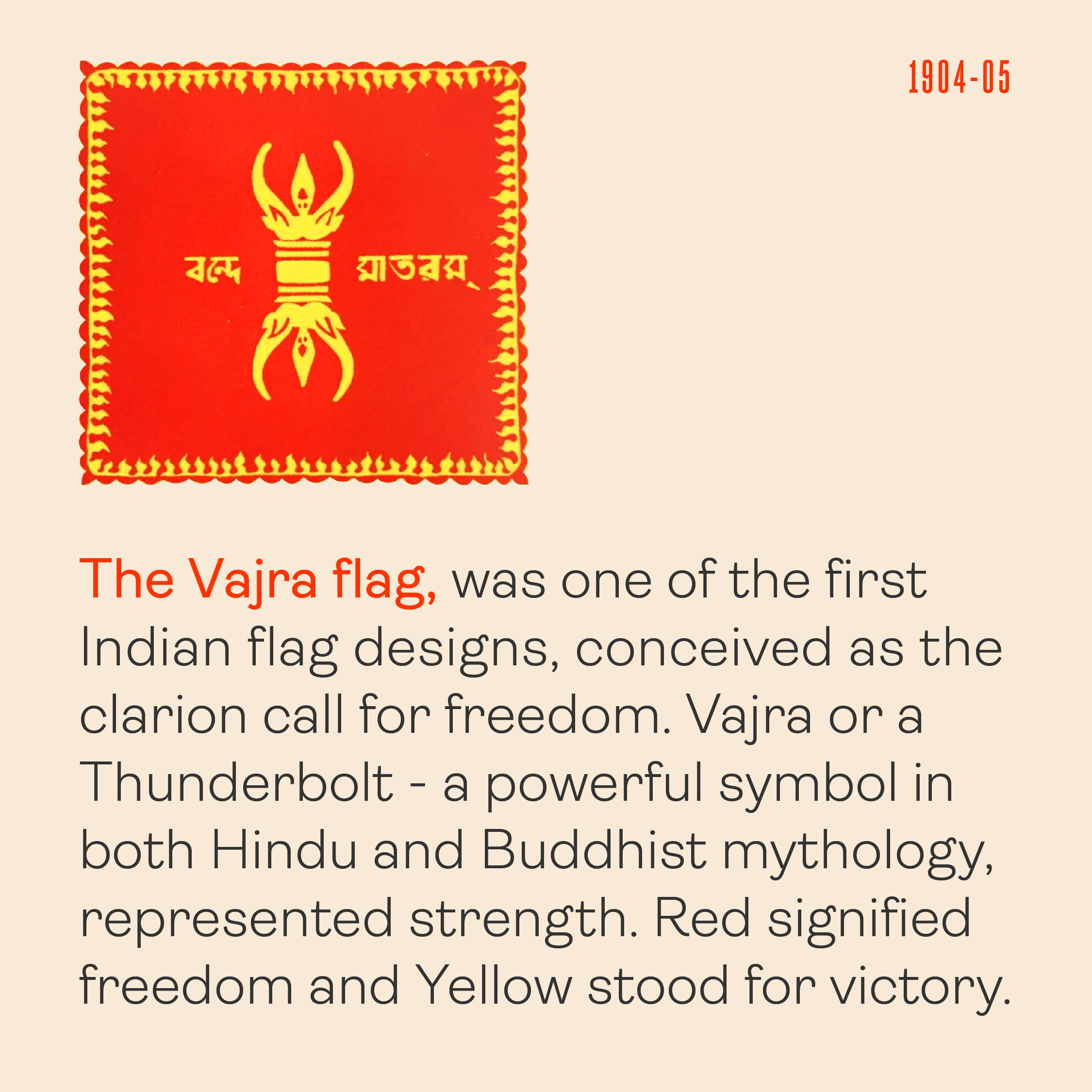
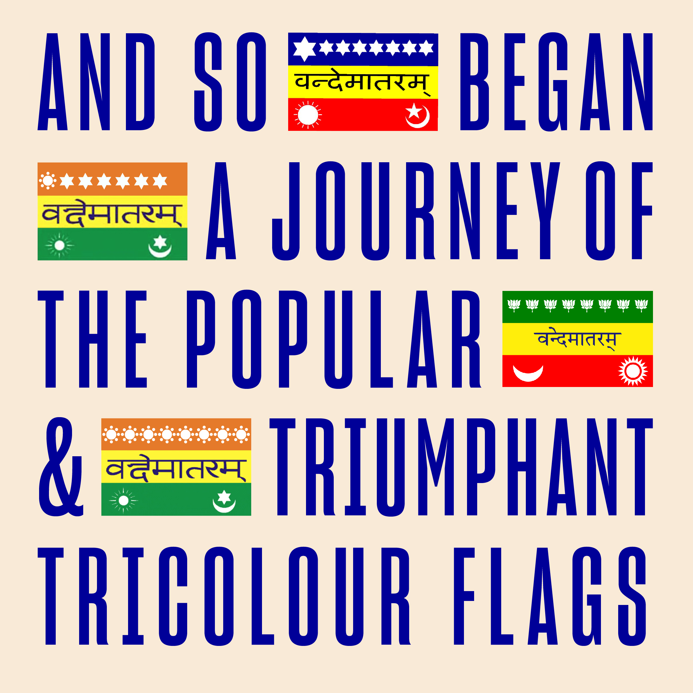
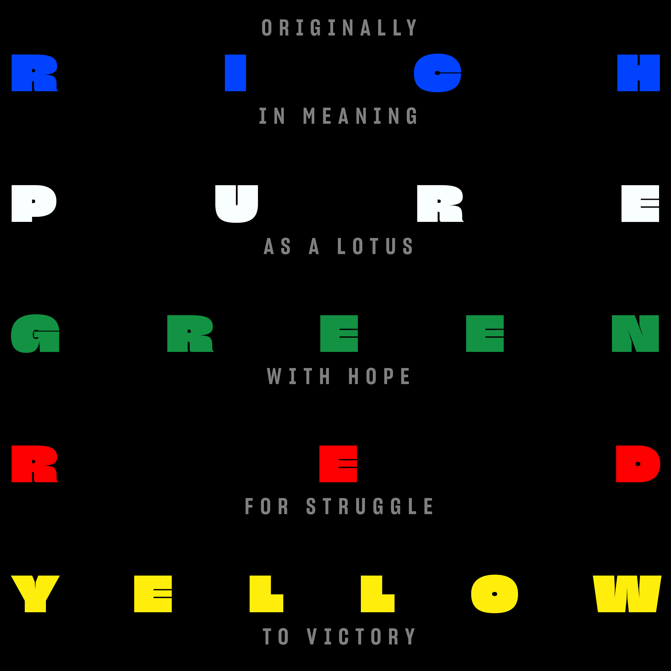
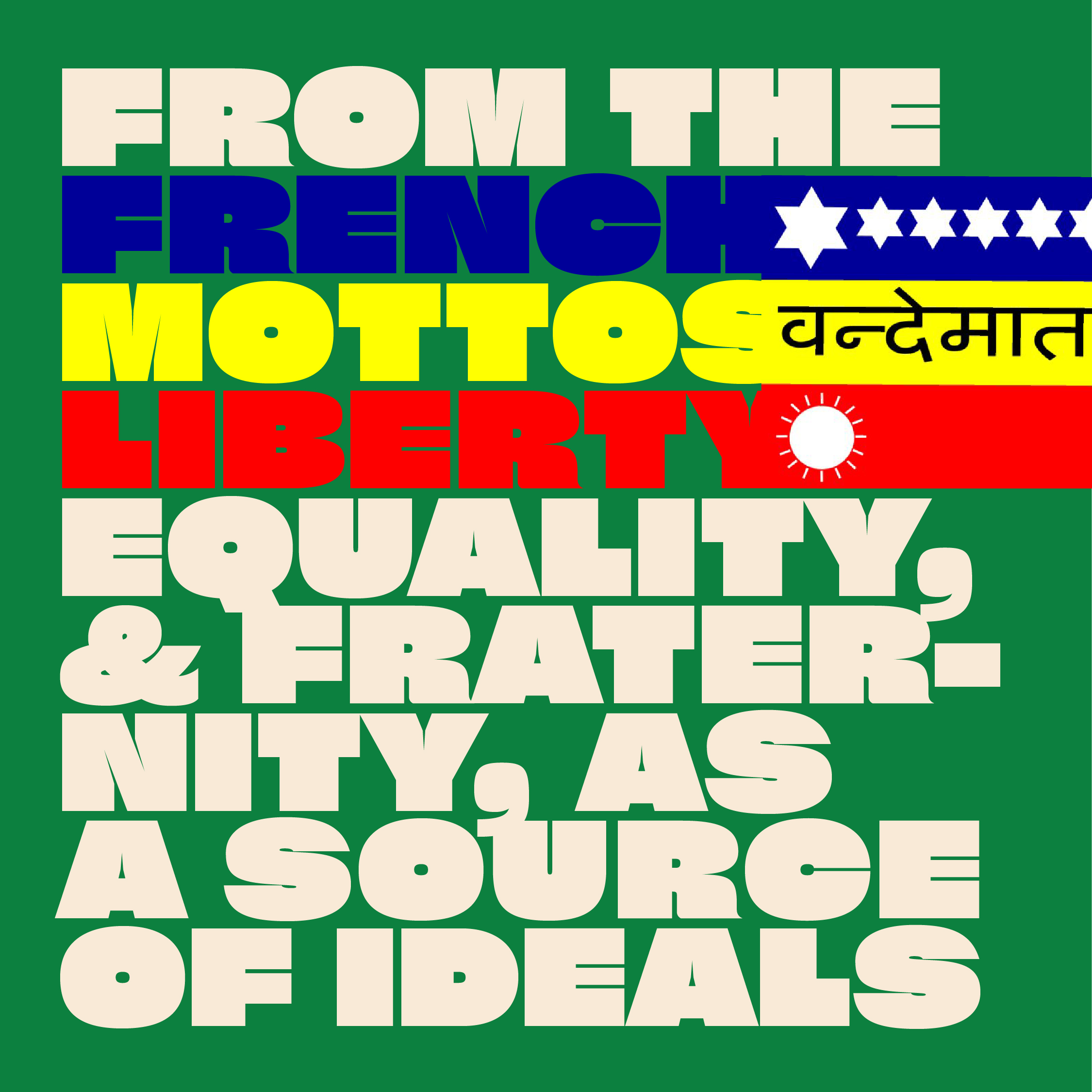
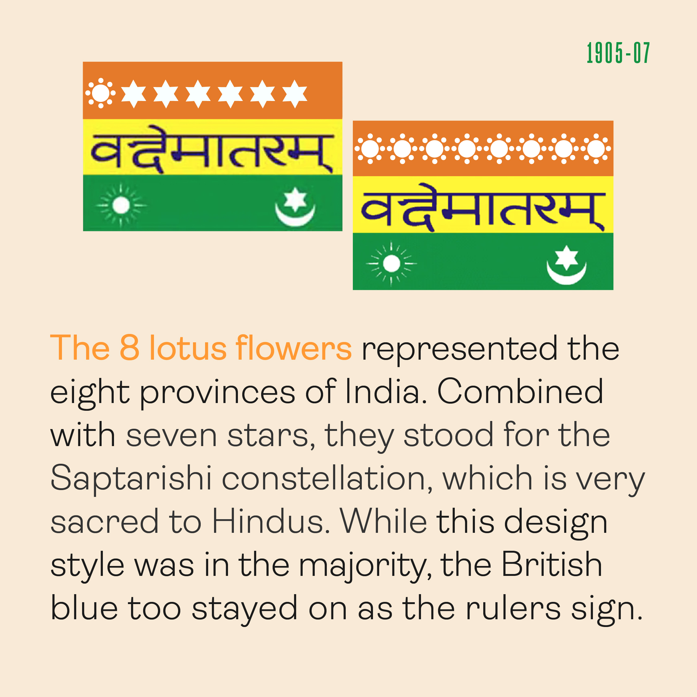
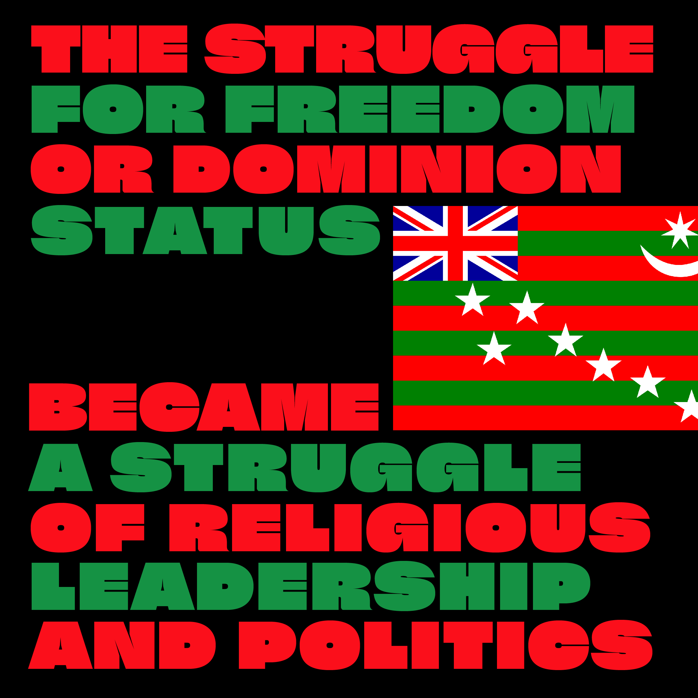
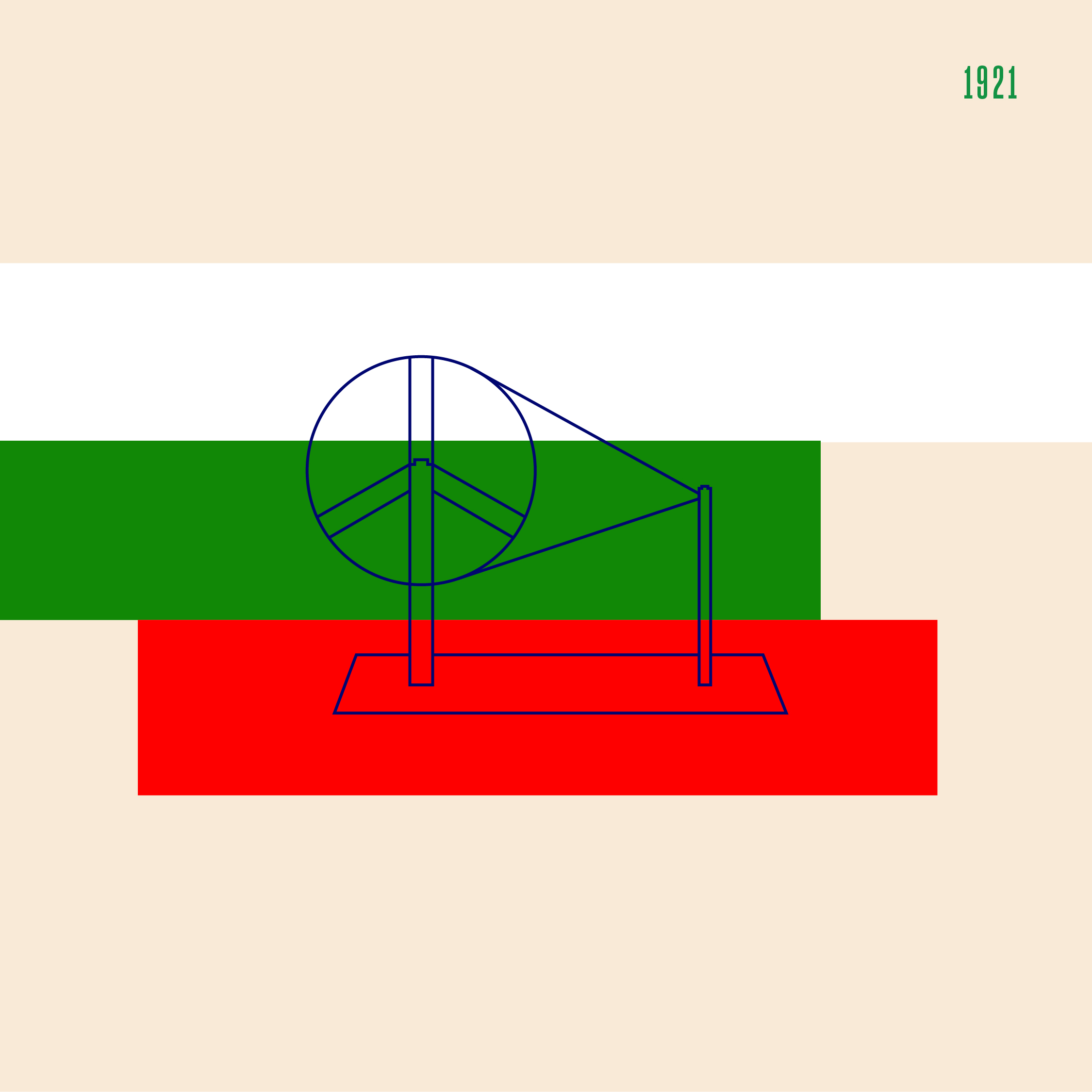
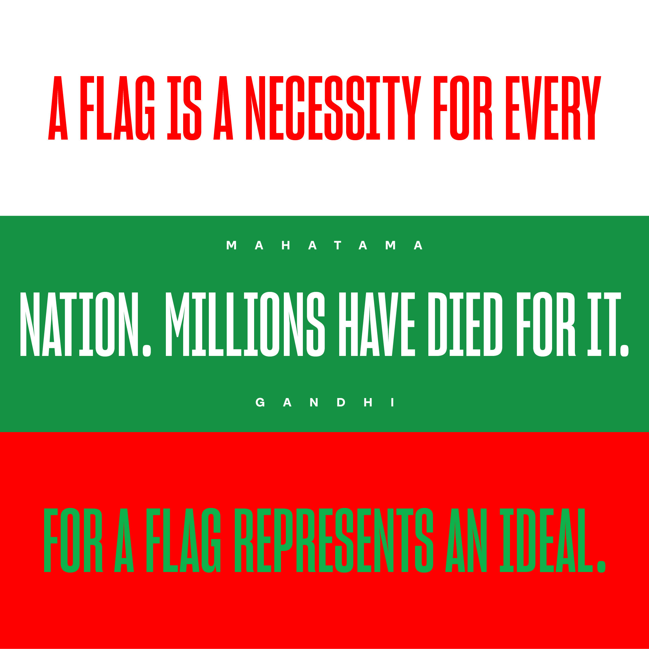
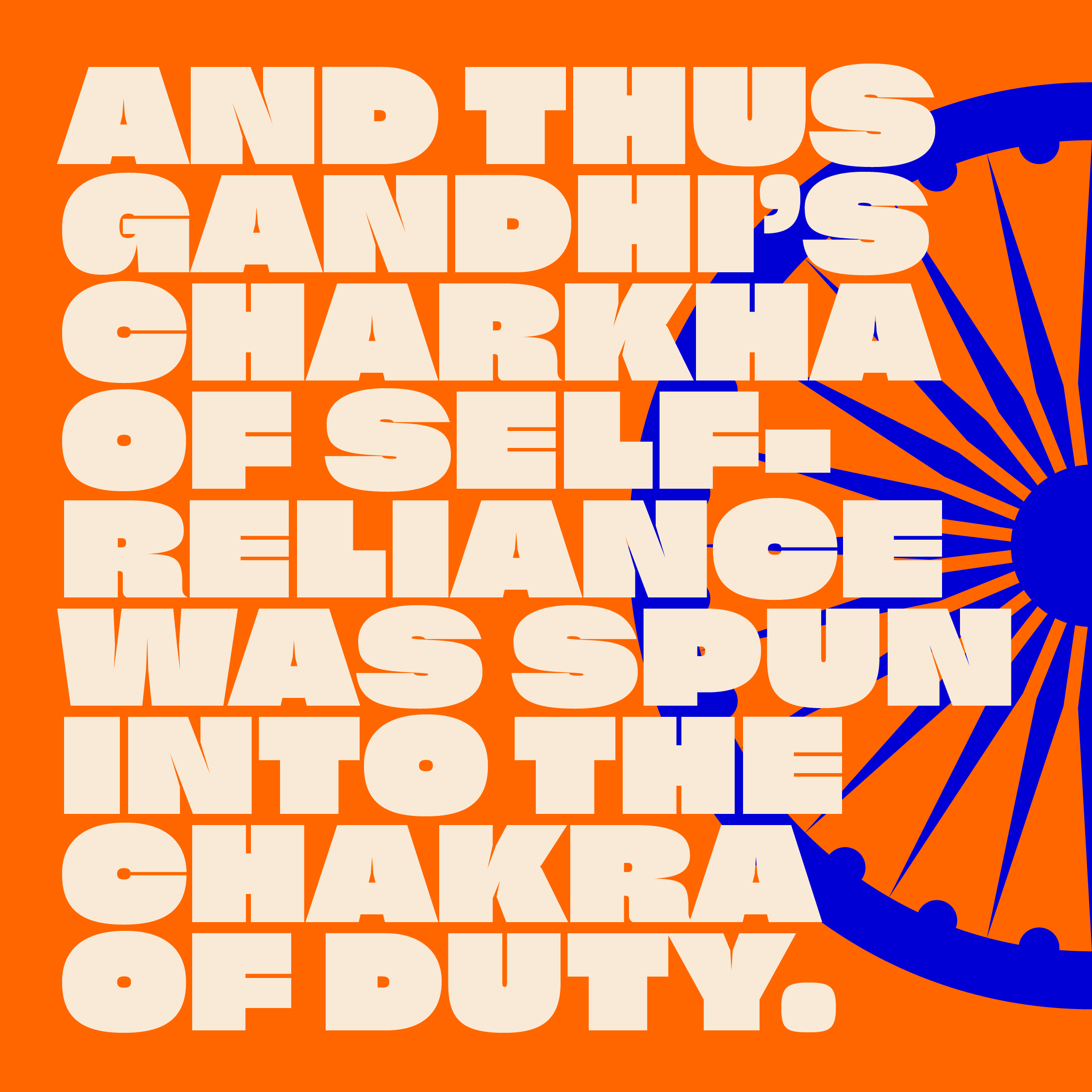
 Flagging the epic journey of the Tiranga.
Colour and symbology study
The Indian flag’s design evolution was an epic struggle of changing politics and identity crisis. It now stands frozen in time, a silent spectator to the rise and fall of ideologies. And an ever mutable identity.
Read more ︎︎︎

An open source font for a breast cancer.
Font creation
Our bespoke font creation is shared as an open resource. It is for the warriors, survivors, caretakers and breast cancer foundations to tell their unique stories and inspire the community.
Read more ︎︎︎
From Incredible to Identical: State vs Design Week branding in India.
Design festival identities the world over have been shedding cultural semantics to adopt a spirit of universality. Indian design week identities seem to be following suit.
By Siddharth Khandelwal and Swati Paranjpe
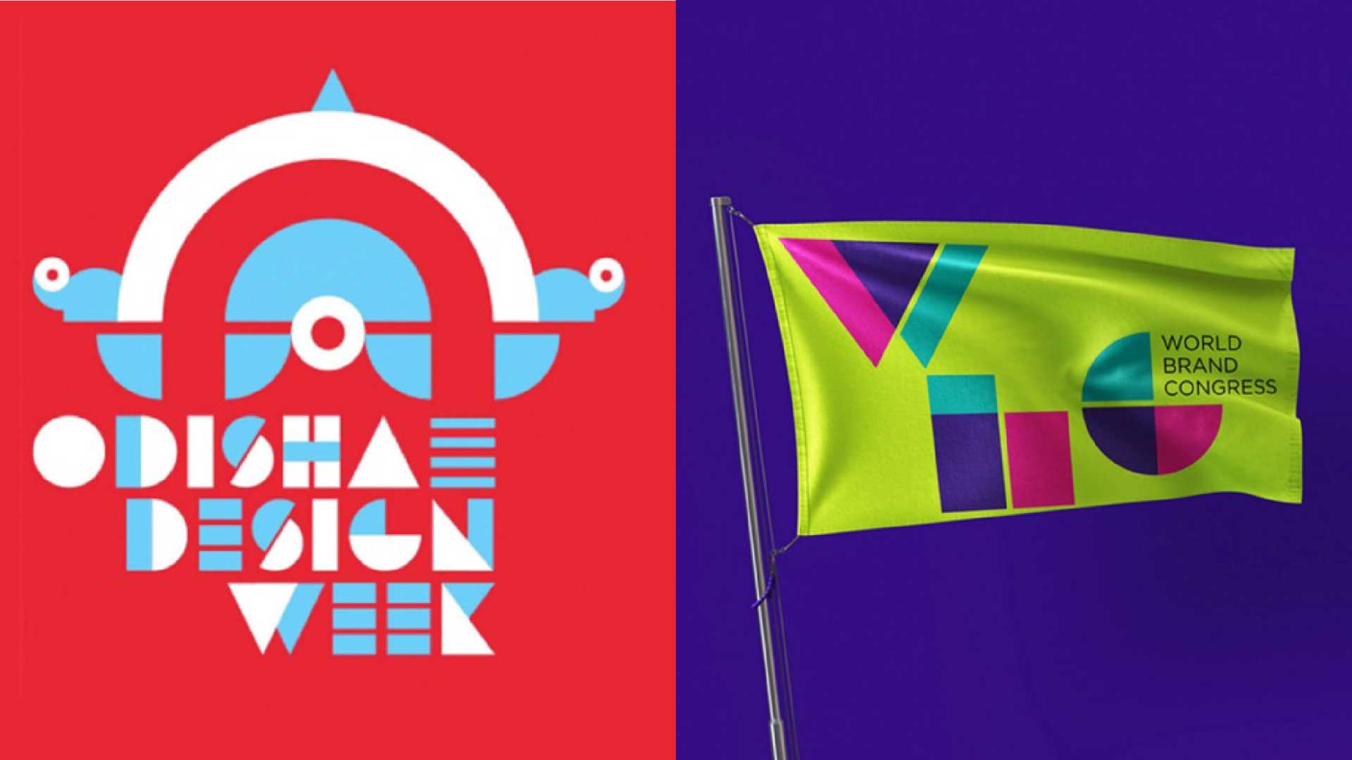
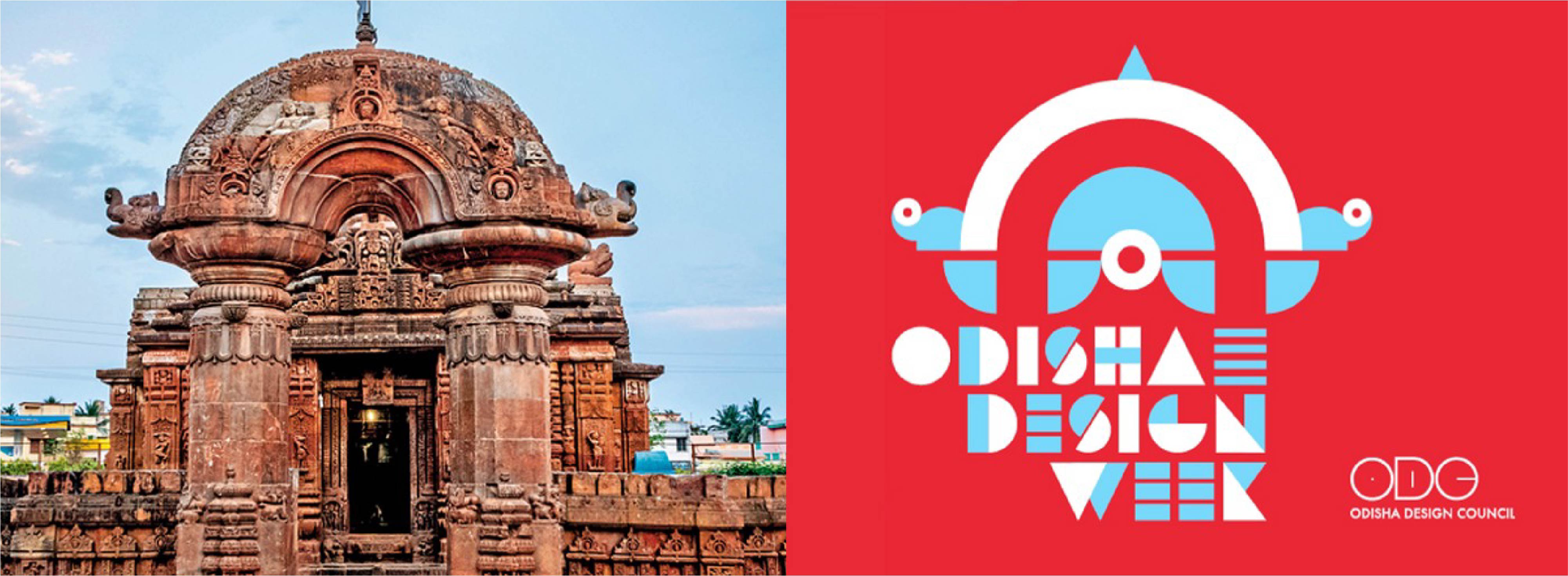
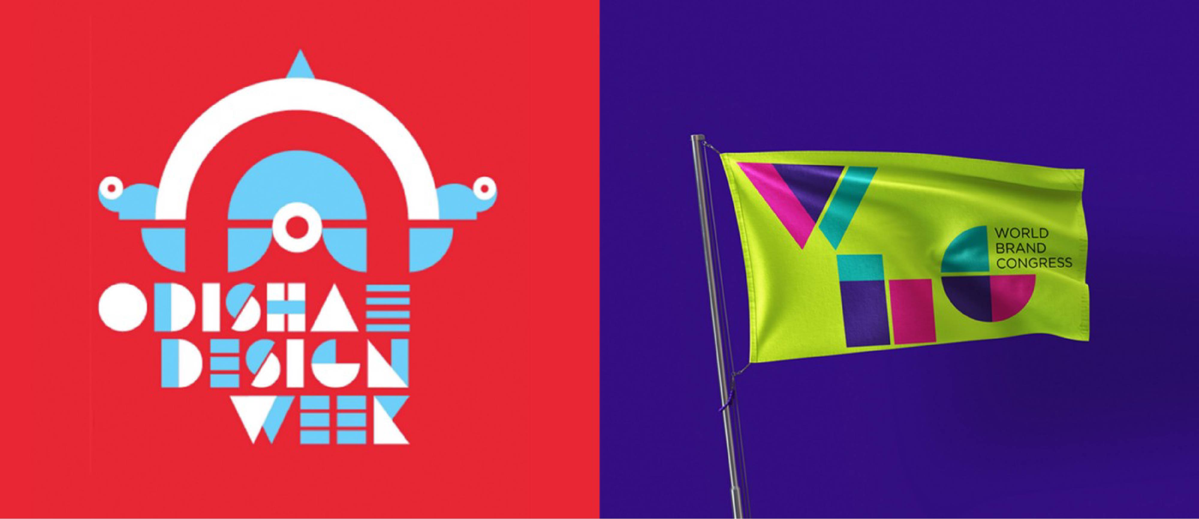 ODW Identity alongside a logotype we had designed in 2010 for the World Brand Congress.
The Odisha Design Week concludes today. And while we couldn’t attend it, we were drawn to its brand identity, launched almost 6 months ago. What drew our eye was initially the similarity it had to a logotype we had designed in 2010 for the World Brand Congress. But on delving deeper, we noticed that design festival identities the world over have been shedding cultural semantics to adopt a spirit of universality. Indian design week identities seem to be following suit.
India has been on a brandwagon of place branding, from Incredible India to the Branded States of India, for over 2 decades. From tourism to investment, competitive federalism is percolating into a growing brand sector. In the context of Design Weeks, city and state-based properties have emerged in Kochi, Hyderabad, Pune, Ahmedabad, and now Odisha. Each slowly attempting to gather momentum and boost state prominence through design equity.
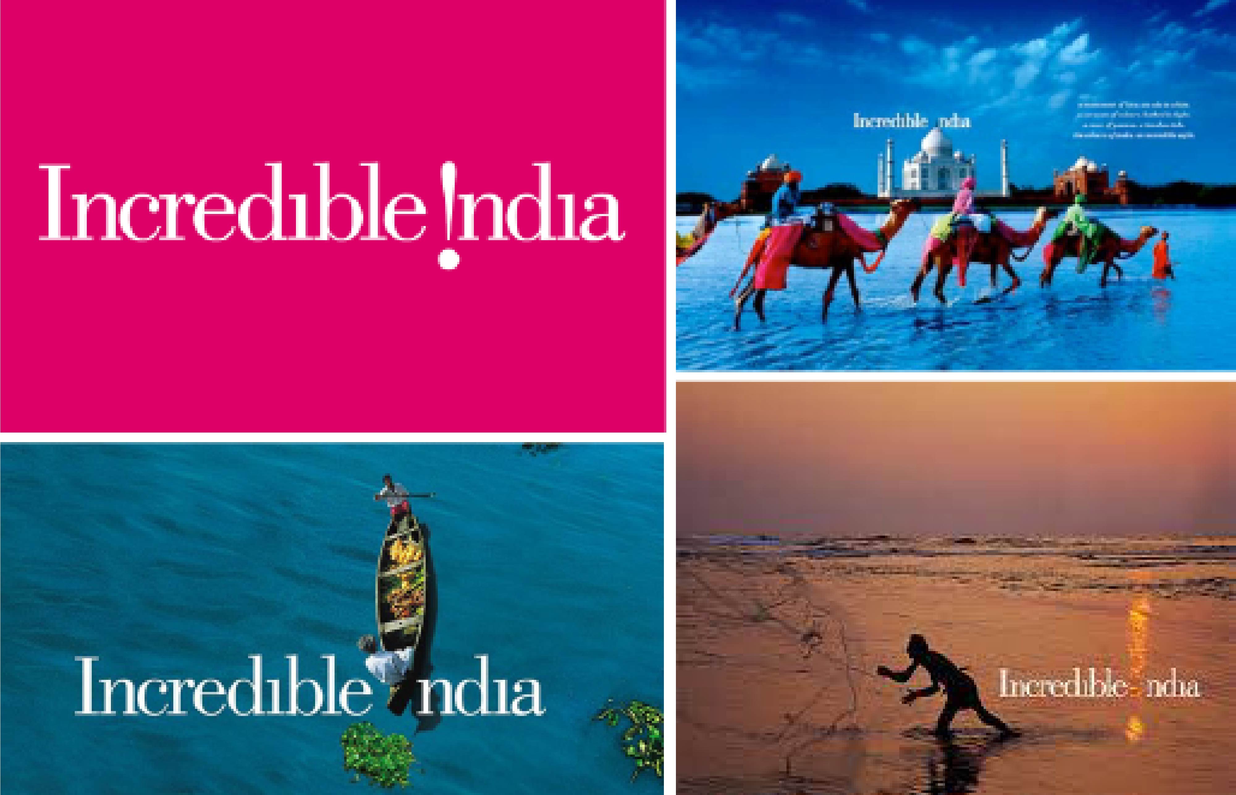 The Legendary Incredible India Identity.
“The semantics of place branding in India began with the tourism brigade. The pioneer, Incredible India, set a high benchmark.”
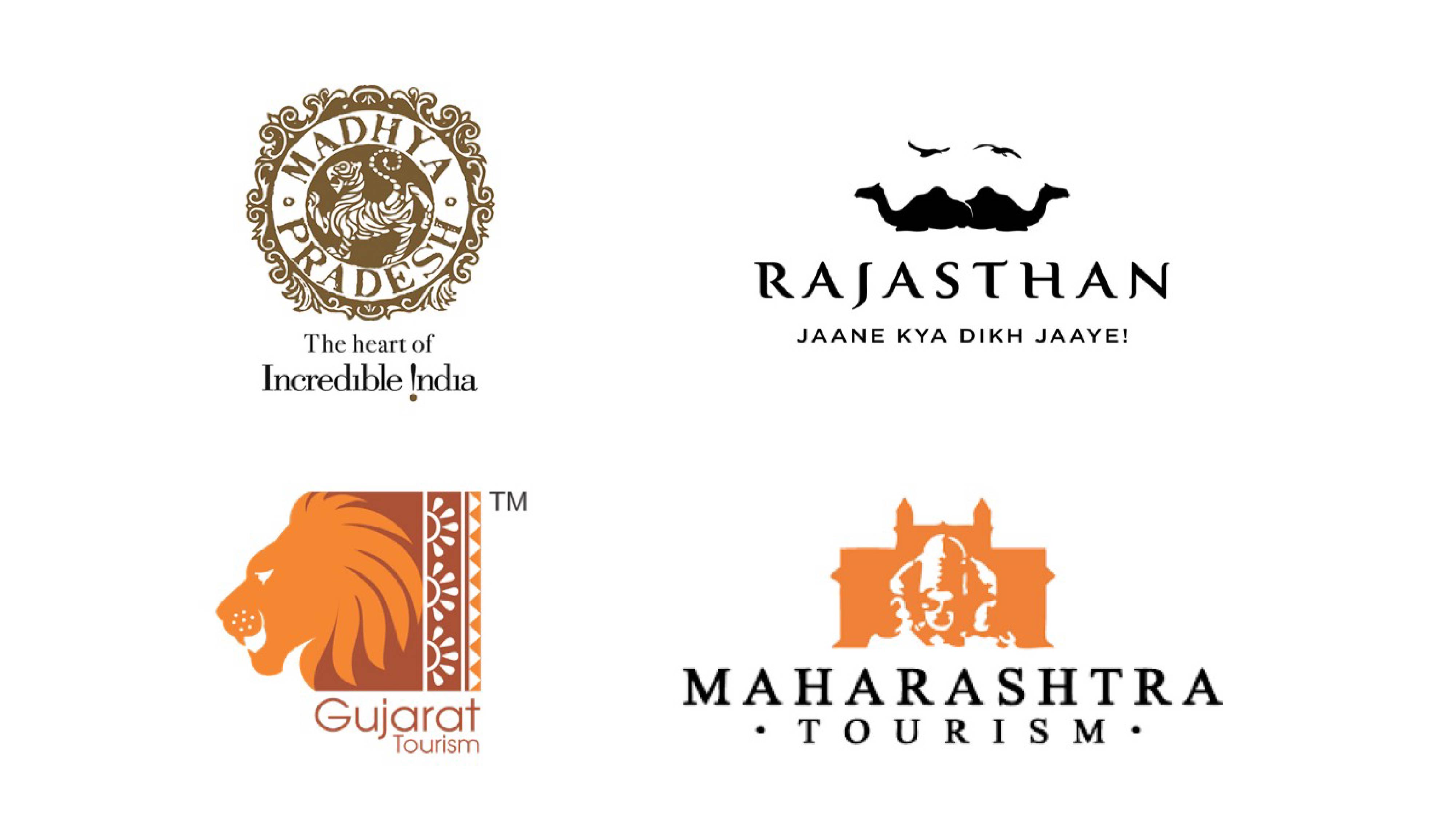 Some State Tourism Identities rooted in culture.
Most of the states following in its footsteps, excelled as well with unique brand narratives and visual metaphors.
They embodied popular icons such as the Lion of Gujarat, Forts of Maharashtra, Tiger of Madhya Pradesh and the Sea for Kerala. Each is beautifully rooted in cultural specificity.
“Unfortunately, Design Week logos looked outward rather than inward to create identities that seem place-less. And Odisha Design Week (ODW) is a fine example of this.”
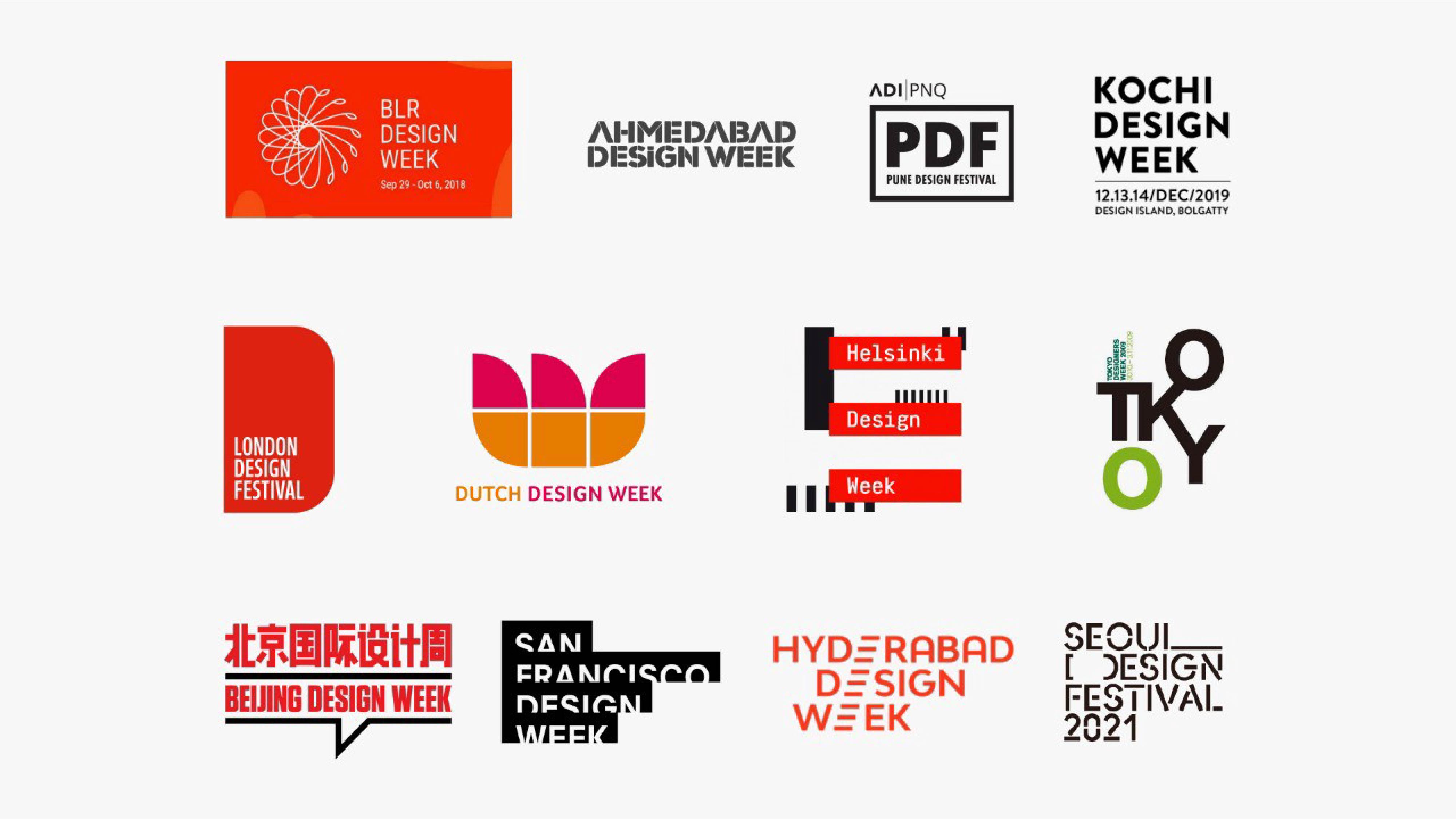 The sea of sameness in Indian and Global Design Week identities.
Culture is the heartbeat that binds communities with shared histories and traditions. Rooted to the land and the hearts of the people that belong to it. Sometimes remembered, sometimes forgotten. Odisha is such a land. Rich in culture, from art and architecture to craftsmanship and cuisine. With a history spanning millennia, a land mentioned in the Mahabharata, its capital is the home of 1000 temples. ODW is seemingly inspired by this temple heritage and uses the shape of the Torana or the arched gateway of the famous Mukteswara Temple. A 10th-century monument located in Bhubaneswar.
 The inspiration diluted.
There is no doubt that this unique architectural design offers itself as a great base to build a logo unit upon. But the chosen rendition not only dilutes the iconic arch but further kills it with an overall look and feel that is reminiscent of a soulless corporate event, defined by the lazy tools typically used by startups.
 Cacophony of the uncultured.
“Free flowing stock icons, meaningless circles and triangles, and an out-of-context logotype that is unnecessarily futuristic and cacaphonic.”
All of it is painted in jarring primary colors that feel too hot and too cold, leaving no room to touch the soul or evoke the sublime. For a design week that, we imagine, hopes to bring the beauty of a glorious land to the fore, its identity falls flat.
Mario Vignelli, the design legend said it best, ‘brand identities become part of our shared history and are an integral part of our culture’. Thus the ODW logo should have been as unique as its rich culture and charted a path missed by the other design week identities. To inspire, influence, and create new opportunities that could be truly Odishaah!
“Kalinga will have to remain buried and forgotten for some time more.”
In the meanwhile, we can ponder over the philosophies of luminaries such as Kōhei Sugiura, who kept pushing designers to look into their own cultures for inspiration and be sparked by a more spiritual, dynamic, and interpretive approach to design. One that is not continuously looking to the east or west, but inward. As captured in this beautiful quote:
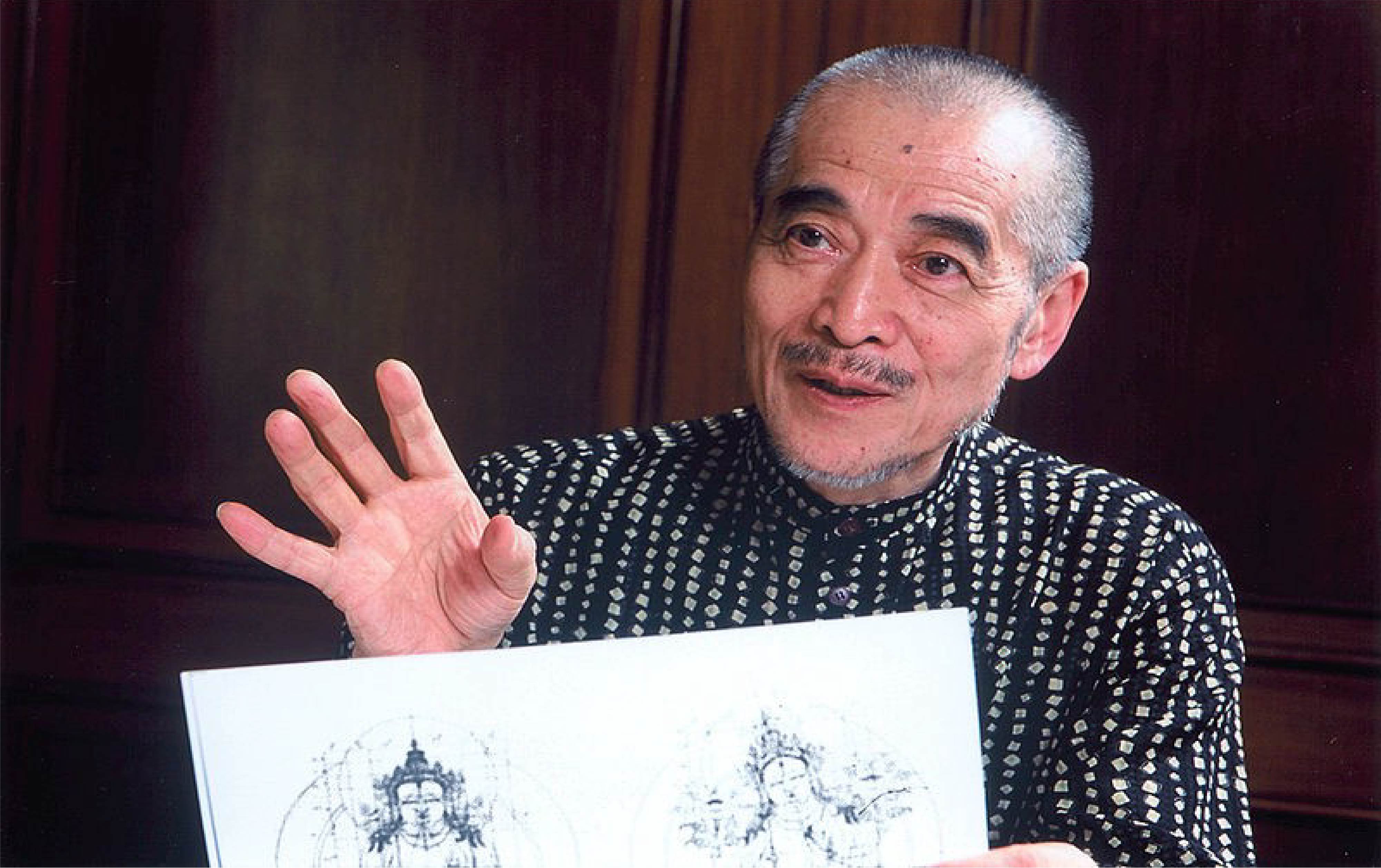 Sugiura Kōhei, is a Japanese graphic designer and researcher in Asian iconography.
“Human beings stand on the ground and walk with two legs. One leg steps forward. To continuously move forward, to grow and develop, is what we all hope for. That is the role of the front leg.
However, we have two legs. There is the back leg as well. If the back leg is not planted firmly on the ground it won’t provide the strength the front leg needs to move forward. It is only when both legs move alternately, in a joint effort, that we are able to advance.
What is the back leg? What does it mean to step firmly on the ground? The ground, of course, is our heritage of history and civilization. By planting one leg on this vast accumulation of wisdom and knowledge, we enable our other leg to move forward. Our two legs and their movement — the front leg advancing civilization, the back leg standing on history and tradition — teach us how to live in the present.”
F*ck Exclusive? Design Inclusive!
Designing digital products for inclusivity, doesn’t have to be a compromise on creativity. You can be exclusive in creation and inclusive in execution.
Swati ParanjpeI, like most Indians, who have lived and or travelled in the west, have always been fascinated by the care given to the needs of people with disabilities. Whether at restaurants, public amenities or private companies, inclusivity in design is being expanded to cover the full range of human diversity. The sensitivity of those who make the effort, from organisations to governments, communities and designers, is a relentless commitment that should be embraced in India.
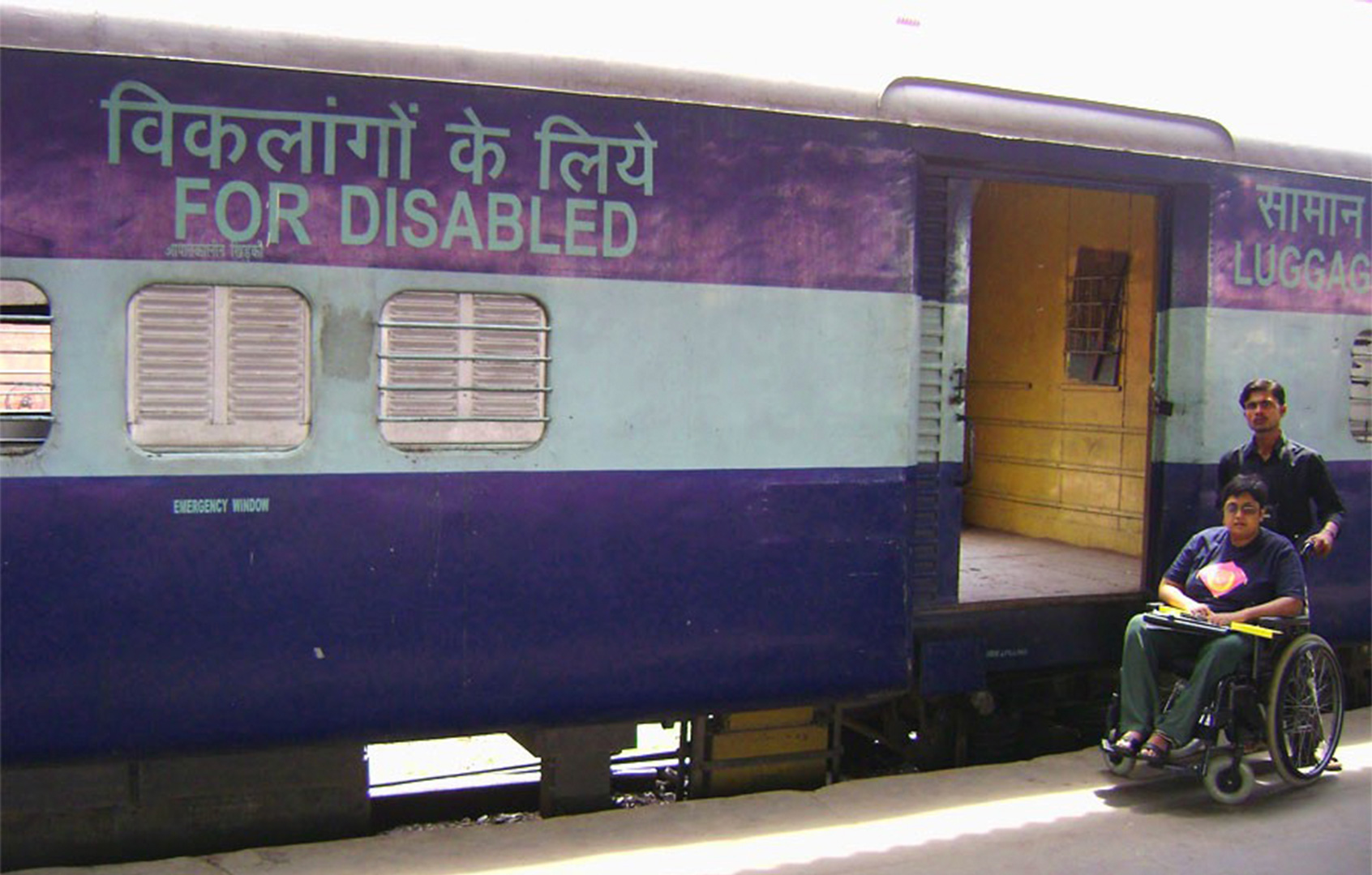 Credit @ accessability-india.blogspot.in
Inclusive design is an evolved conversation globally, but very nascent locally. In not only designing our physical spaces, but also our digital products. With the aim to empower as many and create equity of access. And neither has to be at the expense of creativity, as is the norm.
“As a graphic designer, it’s rare to get a brief in India that centres around inclusivity. But then, when the student is ready, the master appears.”
I have lived in Mumbai for almost 2 decades. As an art, history and culture glutton, I have explored every inch of Kala Ghoda (the art district of Mumbai) in the hours post college and work. However, my first visit to the CSMVS museum, now the crown jewel of the area, was in 2017. Previously, it never seemed inviting enough, but with a spurt of activity, from interesting international exhibits and reinterpretations of their existing collections, it eventually became a must see.
In 2019, CSMVS launched Mumbai’s first children’s museum. A modern, glass-walled structure in stark architectural contrast to the Museum’s Indo-Saracenic heritage building. Designed thoughtfully to include the indoors and outdoors, the space and its philosophy is geared towards engaging young minds through all their senses. But more than anything, it’s an inspiring endeavour that is likely to change India’s relationship with museums.
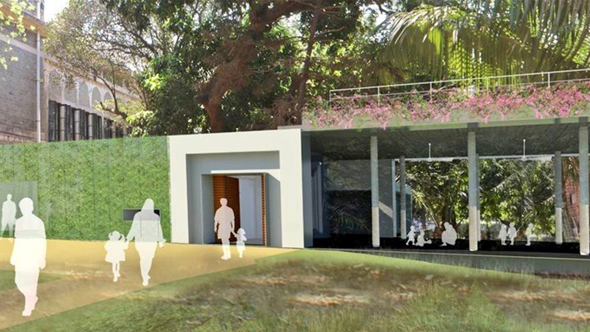
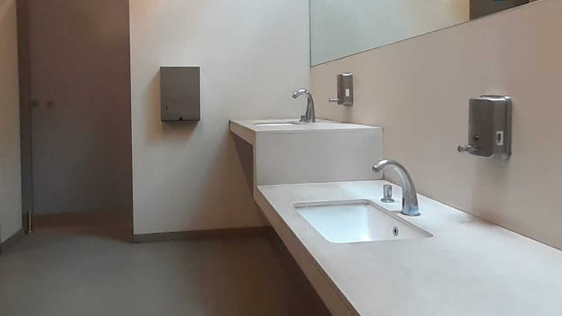 The Child Friendly Toilet at CSMVS Children's Museum, Mumbai.
“It was in the building’s child-friendly toilet, where I first noticed their thoughtfulness.”
It’s something that I had never seen before and was thoroughly excited to recommend to all those who appreciate compassionate spaces. Little did I know that this thoughtful space would become the hotbed of our studio’s long awaited initiation into inclusive design. The Children’s Museum commissioned us to create a unique digital experience for them.
Targeted especially towards children, adolescents and young adults, this digital experience will not be a mere child-friendly online museum. Instead it is imagined as an innovative medium of discovery. A space for young minds to explore, learn and grow into wholesome, curious individuals. Designed with the purpose of creating tech for good and repurposing art, history and culture to create insatiable curiosity amongst the young.
The museum was keen that we follow the latest (WCAG) Web Content Accessibility Guidelines. Globally this is a legal requirement for all public and private web projects. But in India, it seems to be a recommendation for the government sector and not necessarily a binding, either on them or the private sector.
Irrespective, we knew early on that we wouldn’t be able to drive the project by simply following the WCAG guidelines. To be truly inclusive, we would have to factor every challenge of diversity and craft a platform that could truly solve them. Even if it is incremental and designed in stages, with utmost care and caution.
Accessible design, universal design, barrier-free design are all interrelated concepts, subsets of inclusive design, with subtle distinctions. But they are allied with a common purpose to ensure that we design everything from the built environment to digital interfaces, with an eye for everyone. This requires a sensitivity to criterions of culture, diversity, disability, usability, language, age, gender and other forms of human needs and difference.
Every project is a chance to begin again. Earlier this year, we crafted the core ethos for our studio — at The House of Two,
“Branding lives at the intersection of Art and Design, to create and curate Brands and Experiences that are exclusive, uncompromising and above all timeless.”
Designing for Diversity, Indian or otherwise.
Choosing design elements for brands has always been a mélange of assimilating category codes, consumer psychology, brand personality and company beliefs, all assimilated together, to arrive at a design system that intuitively and collectively feels appropriate. This has been a standard process which then gets governed and altered as per the brand’s mediums (from print to digital). Mass market packaging or large corporations undertake focus group inputs and design decisions are then altered as per consumer feedback. But SME’s and cultural institutions usually do not have similar budgets; most often it’s the client and the designers who take a final call. We started our process pretty much in this manner.
Typically, digital design projects factor in user data for experience parameters and not necessarily the visual elements. We always start such projects with the UX/UI and Identity being developed alongside each other.
Considering the wide range of potential users, both in terms of age, as well as socio-economic status, our user data and corresponding insights took over 3 months to cull out and compile. The first unique challenge we faced was understanding the role that cognitive development plays when crafting such a platform for children between the ages of 5 and 23. Our understanding, based on initial research, was enhanced and refined through conversations with psychologists, teachers, parents and the children themselves.
“Through the course of this activity we came to the realisation that we would have to build multiple user journeys for each age category based on cognitive ability.”
These journeys were also classified based on how they would be led. Either aided, independent and/or peer led. While by and large, with all natural factors remaining equal, most children develop at the same rate, access to information and education can cause a difference in development. This was further compounded by the various people with disabilities that we would have to design for within these groups.
As a pilot phase, we decided to focus on 3 core areas of inclusivity:
Ages 10–15 for the economically abled and 13–18 for the economically fragile.
Individuals with various forms of visual disabilities
Children with varying first languages, who decipher english in their own unique ways
In the meantime, we’d already started arriving at the platform’s identity with its logo, colour and font palette being the core design elements. But the minute we put them through the lens of our research, insights and accessibility criterion, we had to re-craft the complete design system.
“In the process, we have now altered our process of creation to design effectively for diversity. While ensuring that the design aesthetic, rich storytelling, delight of colours, form and interactivity isn’t compromised for any of the platform’s users.”
Over the next few weeks, we hope to collate our learnings across each design area. As you join us on this journey we hope you too will begin to consider inclusivity more proactively, in the knowledge that it doesn’t have to come at the cost of creativity.
Reinventing Indian Museum Experiences.
In a land rich with art, culture and history, how we experience these subjects, especially at institutions devoted to their care, is an area ripe for reinvention.
By Siddharth Khandelwal and Swati ParanjpeFor all art lovers, Indian museums have long been tempting but insipid spaces of antiquity. Forcing us to somehow find our way in a characterless maze. Moreover, in a land rich with art, culture and history, how we experience these subjects, especially at institutions devoted to their care, is an area ripe for reinvention.
Distressed charts, incorrect language and lifeless galleries are a testament to the prevalent experiences offered in our country.
“Museums are our go-to for inspiration; fascinating places that contextualise a culture while travelling across the world.”
Personal passion to professional pursuit.
We soak in every city or country we visit, through the lens of history, evolution and changing influences. From the town of Bath in the UK, which can trace its name to the Roman baths still present from a millennia ago, to experiencing the evolution of Philips in Eindhoven. Or the value of the Power icon brought alive at MoMA, every nuance is mesmerising.
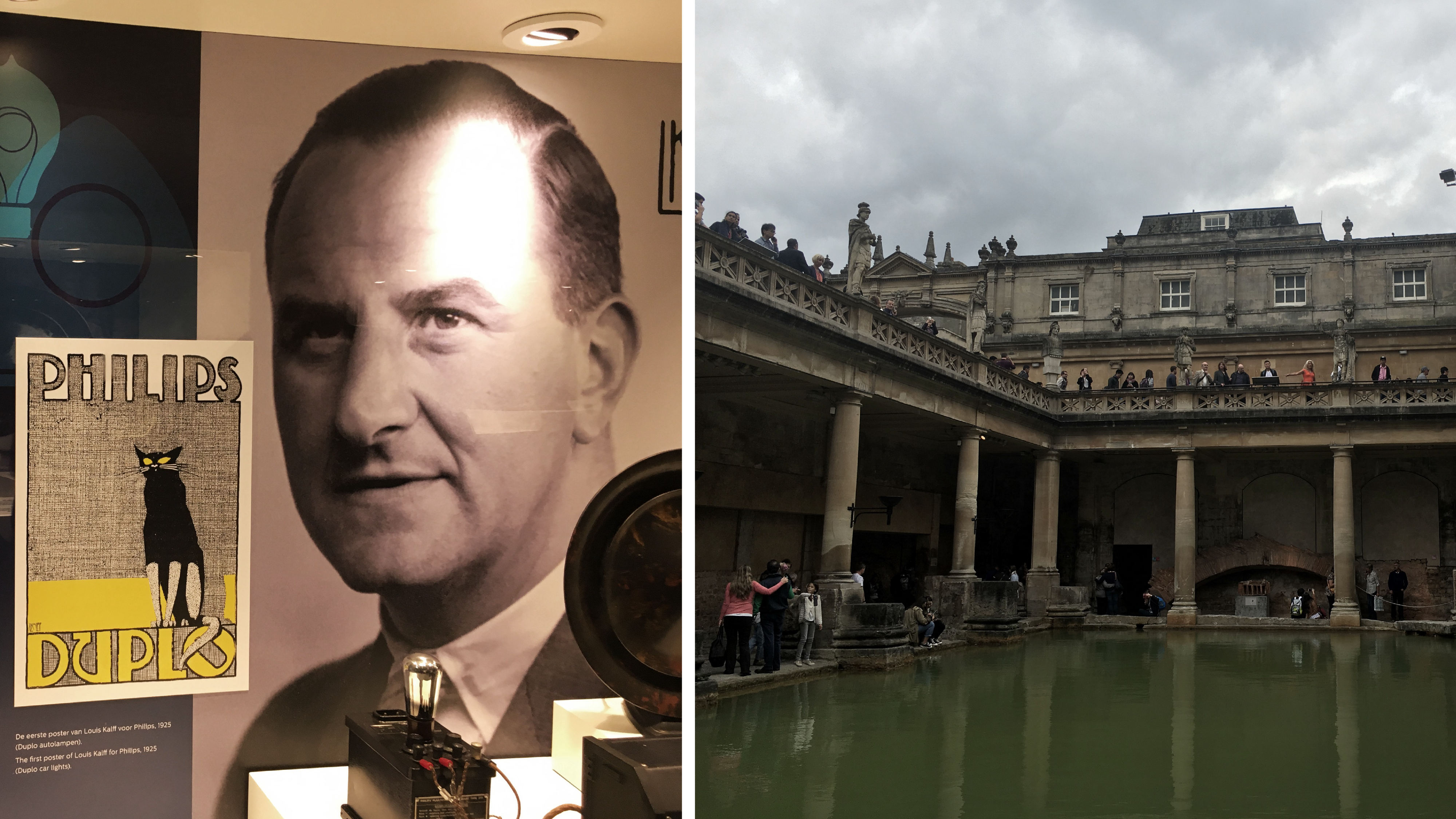 From our visits to the Philips Museum, Eindhoven (left) and the Town of Bath, UK (right).
“As replenishing fountains for our inspiration, museums have always been on our list of dream projects to design.”

The Two of us, at the Stedelijk Museum, Amsterdam (left) and Design Museum, Copenhagen (right).
So when we were approached by the CSMVS (formerly Prince of Wales Museum), now considered among the top 3 museums in India, we were honoured. A slew of projects ranging from branding to designing phygital experiences had us excited and nervous with anticipation.
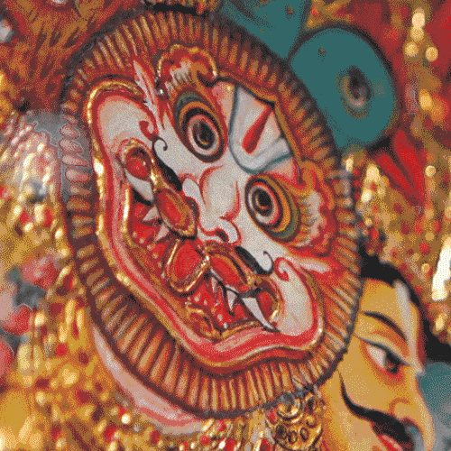
The CSMVS Museum, Mumbai (Image Credits @ Reuben Singh)To begin, designing an exhibition for a Thanjavur Art collection.
Understanding an art form alongside the museum — delving into their processes — from receiving a collection to its curation and conservation, gave us a brand new appreciation for their rigorous approach to keeping art and culture alive.
From the moment we saw the collection, we were enamoured. An enc hantment that only grew the further we dived into the world of this classical South Indian painting style.
 Every visit provided greater inspiration from
 the paintings to their history.
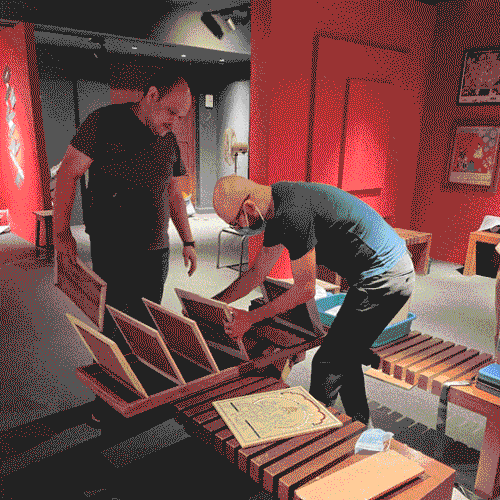
A new approach to exhibition creation.
As non-traditional exhibition designers, we approached this as we do all projects, rooted in the science of Branding. We knew that the exhibition experience had to be a unique storytelling endeavour.
“Our narrative creation began by understanding the fascinating tale that has nurtured Architecture, Performing Arts and Painting Traditions for over 2000 years.”
Thanjavur (both a city and an art form), is the cradle of South Indian culture. In understanding its history and evolution, we learned that two consecutive Chola dynasties were instrumental in its conception. The first in establishing, and the second in revitalising the temple architecture within the city.
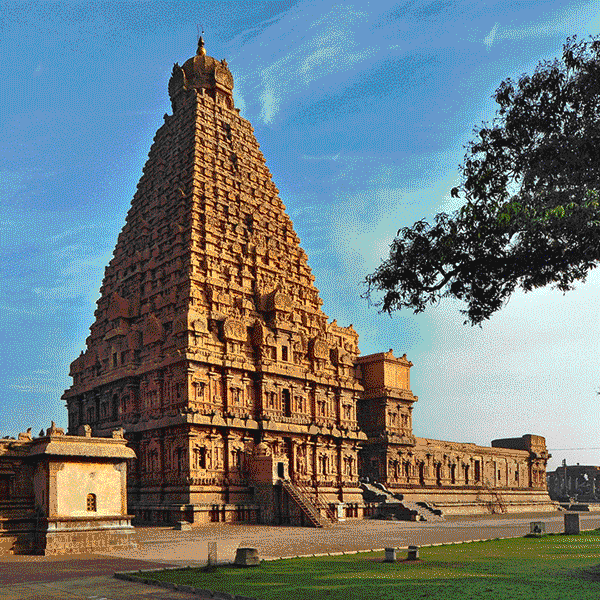
 The Brihadisvara Temple, Thanjavur. Built by Chola emperor Rajaraja I between 1003 and 1010 AD.
Even the past has an older story to tell.
It is on the walls of Thanjavur temples and the surrounding prayer halls that this art-form first began to flourish in the 1600s. But the influence and inspiration for its ‘divine’ creations hearken back to the decline of Buddhism in India, and the democratisation of Brahmanical thought, through the Bhakti movement, which began in South India. First coming to prominence in the seventh to eighth century CE, it spread northwards from Tamil Nadu through Karnataka and gained wide acceptance in fifteenth-century Assam, Bengal and northern India.
“Steeped in the religious beliefs of the times, the art form originally featured Hindu Gods, Goddesses or scenes from spiritual texts and myths.”
But under the patronage of the Marathas, it evolved to incorporate royal portraits and rose to its zenith in the 1800s. Its fall from popularity in the early 20th century can be linked to the rise of ‘divine’ calendar art by the renowned Raja Ravi Verma.
The beginning of the 21st century saw a resurgence of the art form, with Thanjavur artists lending their skill and style to calendars and stained glass artworks. This rejuvenation was highlighted with a Geographical Indications (GI) tag in 2007, proof of Thanjavur art’s long heritage and impact.
 Detailed dimensions of the Thanjavur Collection
 at CSMVS. (Image Copyright@CSMVS)
Re-crafting a tale that is two millennia old.
We realised that this story was astonishingly complex. A complexity compounded with the weaving of the museum’s role as its future guardians. We wanted to pay homage to its roots but also bring forth the confluence of the art form, the museum and its patron. To unfold a journey of discovery and enchantment, that would continue long after the exhibition is seen and felt.
One of the most iconic aspects of Thanjavur paintings is how godlike subjects are brought to life in three-dimensional relief through the layering of materials. We played with these core ideas of Dimensionality and the Divine to craft a singular narrative that encapsulates the art form’s technique and history. Its cultural significance and journey from prominence to obscurity and back to the limelight.
 From inspiration, to ideation and execution.
 A journey of careful consideration.
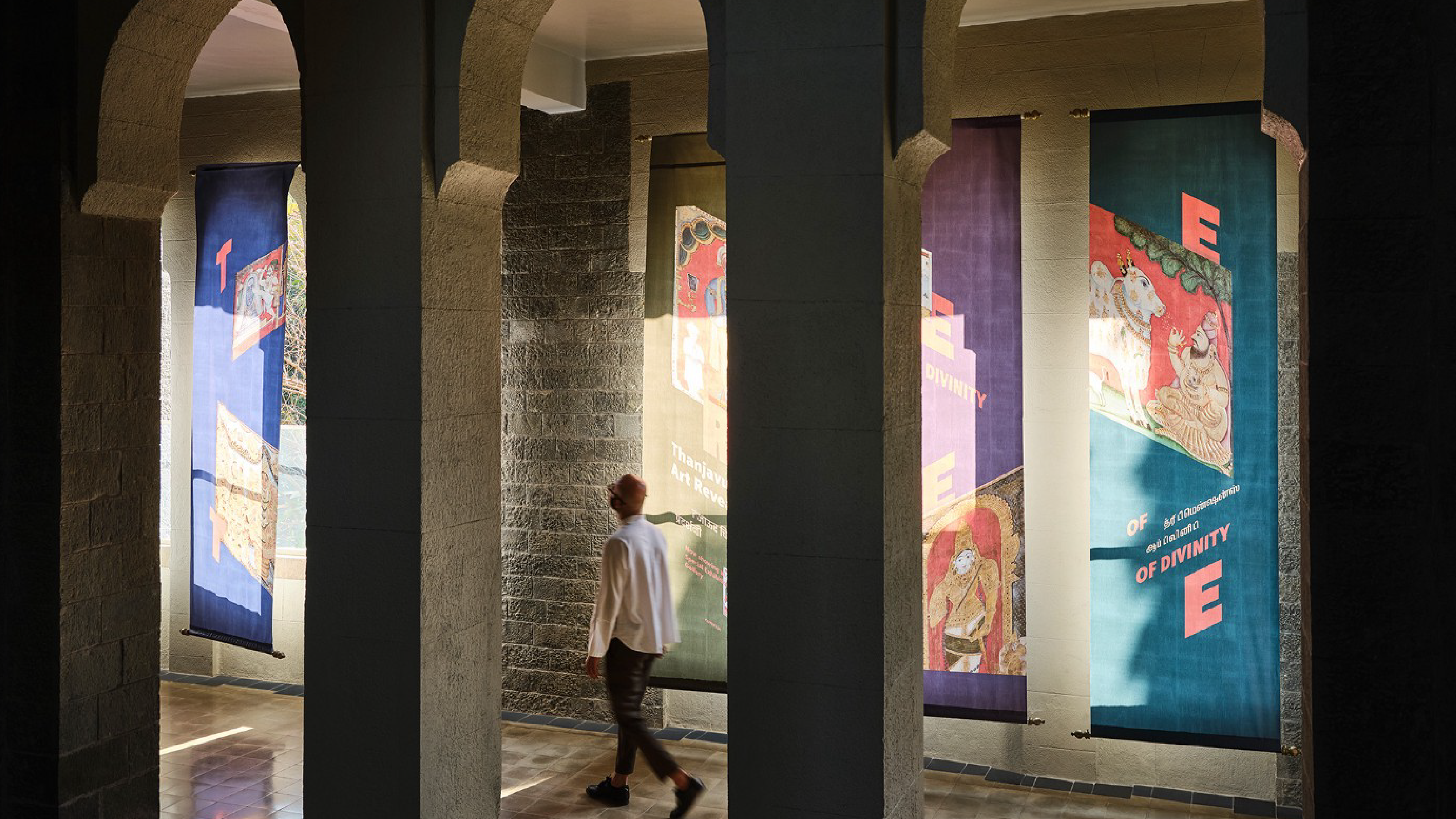
“Three Dimensions of Divinity — Thanjavur Art Revealed, as an exhibition name and experience builds intrigue and authenticity and becomes a unique idea that is cohesively expressed in a myriad of ways, physical and digital.”
At the centre of this dimensionality is the word THREE. It represents not only the three spaces into which the exhibition is divided but also the confluence of the art form, the museum and the sacred quality, we hope it can take in each visitor’s heart who discovers this unique culturally defining heritage.
A multilingual dynamic logo celebrating the art, the audience and the culture.
From our multilingual, dynamic logotype to unique interventions that meaningfully build connections to the story of Thanjavur, we were able to create a seamless, engaging and multi-dimensional journey.
The exhibition has delighted over 60,000 Thanjavur novices and veterans alike, since it opened as part of the CSMVS’s 100-year celebrations in January. Hopefully, it will continue to inspire future visitors till it closes on 30th June.
“To hope, to dream, to dare.
With this initial foray, our desire to continue work in the art and culture world has fanned from spark to flame. Secure in the knowledge that we can add true value to the space.”
India’s rich heritage has been in peril for a while. Stories lost to new generations, breed a false sense of ownership or callous disrespect. Whether due to a lack of resources, guardianship and/or the awareness of its finer nuances, or a combination of all the above, we do not know.
Our past has to be made relevant and unbiased to political and religious fervours. As creative minds it is our duty to guard our shared heritage. Through our expertise in branding and design, the House of Two would like to use inclusive storytelling, phygital re-interpretations and methods of monetisation to reinvigorate the art and culture landscape of this city and our country. Together we can create a lasting impact.
If we only dare to try.
Special thanks to the curatorial and conservation teams at CSMVS. All paintings and images of paintings are © CSVMS Mumbai.
Flagging the
epic journey of
the Tiranga.
The Indian flag’s design evolution was an epic struggle of changing politics and identity crisis. It now stands frozen in time, a silent spectator to the rise and fall of ideologies. And an ever mutable identity.
By Siddharth Khandelwal and Swati Paranjpe
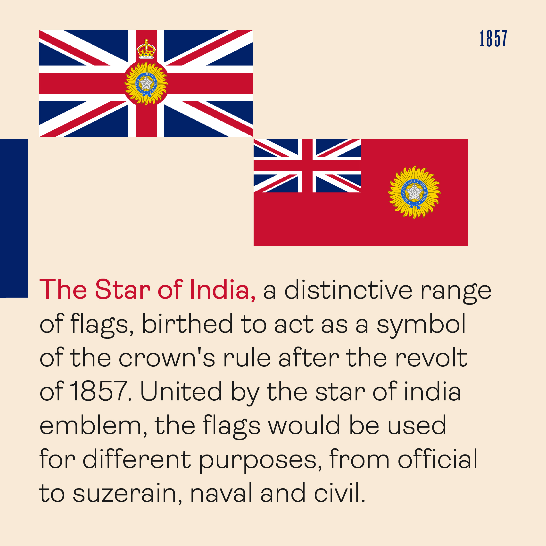
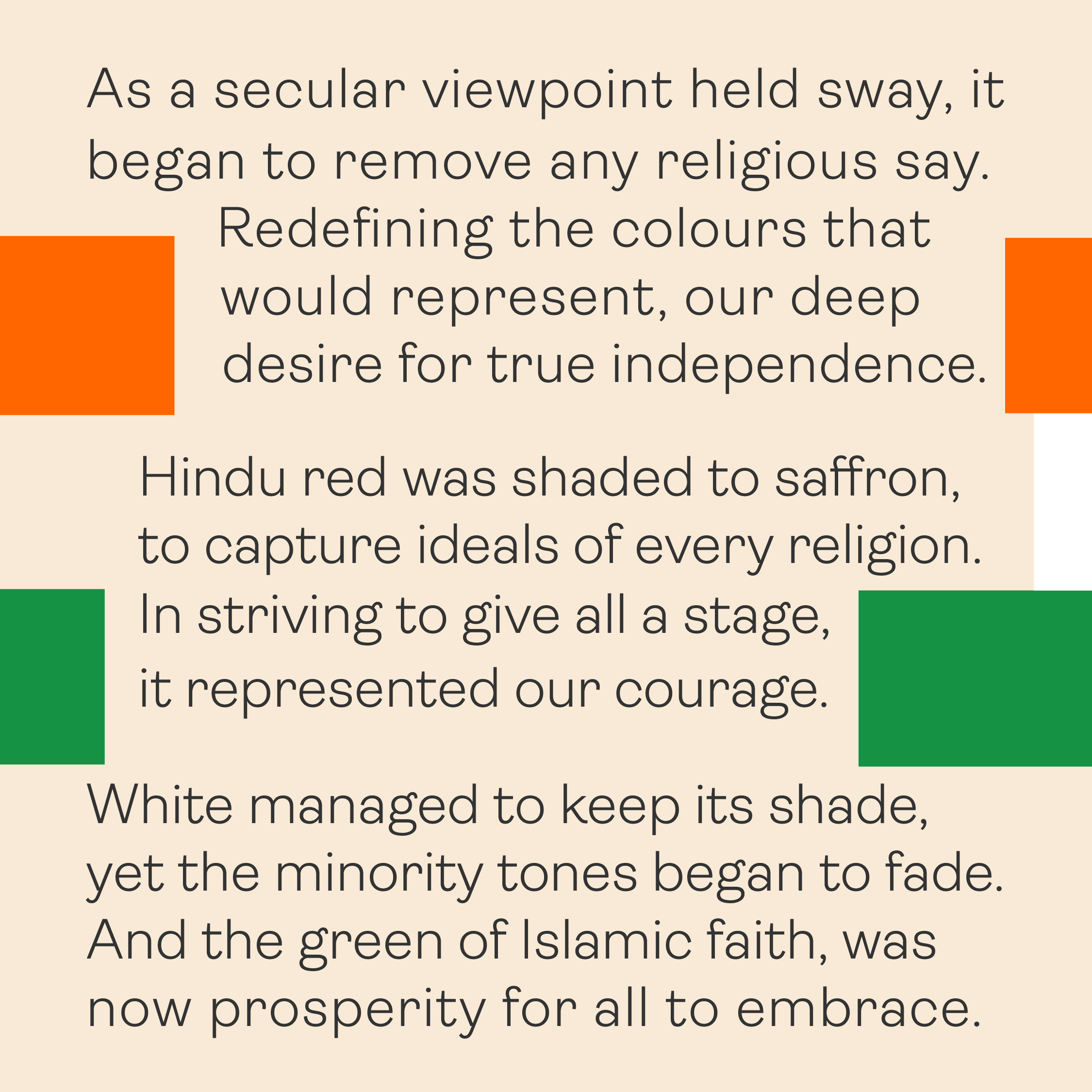
Join us on a colourful tale that began in 1857, when India’s then colonial rulers, the British, conceived the idea of a single flag for India.


Let’s start a conversation.
For business enquiries:
eamonn@twodesign.co.in+91 98676 54952