
From Incredible to Identical: State vs Design Week branding in India.
Design festival identities the world over have been shedding cultural semantics to adopt a spirit of universality. Indian design week identities seem to be following suit.
By Siddharth Khandelwal and Swati Paranjpe
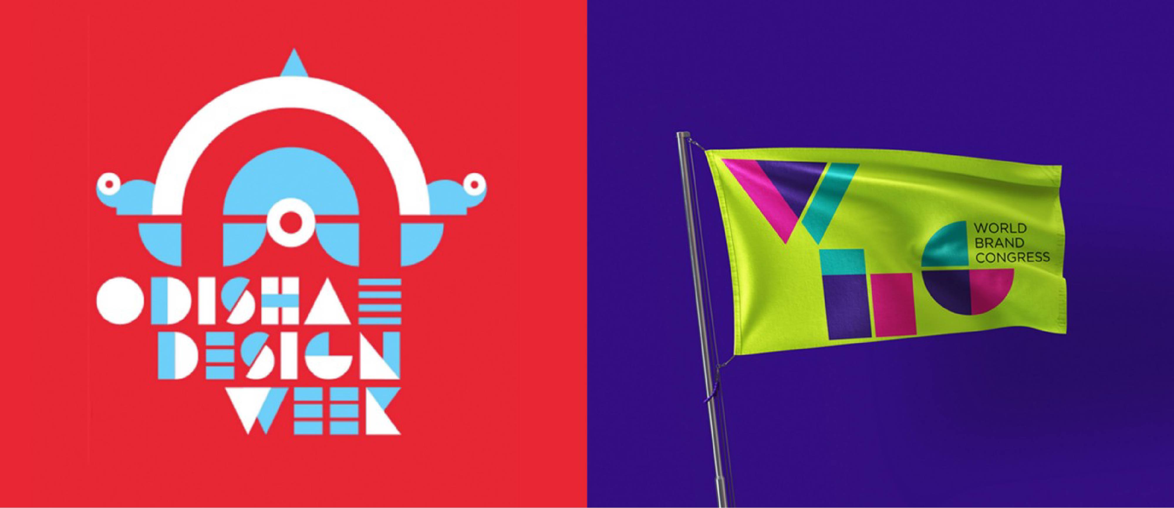 ODW Identity alongside a logotype we had designed in 2010 for the World Brand Congress.
The Odisha Design Week concludes today. And while we couldn’t attend it, we were drawn to its brand identity, launched almost 6 months ago. What drew our eye was initially the similarity it had to a logotype we had designed in 2010 for the World Brand Congress. But on delving deeper, we noticed that design festival identities the world over have been shedding cultural semantics to adopt a spirit of universality. Indian design week identities seem to be following suit.
India has been on a brandwagon of place branding, from Incredible India to the Branded States of India, for over 2 decades. From tourism to investment, competitive federalism is percolating into a growing brand sector. In the context of Design Weeks, city and state-based properties have emerged in Kochi, Hyderabad, Pune, Ahmedabad, and now Odisha. Each slowly attempting to gather momentum and boost state prominence through design equity.
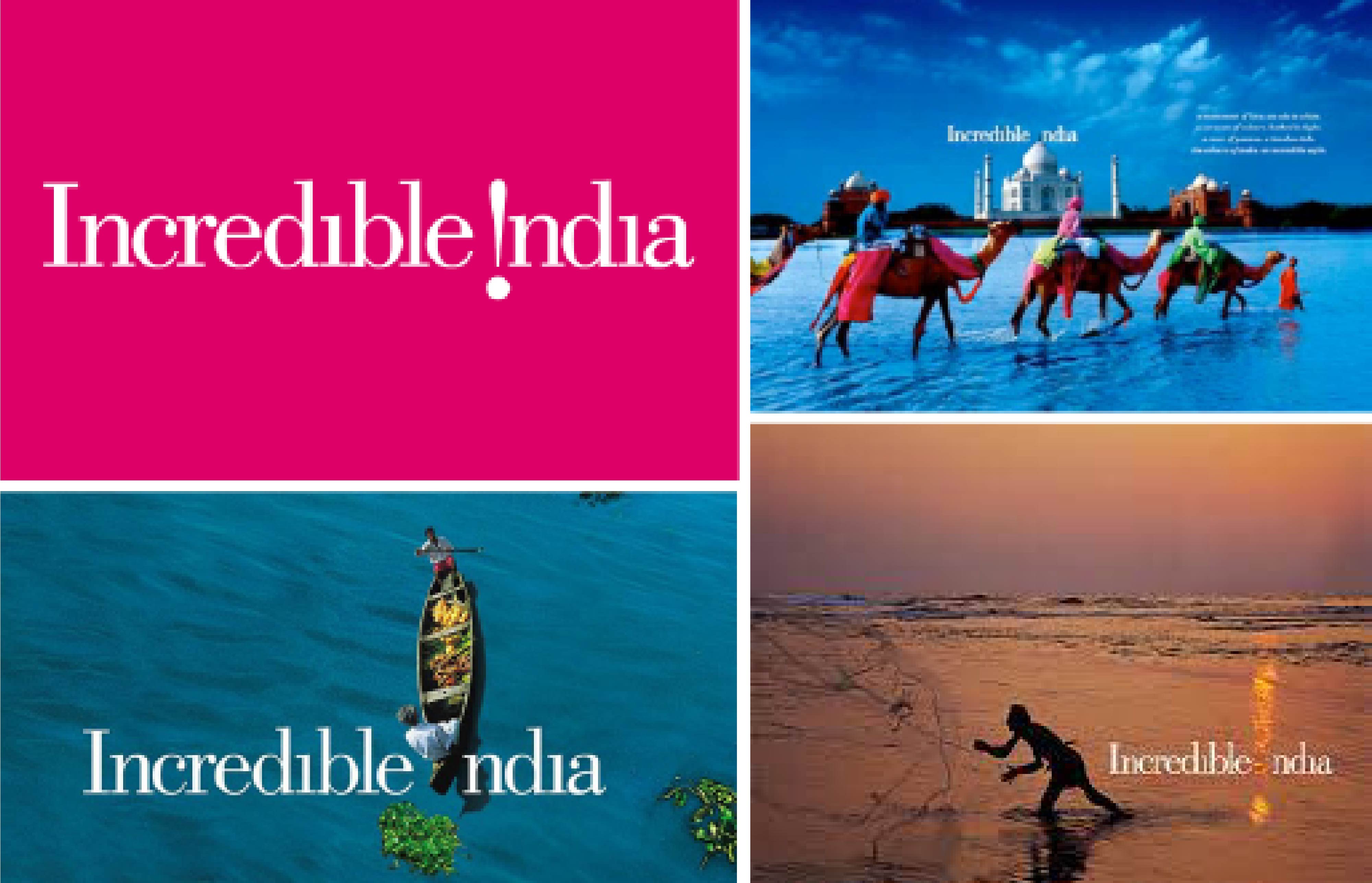 The Legendary Incredible India Identity.
“The semantics of place branding in India began with the tourism brigade. The pioneer, Incredible India, set a high benchmark.”
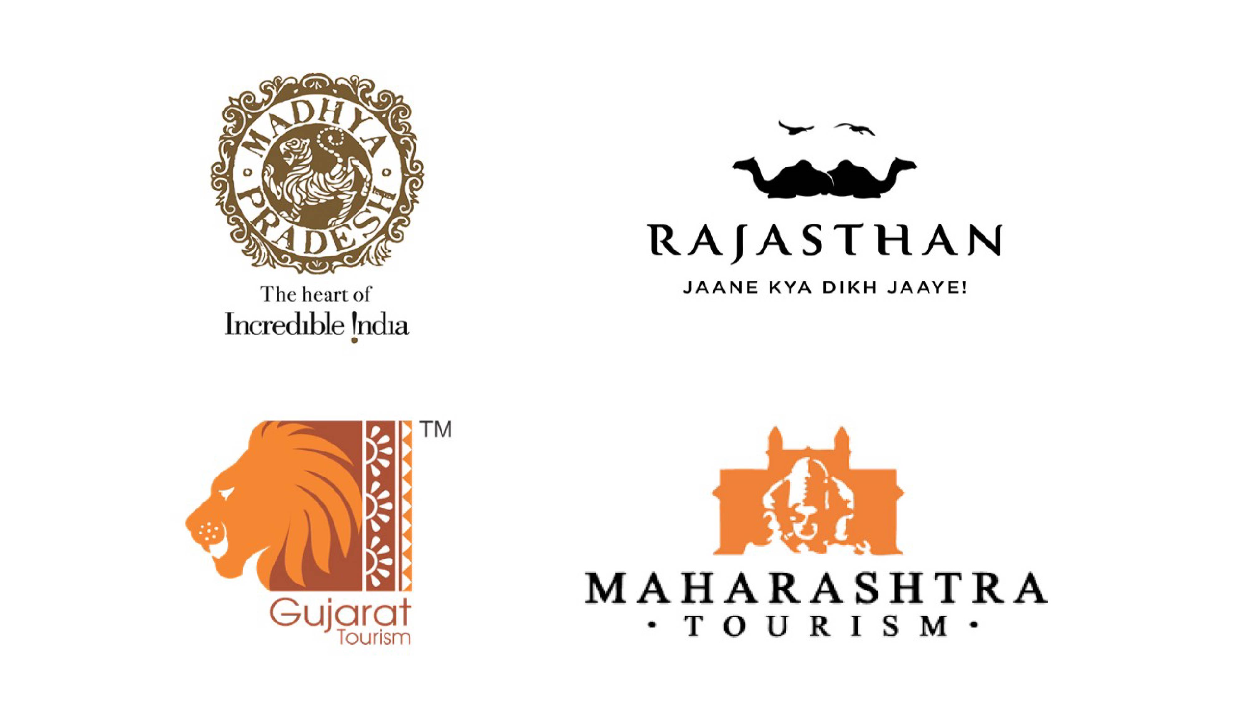 Some State Tourism Identities rooted in culture.
Most of the states following in its footsteps, excelled as well with unique brand narratives and visual metaphors.
They embodied popular icons such as the Lion of Gujarat, Forts of Maharashtra, Tiger of Madhya Pradesh and the Sea for Kerala. Each is beautifully rooted in cultural specificity.
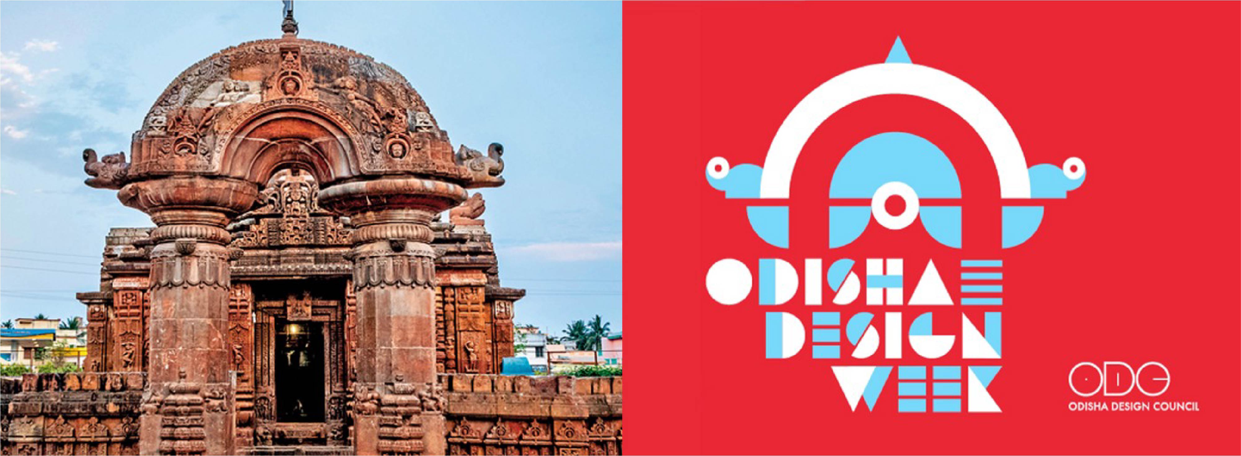
“Unfortunately, Design Week logos looked outward rather than inward to create identities that seem place-less. And Odisha Design Week (ODW) is a fine example of this.”
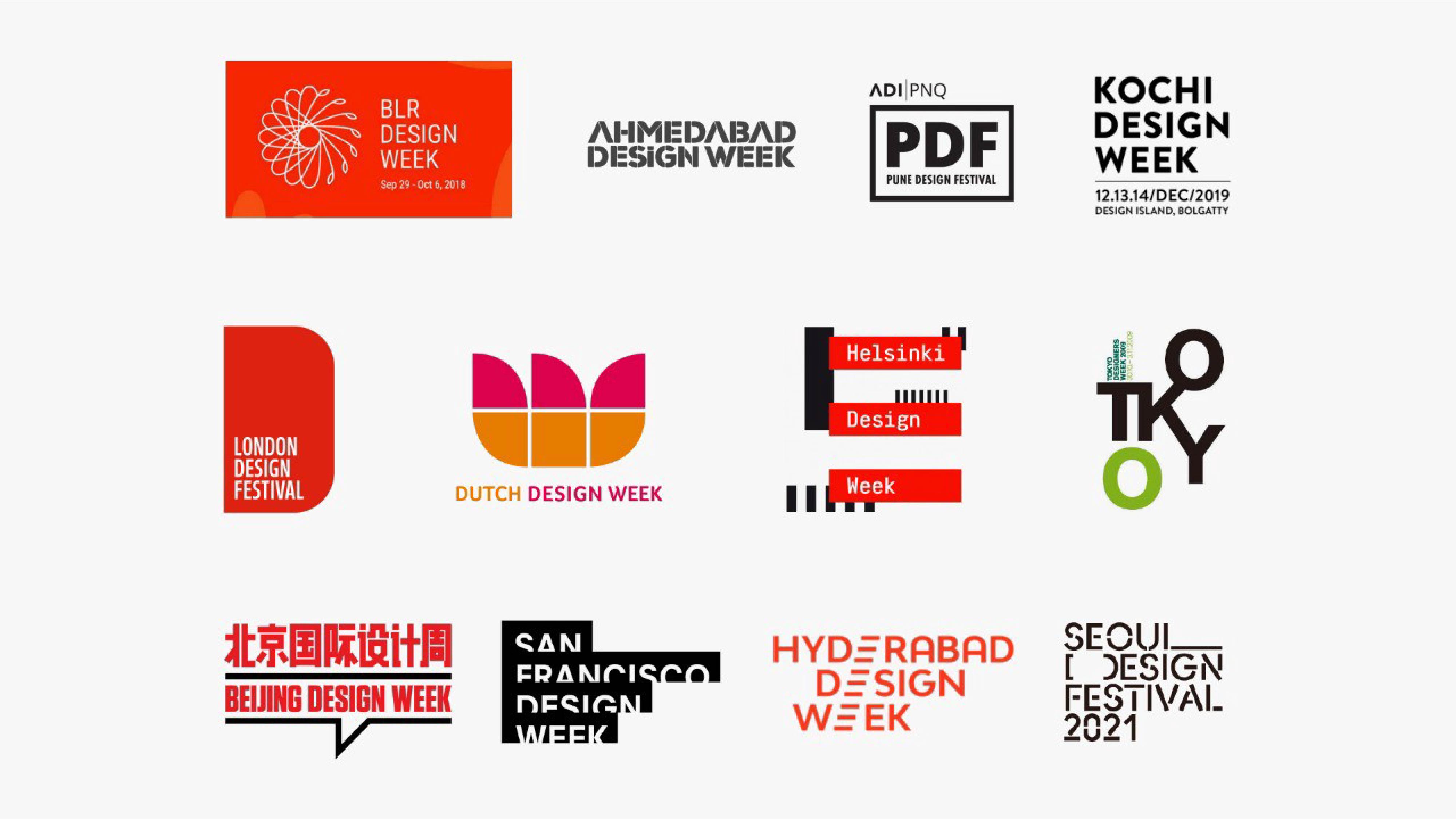 The sea of sameness in Indian and Global Design Week identities.
Culture is the heartbeat that binds communities with shared histories and traditions. Rooted to the land and the hearts of the people that belong to it. Sometimes remembered, sometimes forgotten. Odisha is such a land. Rich in culture, from art and architecture to craftsmanship and cuisine. With a history spanning millennia, a land mentioned in the Mahabharata, its capital is the home of 1000 temples. ODW is seemingly inspired by this temple heritage and uses the shape of the Torana or the arched gateway of the famous Mukteswara Temple. A 10th-century monument located in Bhubaneswar.
 The inspiration diluted.
There is no doubt that this unique architectural design offers itself as a great base to build a logo unit upon. But the chosen rendition not only dilutes the iconic arch but further kills it with an overall look and feel that is reminiscent of a soulless corporate event, defined by the lazy tools typically used by startups.
 Cacophony of the uncultured.
“Free flowing stock icons, meaningless circles and triangles, and an out-of-context logotype that is unnecessarily futuristic and cacaphonic.”
All of it is painted in jarring primary colors that feel too hot and too cold, leaving no room to touch the soul or evoke the sublime. For a design week that, we imagine, hopes to bring the beauty of a glorious land to the fore, its identity falls flat.
Mario Vignelli, the design legend said it best, ‘brand identities become part of our shared history and are an integral part of our culture’. Thus the ODW logo should have been as unique as its rich culture and charted a path missed by the other design week identities. To inspire, influence, and create new opportunities that could be truly Odishaah!
“Kalinga will have to remain buried and forgotten for some time more.”
In the meanwhile, we can ponder over the philosophies of luminaries such as Kōhei Sugiura, who kept pushing designers to look into their own cultures for inspiration and be sparked by a more spiritual, dynamic, and interpretive approach to design. One that is not continuously looking to the east or west, but inward. As captured in this beautiful quote:
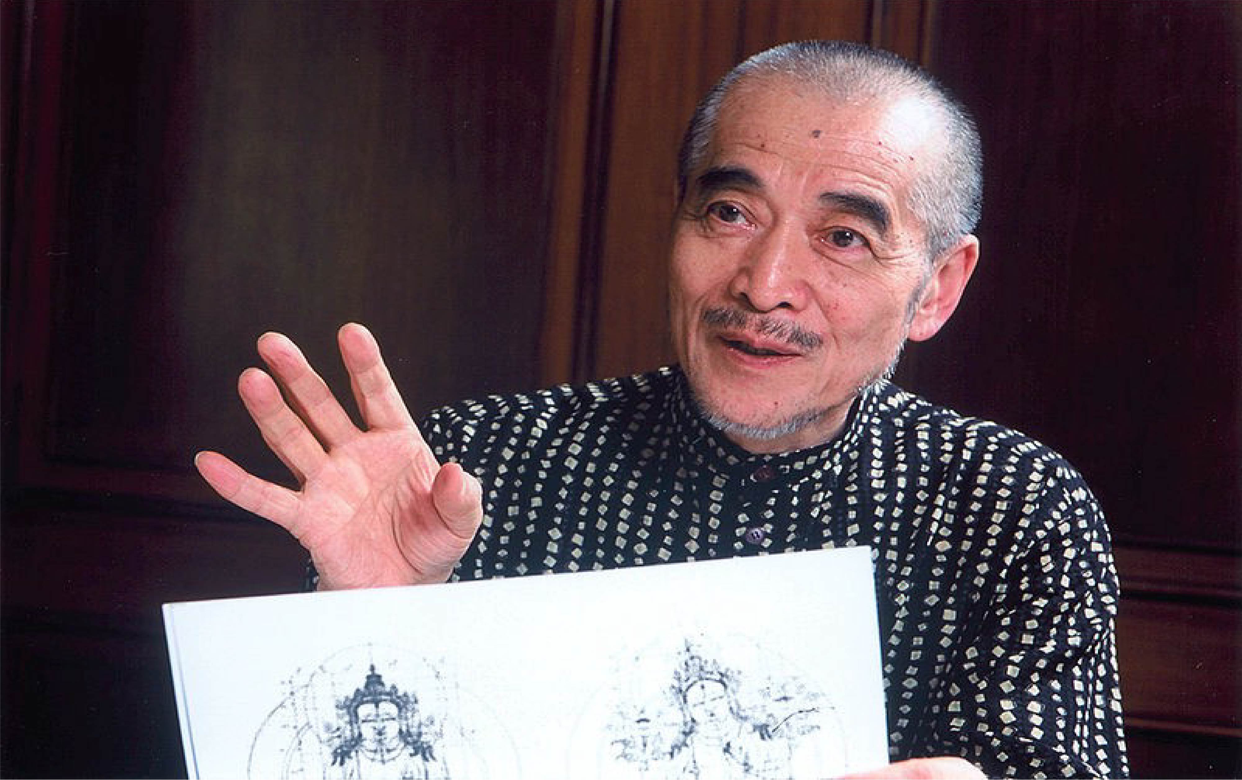 Sugiura Kōhei, is a Japanese graphic designer and researcher in Asian iconography.
“Human beings stand on the ground and walk with two legs. One leg steps forward. To continuously move forward, to grow and develop, is what we all hope for. That is the role of the front leg.
However, we have two legs. There is the back leg as well. If the back leg is not planted firmly on the ground it won’t provide the strength the front leg needs to move forward. It is only when both legs move alternately, in a joint effort, that we are able to advance.
What is the back leg? What does it mean to step firmly on the ground? The ground, of course, is our heritage of history and civilization. By planting one leg on this vast accumulation of wisdom and knowledge, we enable our other leg to move forward. Our two legs and their movement — the front leg advancing civilization, the back leg standing on history and tradition — teach us how to live in the present.”
Let’s start a conversation.
For business enquiries:
eamonn@twodesign.co.in+91 98676 54952