
Brand
Wakency
Wakency
Industry
New Ventures
Gig Economy
Recruitment Tech
New Ventures
Gig Economy
Recruitment Tech
Region
India
India
Key Services
Brand Strategy
Verbal Identity
Brand Identity
Communication
Environment
Brand Guideline
Brand Strategy
Verbal Identity
Brand Identity
Communication
Environment
Brand Guideline
Waking up the world to the future of work.
Datamatics, one of India’s largest technology service providers, was founded by Lalit Kanodia, who played an instrumental role in establishing Tata Consultancy Services (TCS) in 1967. Looking to craft their first direct-to-consumer platform, they were embarking on an ambitious road. The goal; provide impetus to the projected growth of the temporary staffing or gig economy in India. Attempting to create the Uber of jobs.
We worked together with these visionaries to craft a category creating brand that transcends traditional B2B/B2C audience boundaries with a holistic visual and communication design system.
We worked together with these visionaries to craft a category creating brand that transcends traditional B2B/B2C audience boundaries with a holistic visual and communication design system.
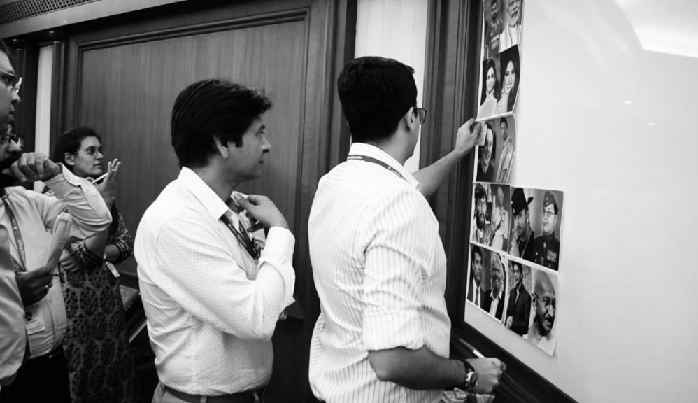
Understanding every facet
Independent surveys by reputed firms suggested that the temporary staffing sector in India would grow 74% in four years to reach $5.3 billion (KPMG, 2017). This was based on the gig economy seeing a tremendous uptake globally, particularly in the U.S. where one in three workers are freelancers.
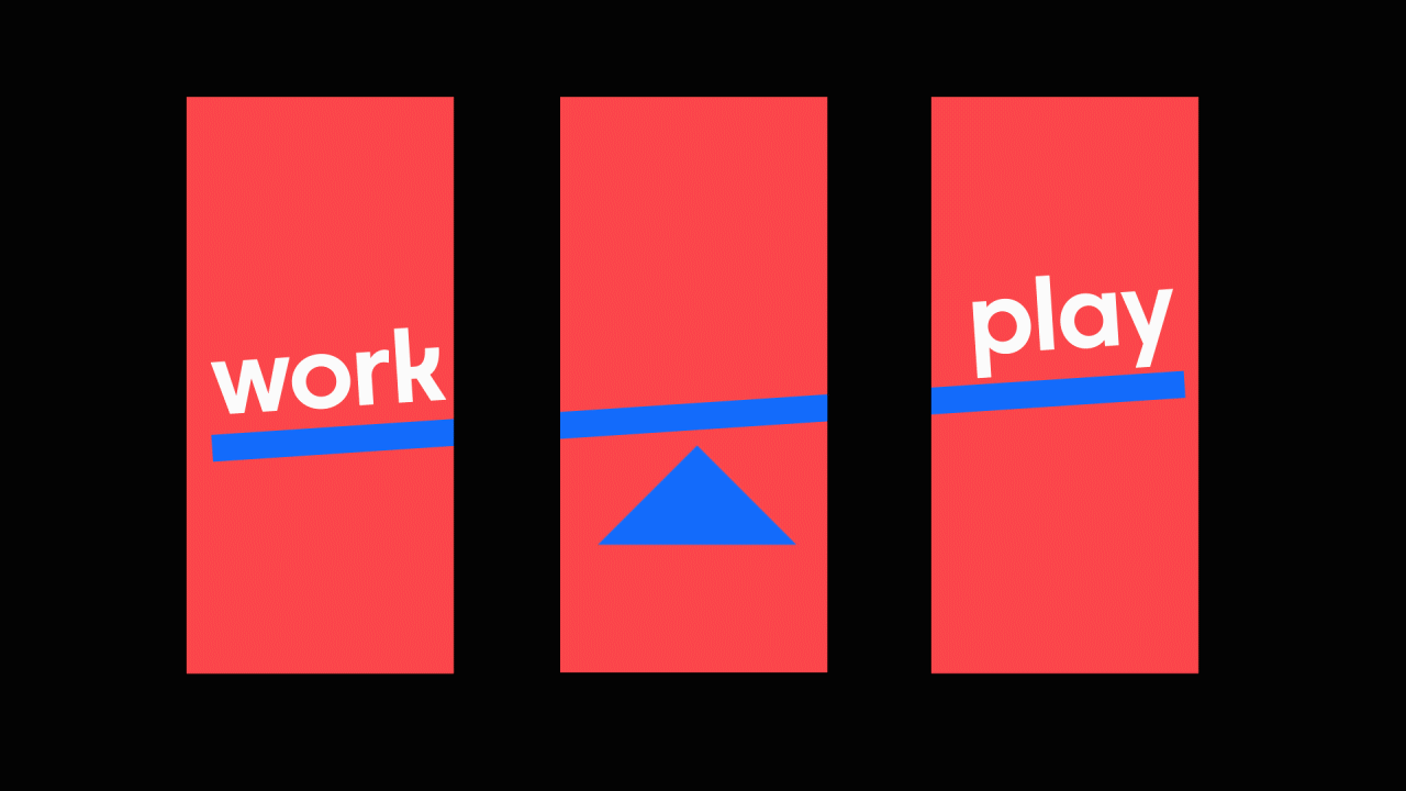
Datamatics were hoping to leverage first-to-market benefits by crafting an offering that would use proprietary technology to easily connect gig workers with potential employers. We researched the marketplace and interviewed millennials, both domestically and internationally, to understand their changing behaviour towards work. Sifting through the data we uncovered a growing need for flexibility, a desire to establish a work-life balance, but also a fear of the inconsistency that comes with this lifestyle.
Independent surveys by reputed firms suggested that the temporary staffing sector in India would grow 74% in four years to reach $5.3 billion (KPMG, 2017). This was based on the gig economy seeing a tremendous uptake globally, particularly in the U.S. where one in three workers are freelancers.
Datamatics were hoping to leverage first-to-market benefits by crafting an offering that would use proprietary technology to easily connect gig workers with potential employers. We researched the marketplace and interviewed millennials, both domestically and internationally, to understand their changing behaviour towards work. Sifting through the data we uncovered a growing need for flexibility, a desire to establish a work-life balance, but also a fear of the inconsistency that comes with this lifestyle.
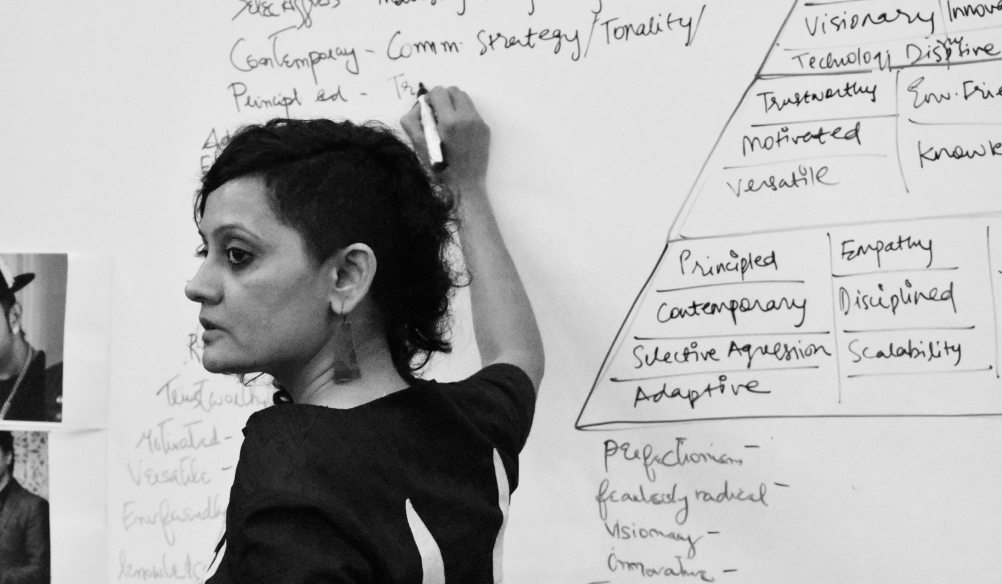
Refining the sketch
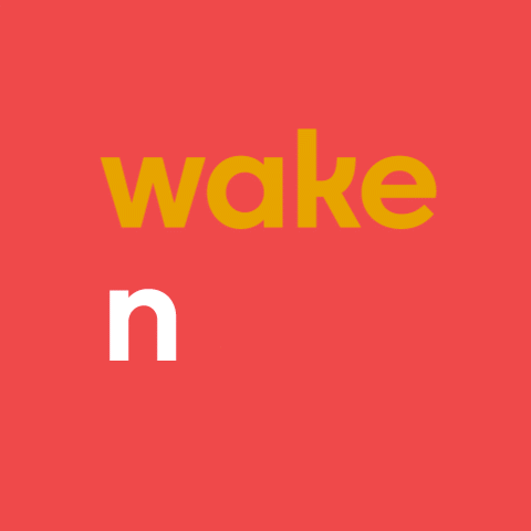
The brand name needed to be empowering. One that would assuage the fears of the target audience while at the same time inspiring them to achieve their dreams. To wake up and seize the opportunities that come their way.
The name ‘wakency’ is a portmanteau of ‘wake up and see’. Embodying the soul of the brand's purpose and its desire to inspire people to live life on their own terms from the moment they wake up.
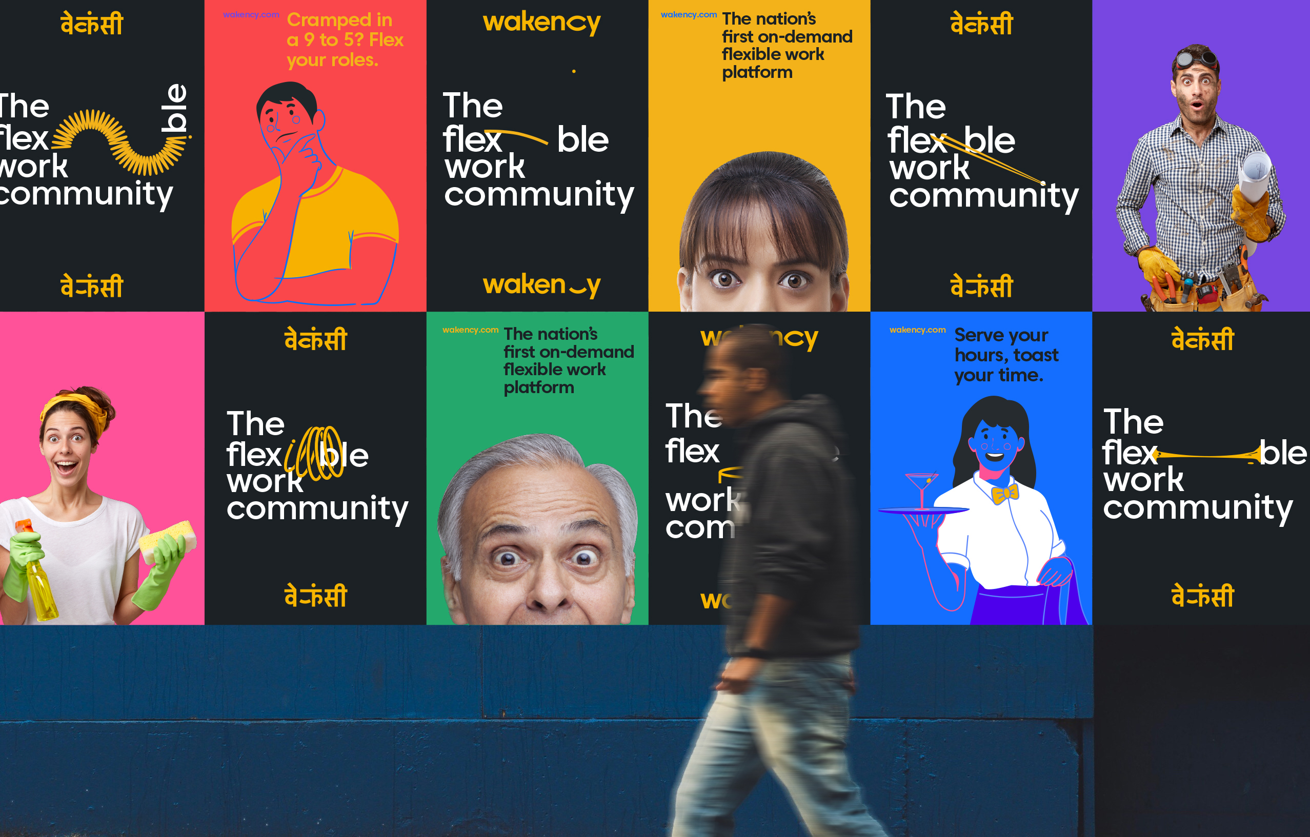
The final piece
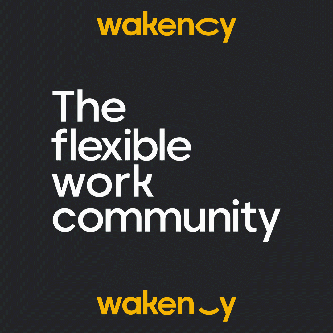
Everyday is a new opportunity. Wakency is a wake up call to be this change as part of an inspired holistic community that embraces flexible work opportunities.
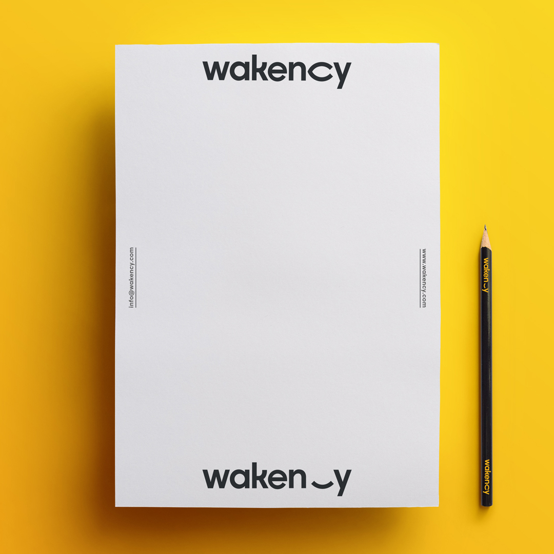
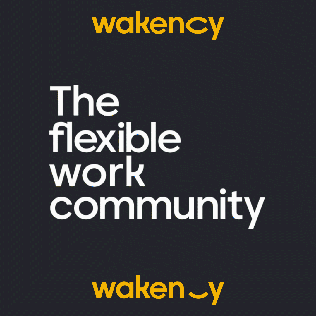
Our logo type embodies this moment of awareness with our signature blinking eye. Like a new sunrise, it is inviting, spontaneous and accepts change. It represents infinite possibilities and clearly states our brand’s promise. A place that offers opportunities every time you open your eyes to see what the world has to offer.
The devanagari logotype carries forward the blinking eye, making it an integral part of our communciation
Everyday is a new opportunity. Wakency is a wake up call to be this change as part of an inspired holistic community that embraces flexible work opportunities.
Our logo type embodies this moment of awareness with our signature blinking eye. Like a new sunrise, it is inviting, spontaneous and accepts change. It represents infinite possibilities and clearly states our brand’s promise. A place that offers opportunities every time you open your eyes to see what the world has to offer.
The devanagari logotype carries forward the blinking eye, making it an integral part of our communciation
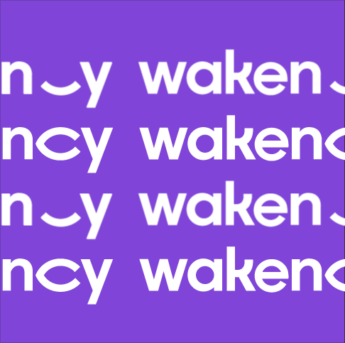

Every blink, brings to life new opportunities
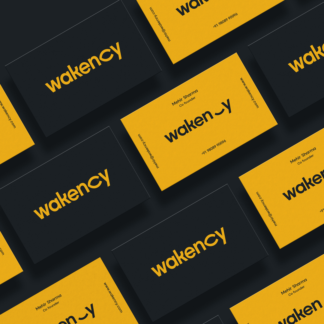
The blinking dynamic logographic device represents the moment of awareness that we aim to engender. It was crafted to become the brand’s calling card across multiple touchpoints.
The blinking dynamic logographic device represents the moment of awareness that we aim to engender. It was crafted to become the brand’s calling card across multiple touchpoints.
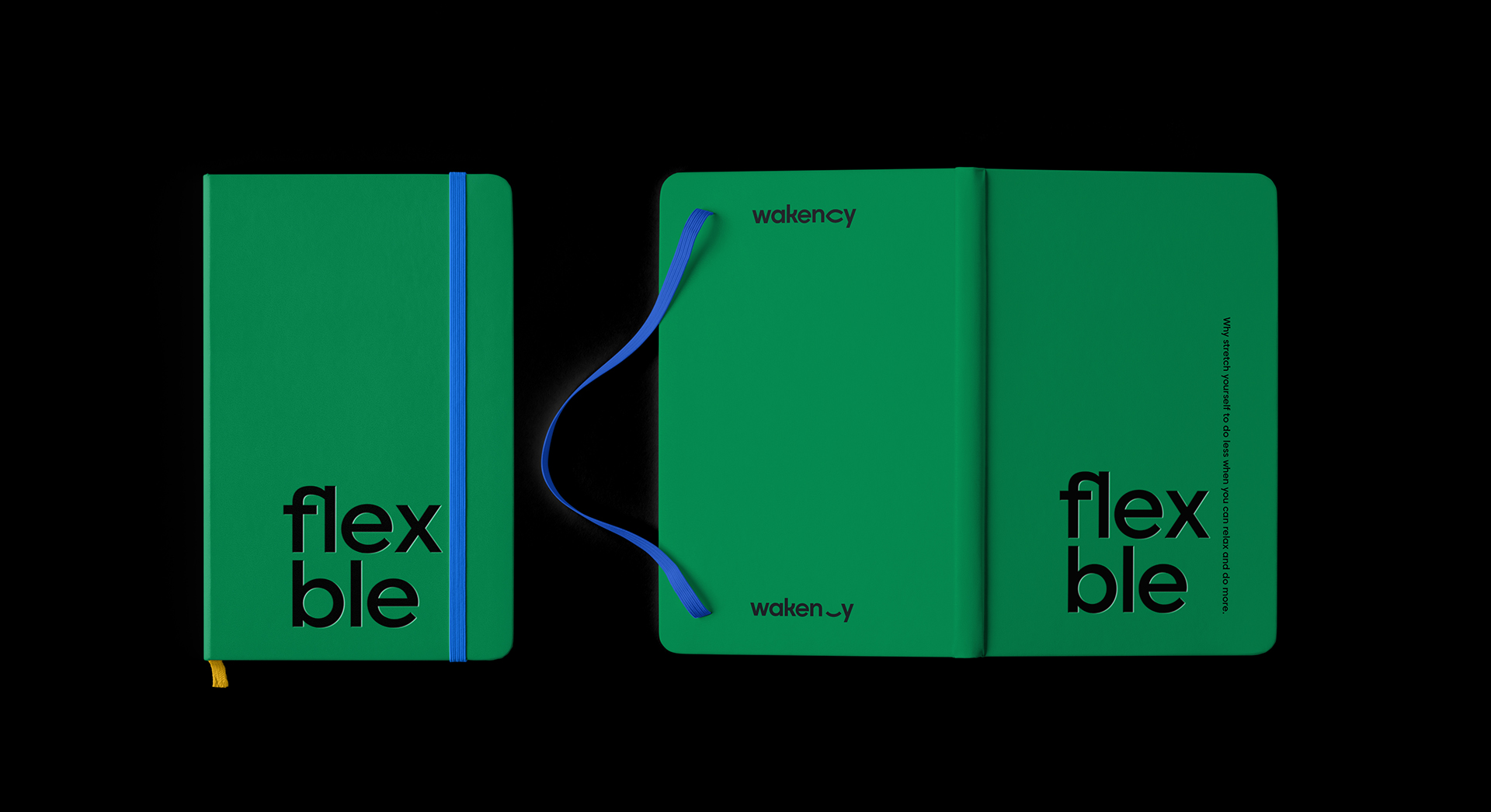
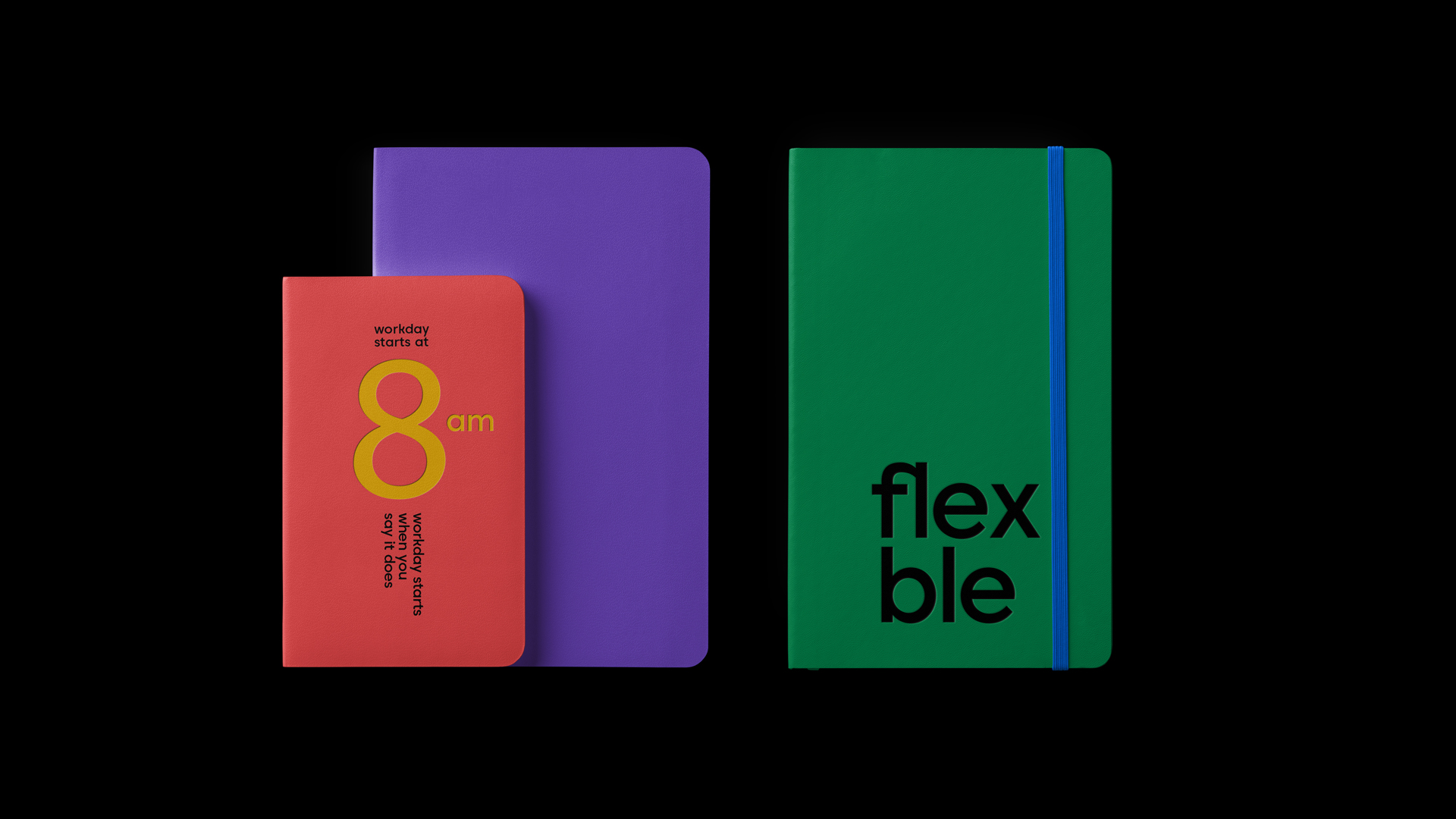
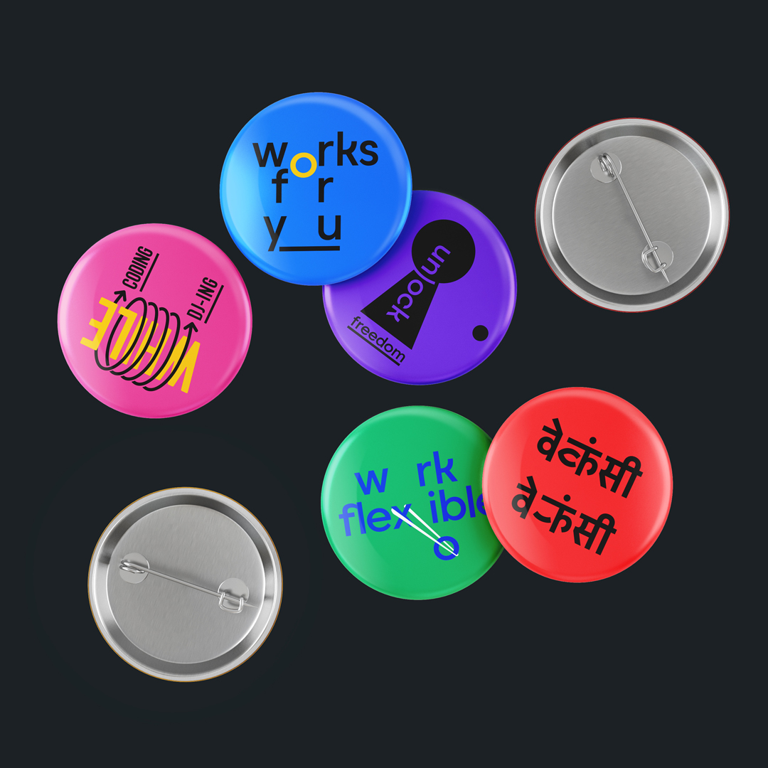

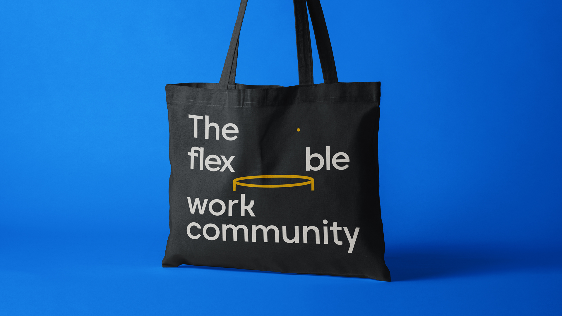
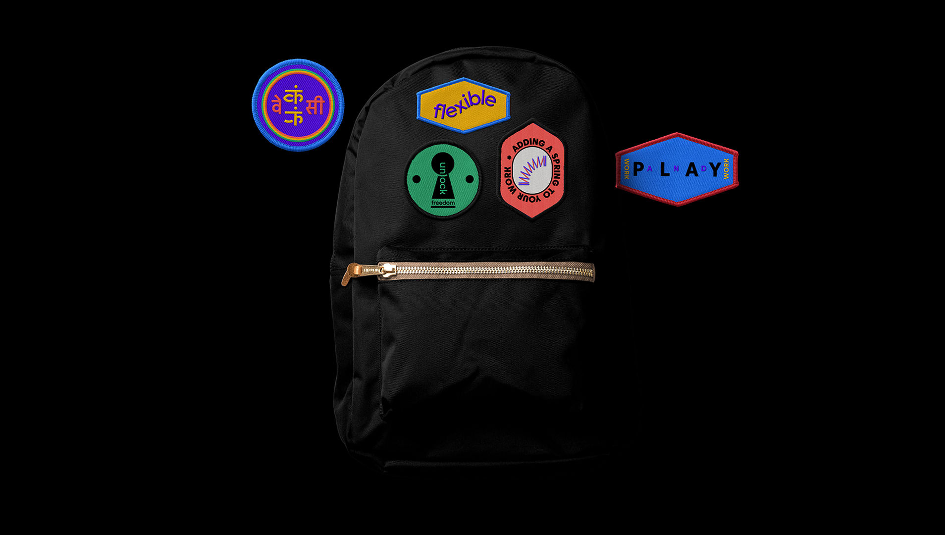

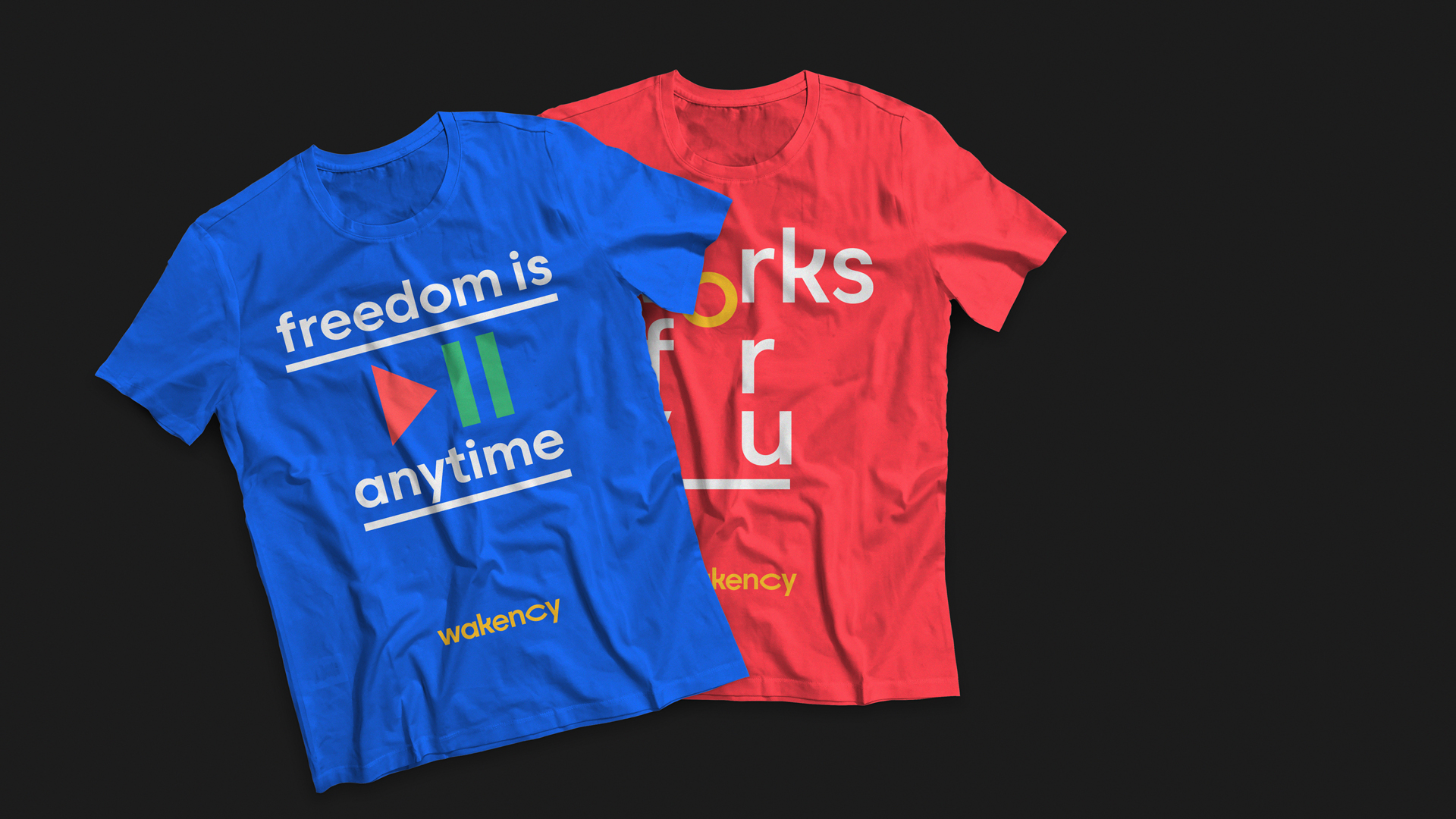


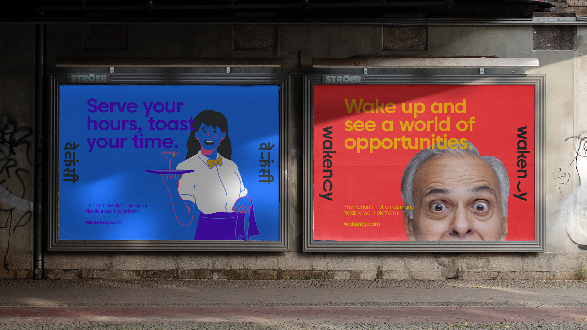
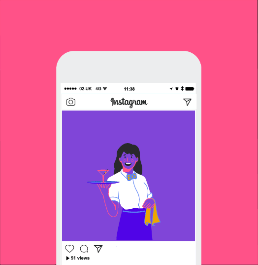
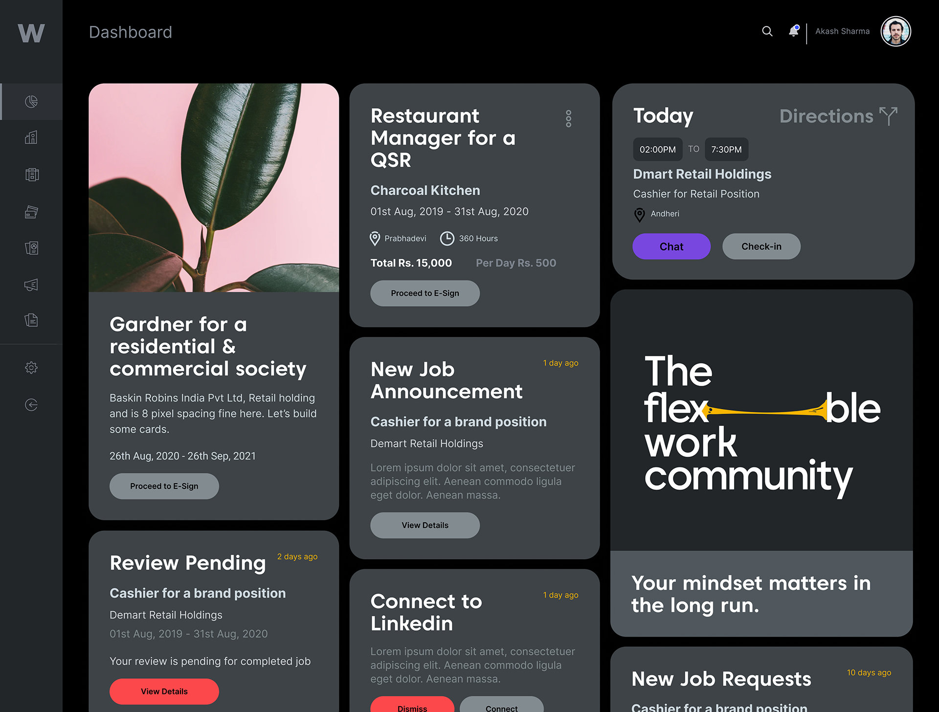
A design system so flexible, it’s fun
The design system is a dynamic enabler to scale the brand with consistency, yet allow future creators to express their ideas in myriad ways.
The design system is a dynamic enabler to scale the brand with consistency, yet allow future creators to express their ideas in myriad ways.
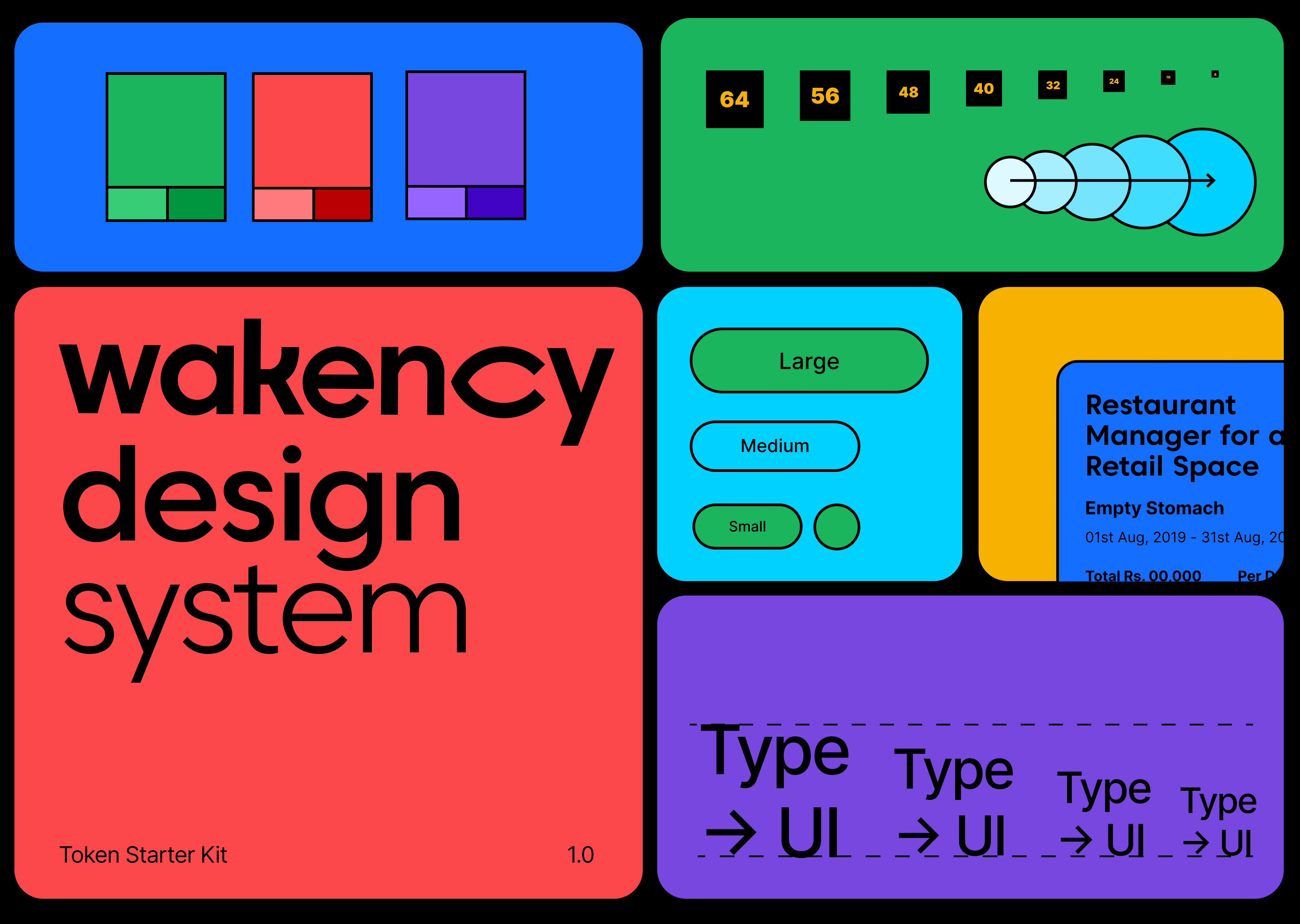
An eye for details and the future
We crafted an iconography system that was built around the motif of our blinking eye. The initial system of icons also came with clear instructions on how new icons could be constructed. This was extremely important as the brand aimed to expand its reach into new businesses and opportunities.
We crafted an iconography system that was built around the motif of our blinking eye. The initial system of icons also came with clear instructions on how new icons could be constructed. This was extremely important as the brand aimed to expand its reach into new businesses and opportunities.
Digital Brand Guideline
Let’s start a conversation.
For business enquiries:
eamonn@twodesign.co.in+91 98676 54952