
Brand
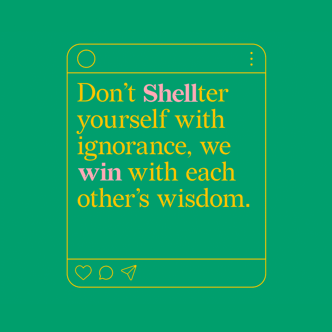
Shell win
Shell win
Industry
Health & Wellbeing
Health & Wellbeing
Region
India
India
Key Services
Brand Strategy, Brand Identity,
Service Design, Digital Communication, Bespoke Font, Illustration, Social Media Management
Brand Strategy, Brand Identity,
Service Design, Digital Communication, Bespoke Font, Illustration, Social Media Management
Awards
India’s Best Design Award 2022
- India’s Best Design Award -
India’s Best Design Award 2022
- India’s Best Design Award -
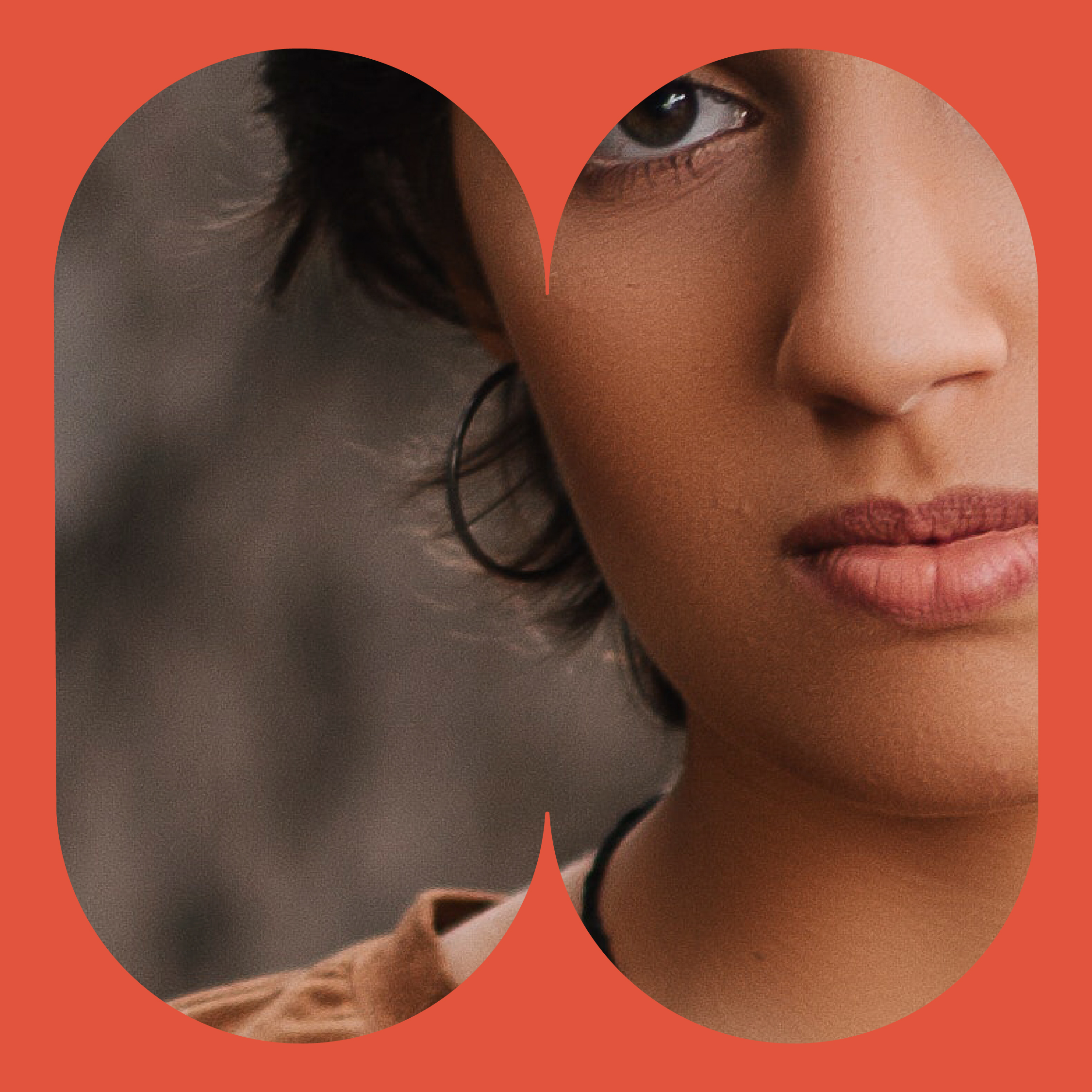
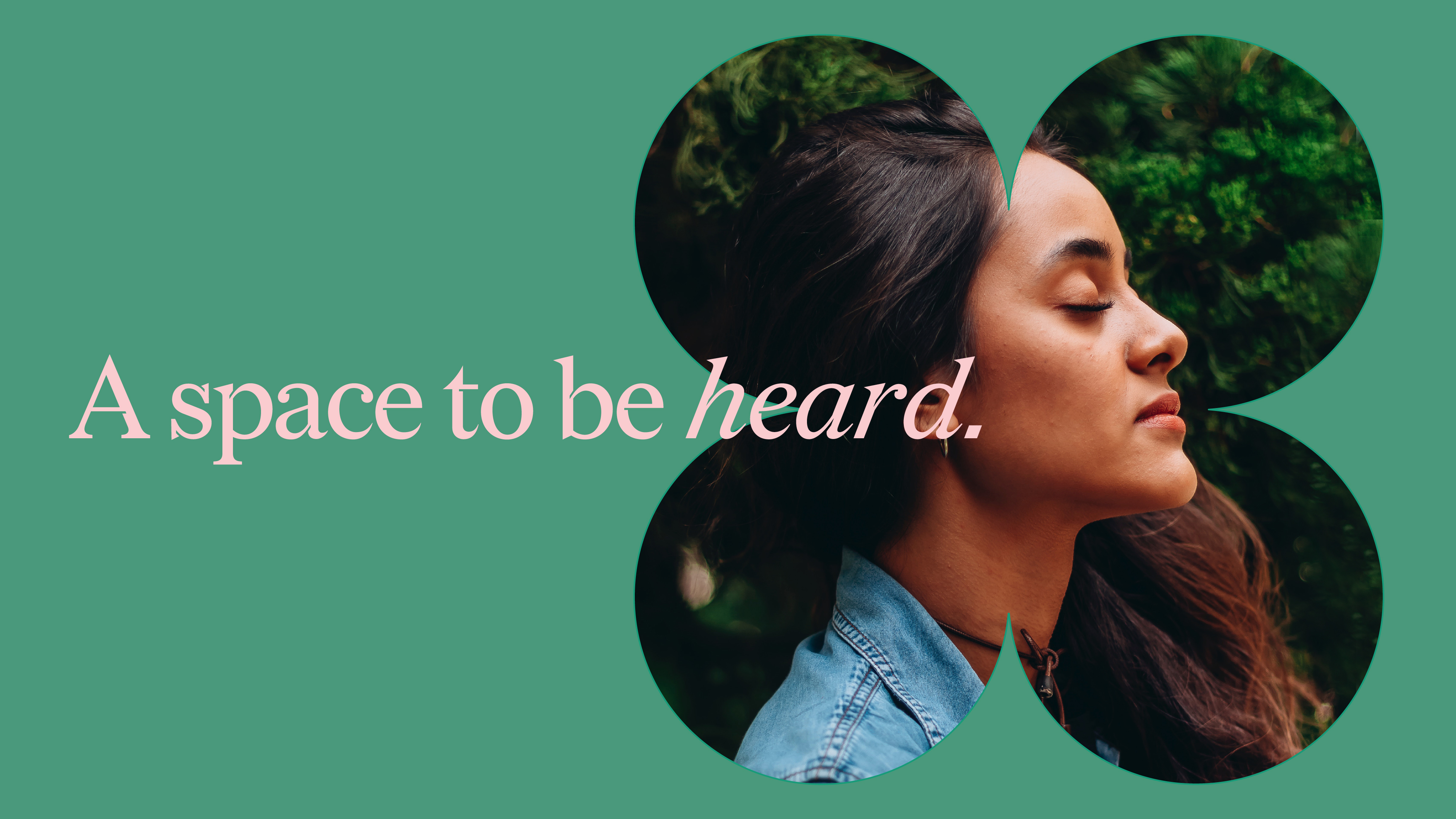
Designing a community for breast cancer support
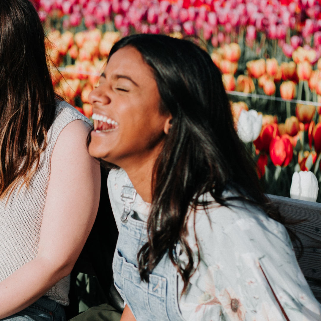
Shell win is a family run breast cancer foundation, in Agra, India. Named in memory of their daughter, Shelly, they aim to create awareness and offer support for early detection, prevention and care. The family needed a digital first, social media focused branding, to build national outreach and establish first contact with potential members, targeting an urban audience aged 24-45.
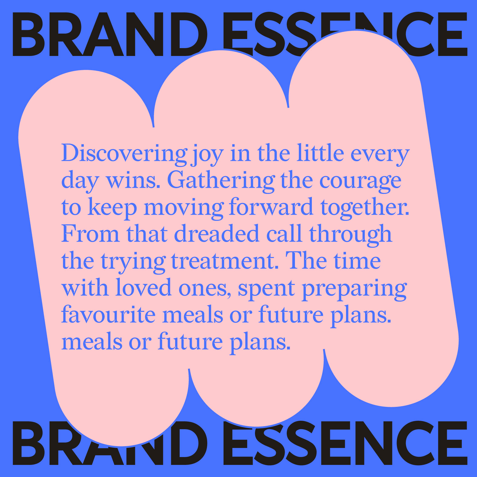
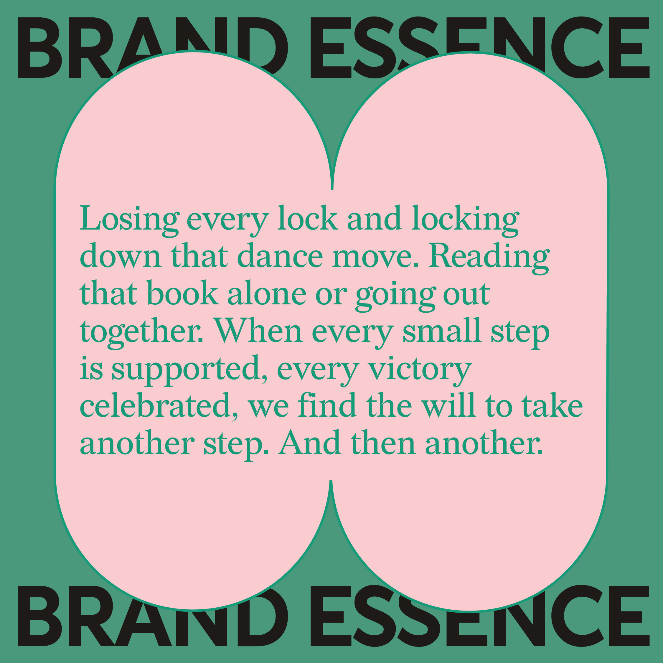
An initiative close to our hearts, we have designed the brand as a service that focuses on rallying a strong community of affected families. The identity is crafted as an all encompassing conversational system that eloquently acts as the brand narrative. Compassionate and courageous, insightful and lighthearted, Shell win has become a truly one-of-a-kind cancer support community in India that has been recognised globally.
An initiative close to our hearts, we have designed the brand as a service that focuses on rallying a strong community of affected families. The identity is crafted as an all encompassing conversational system that eloquently acts as the brand narrative. Compassionate and courageous, insightful and lighthearted, Shell win has become a truly one-of-a-kind cancer support community in India that has been recognised globally.
Understanding Every Facet
Breast cancer is the most common cancer affecting women in India. While it is the most treatable, a majority of cases present only in the latter stages and the affected age group is getting younger, with some as young as 25. Lack of awareness, coupled with inadequate support systems makes the journey extremely traumatic for patients and families. Overabundant medical avenues and conflicting communication are overwhelming and confusing. Across socio-economic sections, misinformation, social taboos, emotional triggers, and psychological challenges abound. Collectively causing a devastating effect on the journey before, during and after treatment.
We gleaned the brand’s insight from those affected by breast cancer, who need a supporting space where they can simply be. To be heard if they feel like, participate when they want to and partake in everything that provides them a sense of normalcy.
Refining the Sketch
Available research shows that greater support from a community or social networks, improves quality of life for patients. Advice must come from those who truly understand the journey. Our conversations with families revealed that the treatment process, from diagnosis to remission, is in itself more debilitating than the disease. Affecting not just the patients but their families too. This insight led to a fundamental shift in the proposition. Transitioning from only offering free medical services and financial assistance, we envisioned the brand as a safe space. A community of support for affected families, by affected families that encourages intimate, honest conversations.
This insight fit perfectly with the family’s vision, as it captured Shelly’s own belief and brave approach during her decade long battle with cancer. Her journey further inspired us to imbue the brand with a ‘win’ing spirit.
The final piece
The brand name is inspirational and effortlessly captures the winning spirit. We envisioned a conversational identity, to carry this spirit forward in every brand interaction. The phonetic essence of Shell and win works in unison with our messaging, to inject a sense of upliftment into every conversation.
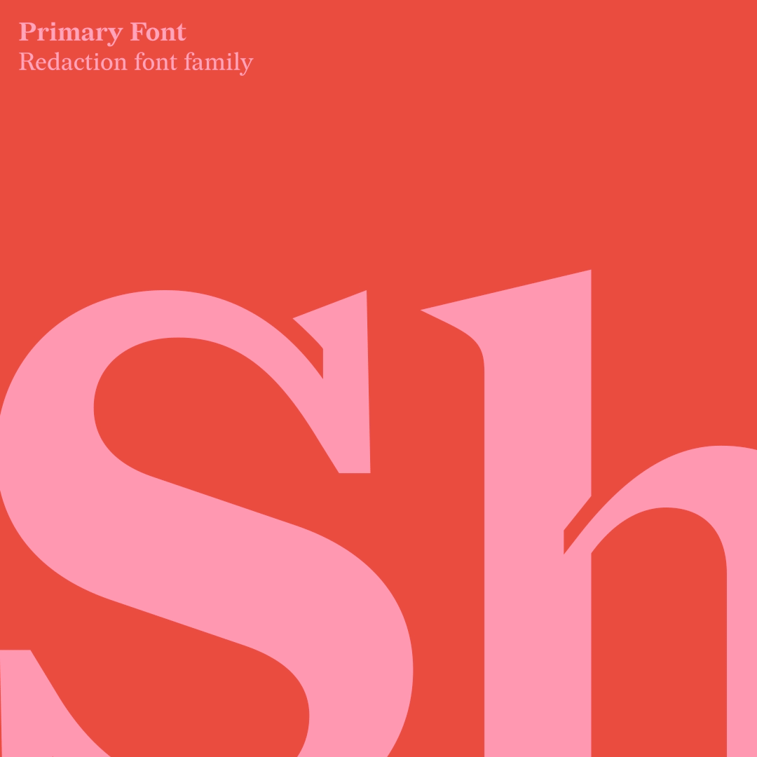
The serif font for the logo was chosen as an ideal embodiment to narrate heartwarming stories. The ink trap detailing is inviting for open and safe conversations. Flexible to integrate into all communications, it builds comfort and reliability.
And informs the key typography style for most of the brands communication templates.
The brand name is inspirational and effortlessly captures the winning spirit. We envisioned a conversational identity, to carry this spirit forward in every brand interaction. The phonetic essence of Shell and win works in unison with our messaging, to inject a sense of upliftment into every conversation.
The serif font for the logo was chosen as an ideal embodiment to narrate heartwarming stories. The ink trap detailing is inviting for open and safe conversations. Flexible to integrate into all communications, it builds comfort and reliability.
And informs the key typography style for most of the brands communication templates.

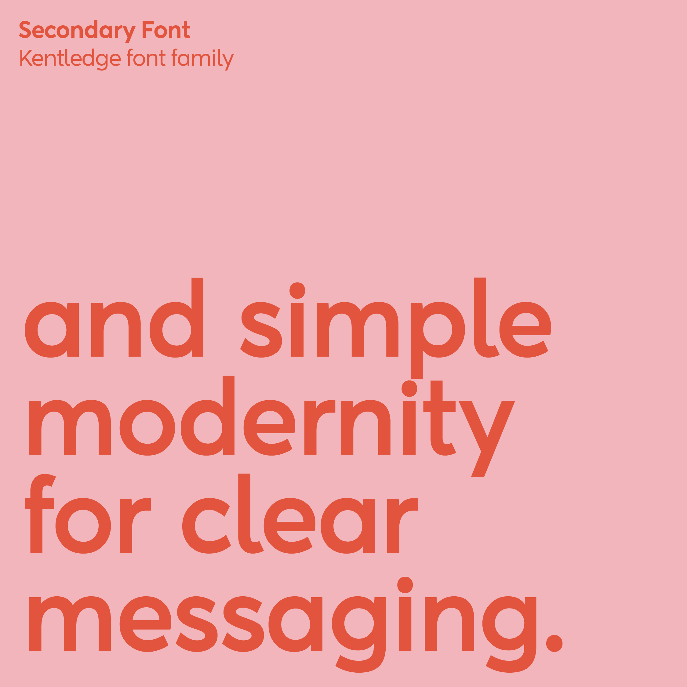
The type palette
The primary typeface comprises the logotype family and is used as the critical communication device. The san serif secondary font compliments with titles, sub headers and as a supporting device.
The primary typeface comprises the logotype family and is used as the critical communication device. The san serif secondary font compliments with titles, sub headers and as a supporting device.

A new type of acceptance
Our bespoke font creation hopes to normalise the changes that come with breast cancer. Rounded and wholesome, it is characterised to be soft, caring, and accepting - in scars visible or invisible. Every alphabet exemplifies the idea of loving yourself, no matter your shape or social expectations.
Our bespoke font creation hopes to normalise the changes that come with breast cancer. Rounded and wholesome, it is characterised to be soft, caring, and accepting - in scars visible or invisible. Every alphabet exemplifies the idea of loving yourself, no matter your shape or social expectations.

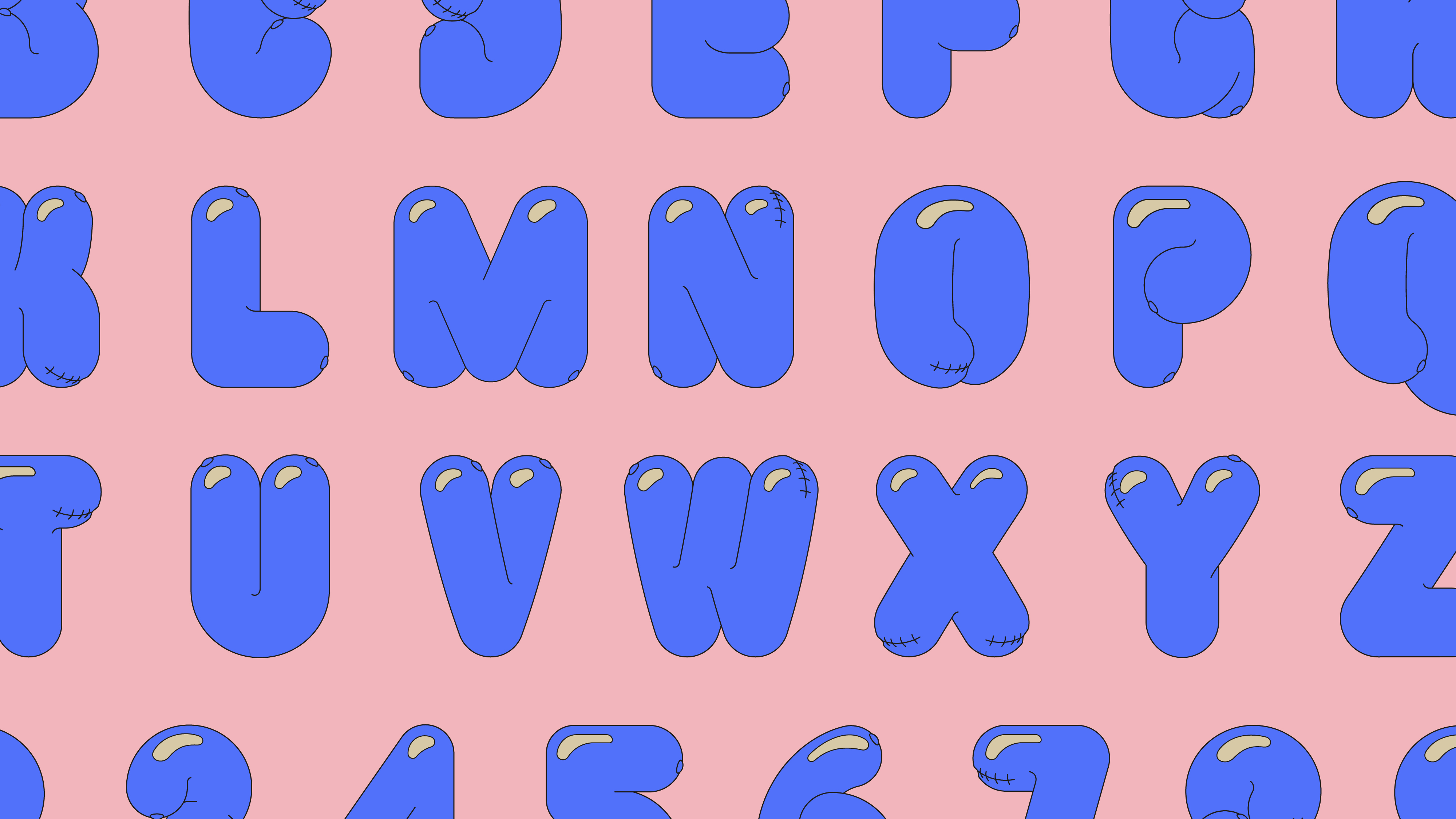


The font acts as a typographic visual. It is used to craft visually powerful and verbally insightful messages. The letters of our bespoke font are used to accentuate a message. Evoking a sense of innocent joy.
Reimagining the colours of breast cancer
The brand is designed to bring more positivity, energy and joy in its community. While the primary colours take their inspiration from the shade of the breast cancer ribbon. The secondary colours accommodate the familiarity of the pink while complimenting by adding vibrancy and cheerfulness. Helping the brand bring difficult conversations to the fore.
The brand is designed to bring more positivity, energy and joy in its community. While the primary colours take their inspiration from the shade of the breast cancer ribbon. The secondary colours accommodate the familiarity of the pink while complimenting by adding vibrancy and cheerfulness. Helping the brand bring difficult conversations to the fore.

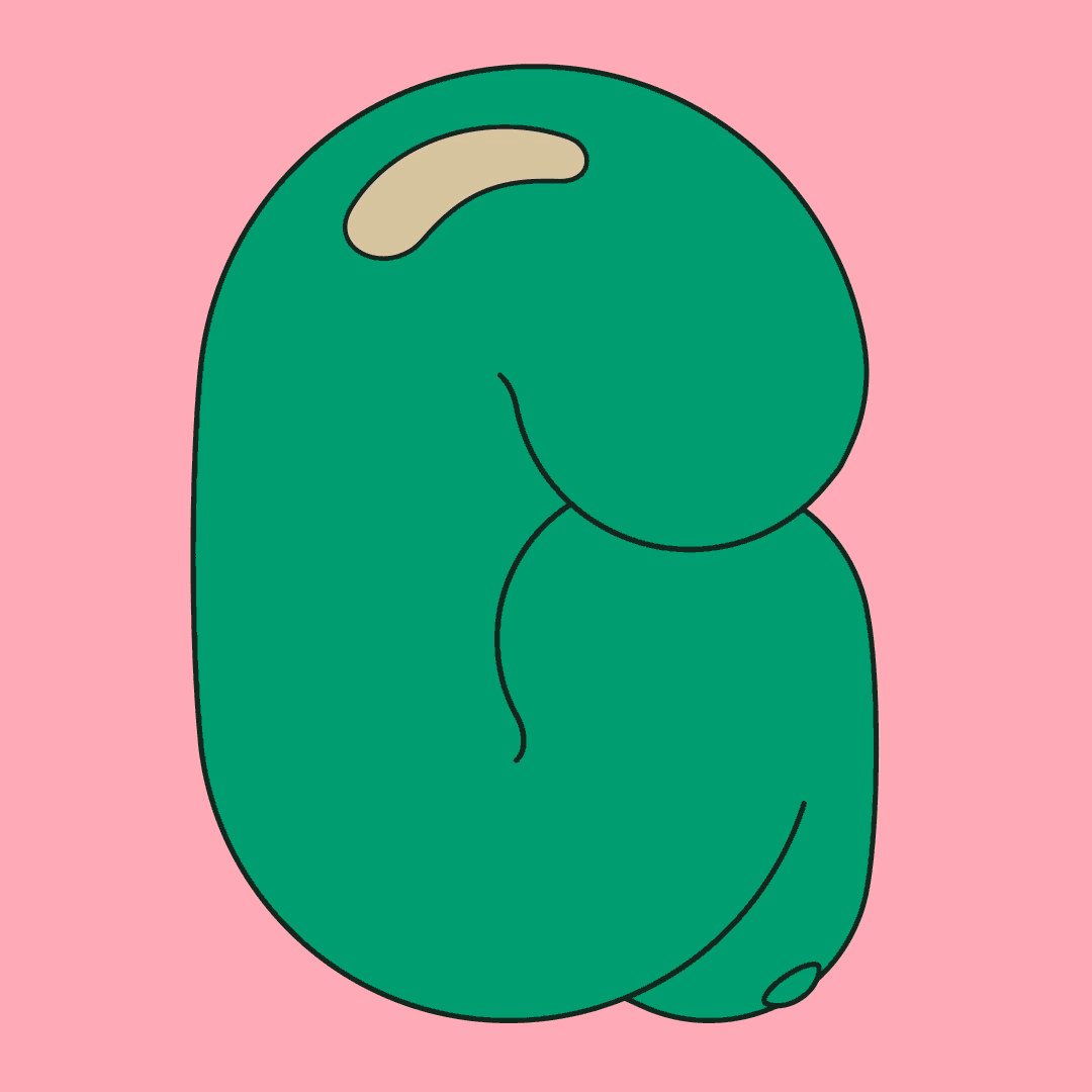
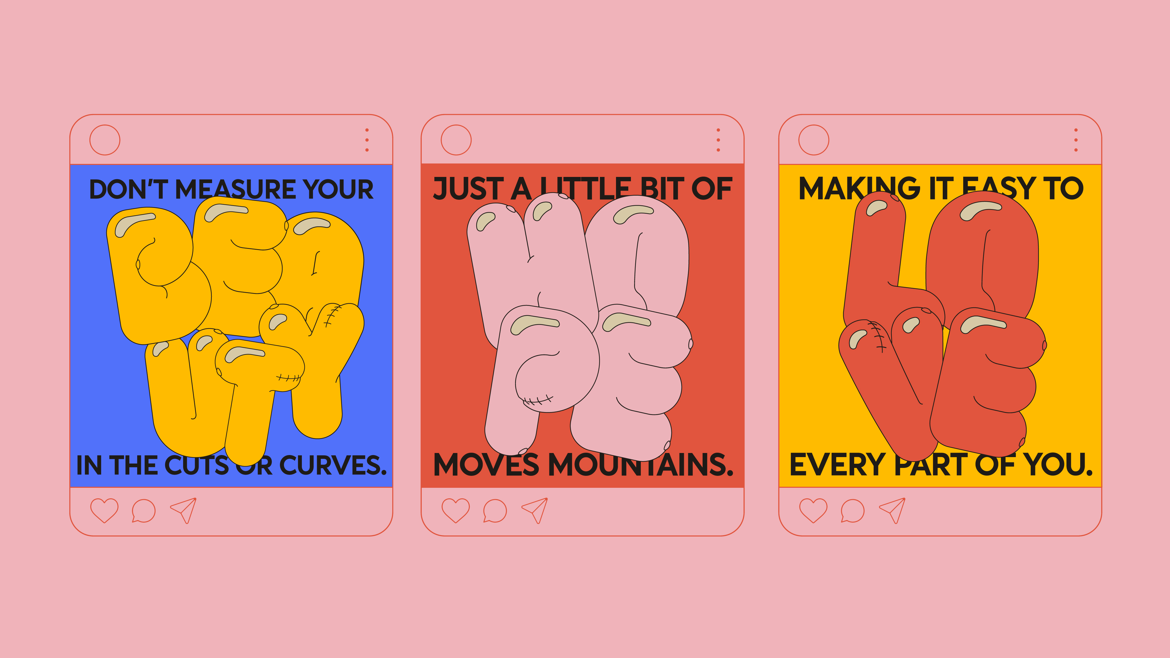
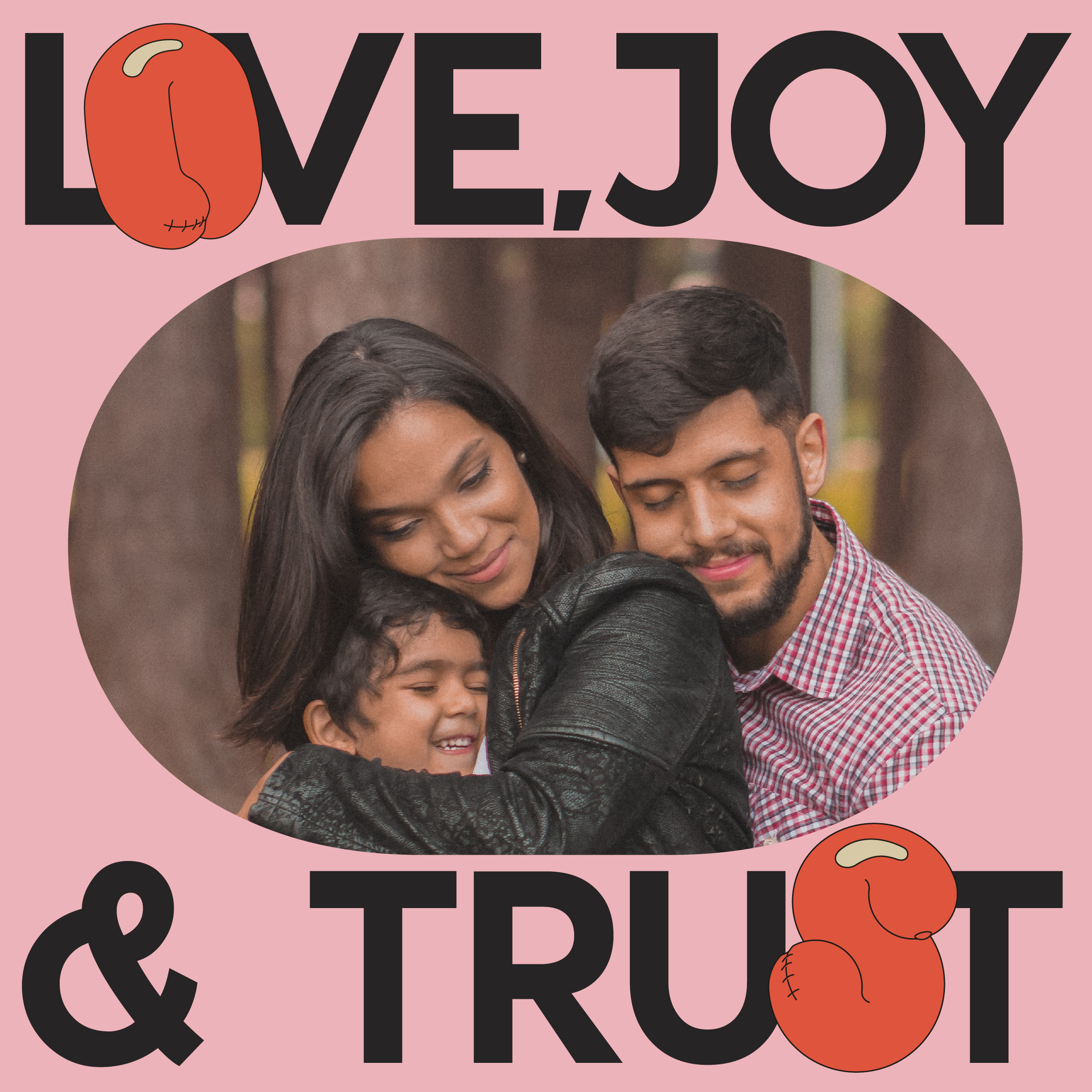
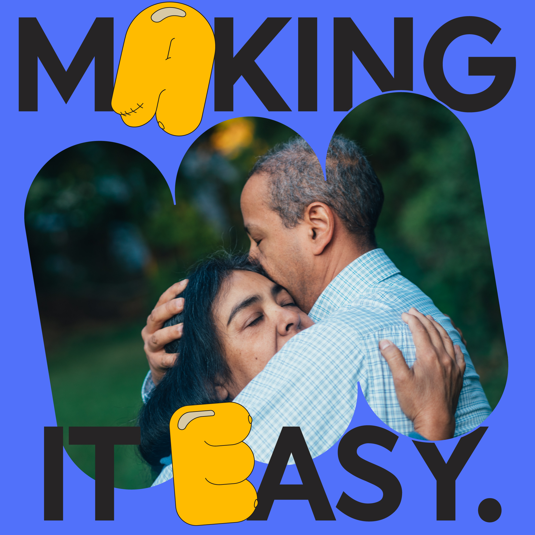
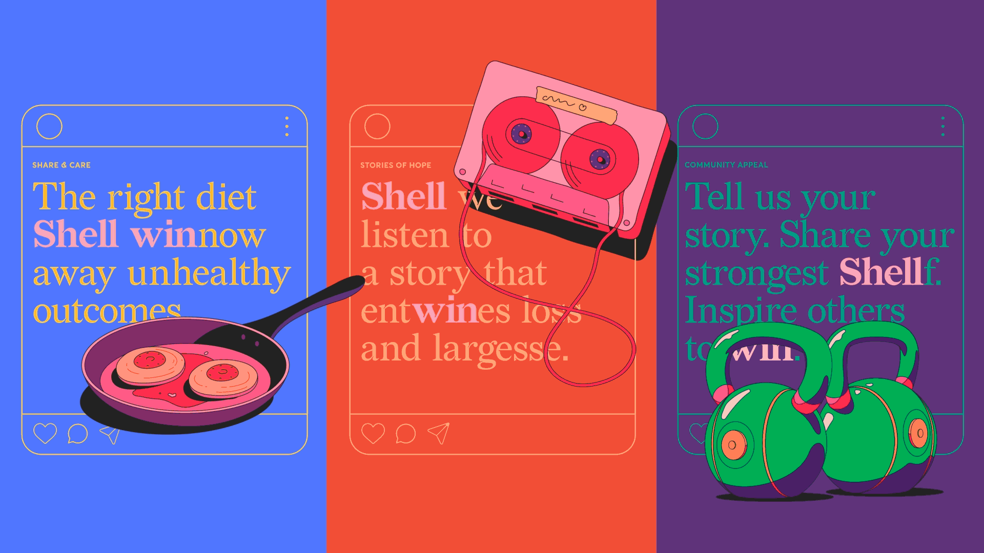
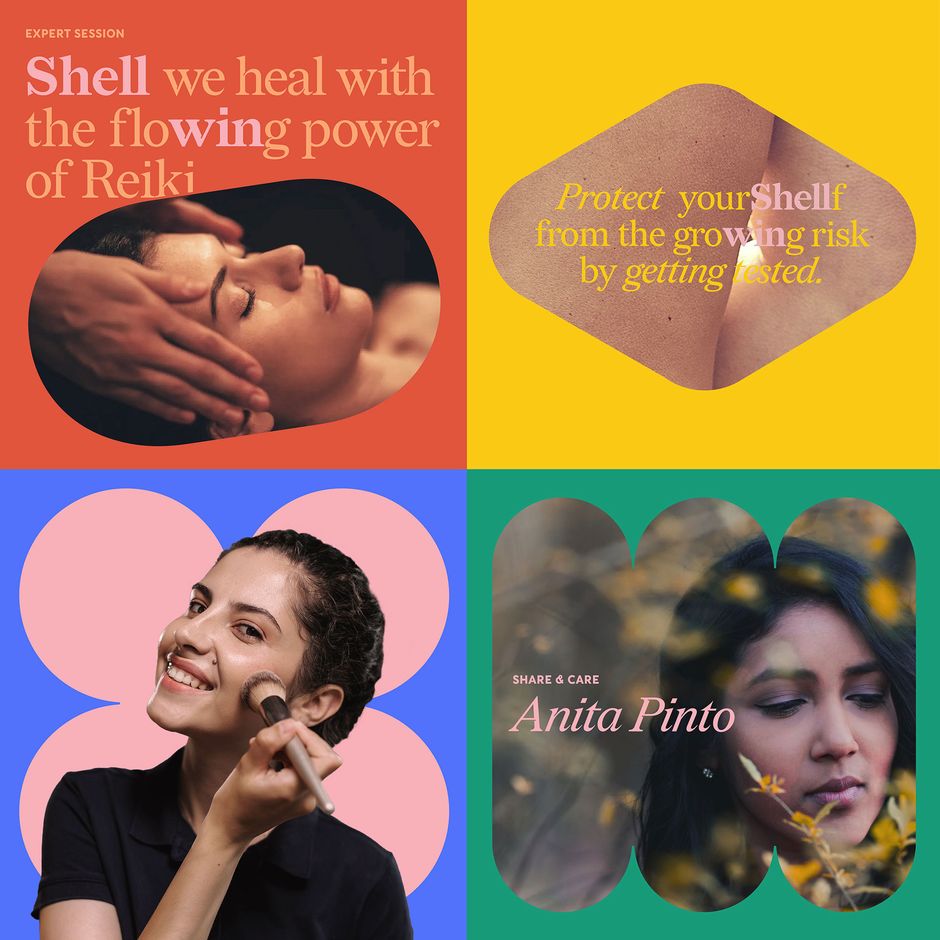
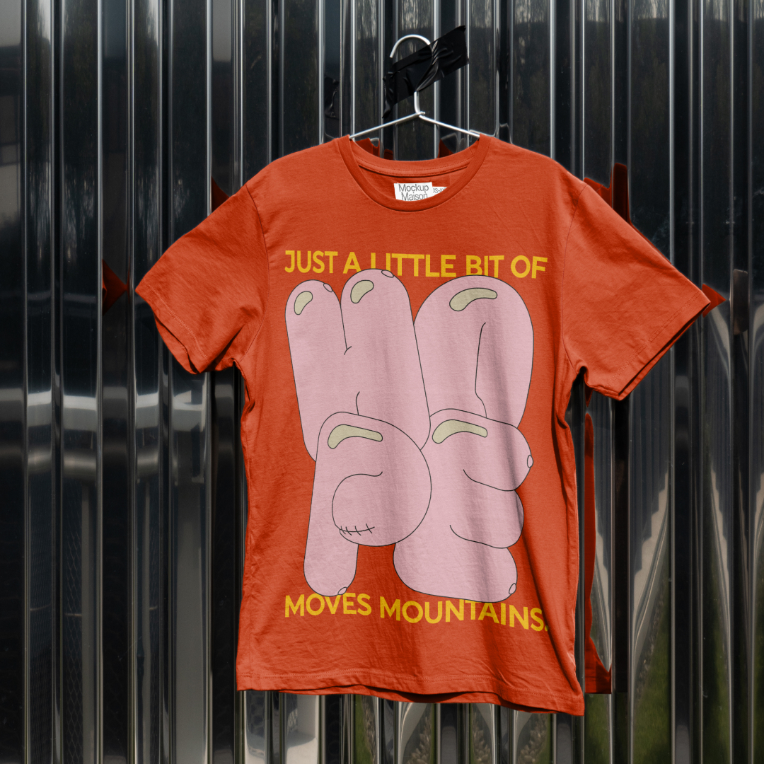
Illustrating the importance of everyday conversations
Every illustration subtly incorporates breasts. Subliminally making difficult conversations easy and everyday. Removing the shame and taboo that surrounds talking about breast health in India with lighthearted wit.
Every illustration subtly incorporates breasts. Subliminally making difficult conversations easy and everyday. Removing the shame and taboo that surrounds talking about breast health in India with lighthearted wit.
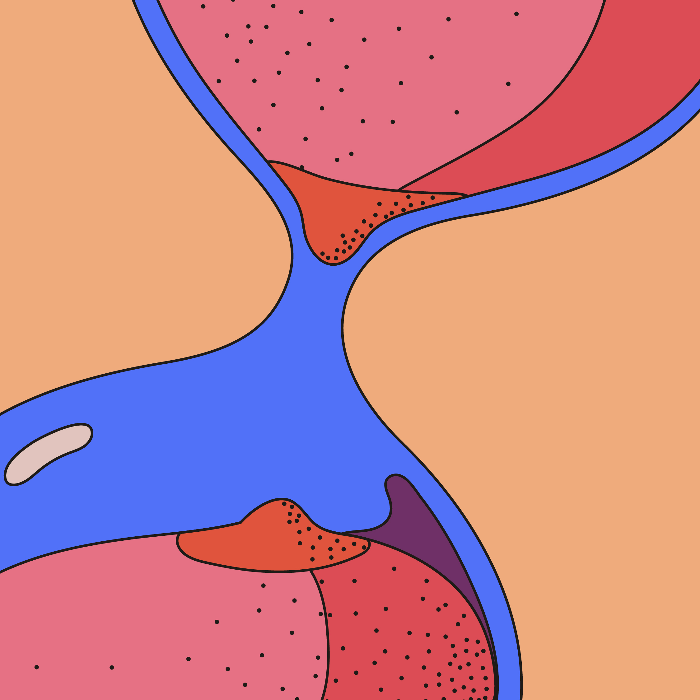
When used with messaging, illustrations are carefully crafted and chosen to highlight the core idea. They bring a sense of lighthearted joy to what can sometimes be serious topics. A right aligned placement forms the standard template for this style of communication.
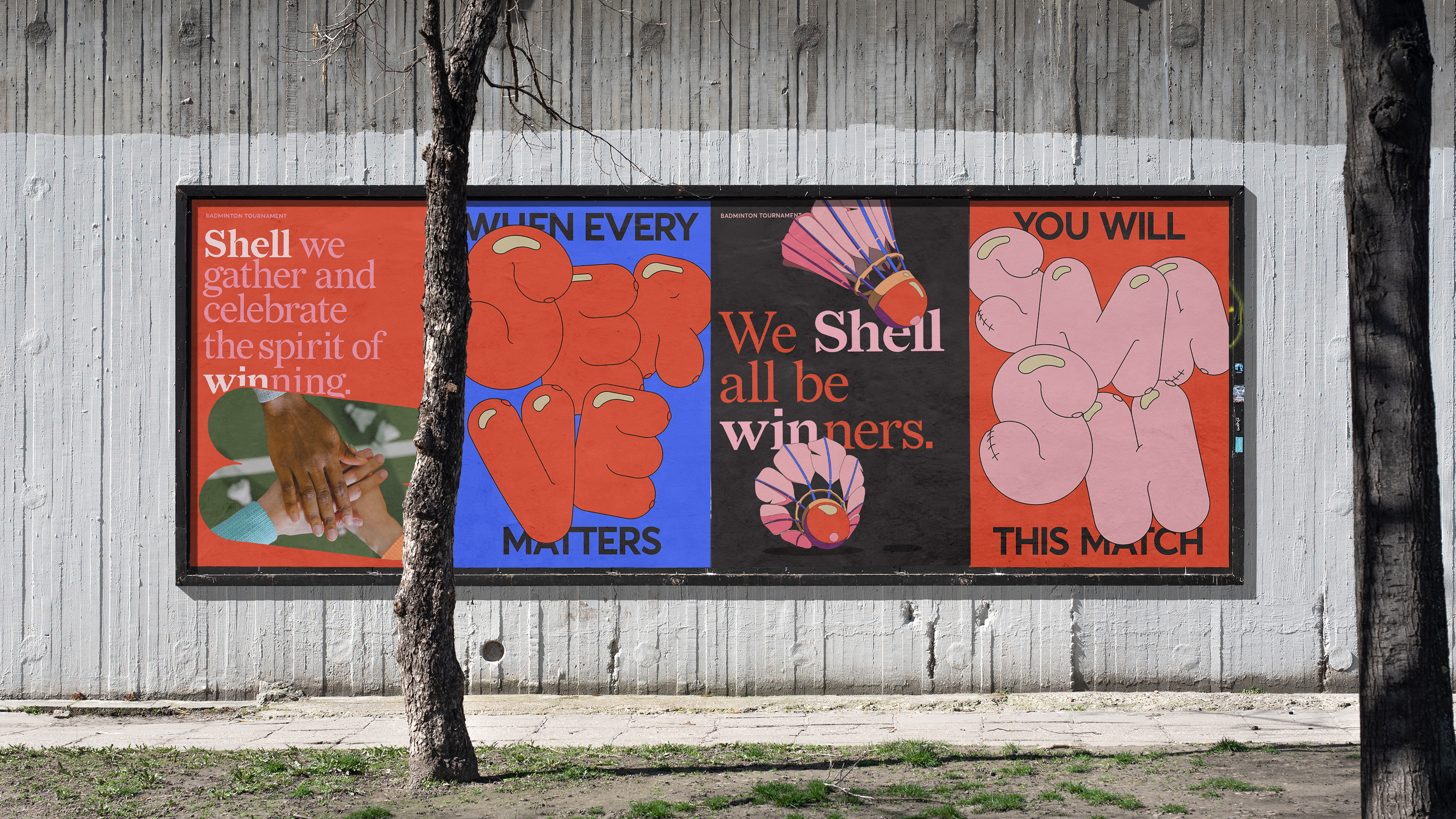
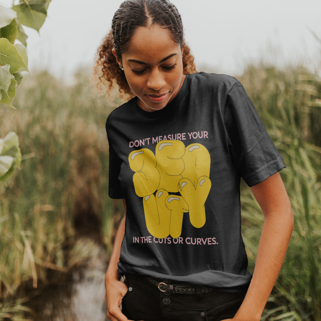
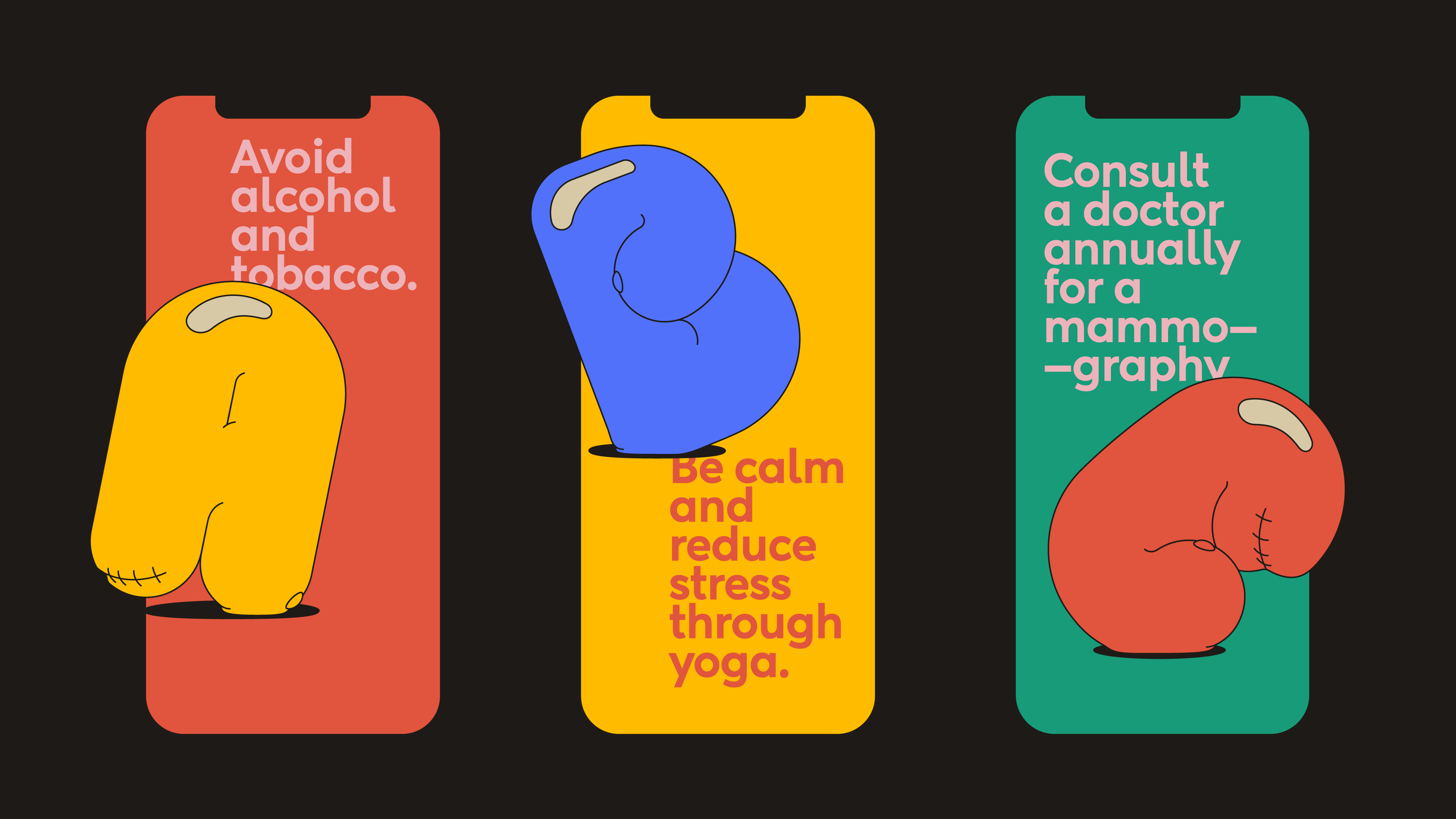
Shaping conversations with kindness
Distinct shapes are carefully crafted to personify the brand values of conversation, caring, sharing, togetherness, choice and support. Rooted in human kindness each shape becomes a canvas to convey these emotions.
Distinct shapes are carefully crafted to personify the brand values of conversation, caring, sharing, togetherness, choice and support. Rooted in human kindness each shape becomes a canvas to convey these emotions.
Distinct and dynamic, the multitude of shapes ensure that communication templates are each flexible, identifiable and refreshing.
Building a community of conversations
From our very first conversations with affected families, we understood the importance of building every aspect of the brand around their needs. Shell win would have to evolve and respond to issues they faced when dealing with the disease, from diagnosis through to post treatment care.
From our very first conversations with affected families, we understood the importance of building every aspect of the brand around their needs. Shell win would have to evolve and respond to issues they faced when dealing with the disease, from diagnosis through to post treatment care.
Before we were brought on board, the group was focused on providing medical and financial aid to families. The seminars they conducted revolved around cancer, treatment and ways to manage finances for the same. They were mainly educational and did not result in a lot of audience participation.
We looked to reinvigorate the existing activities through the lens of the values we crafted. To build the ideas of caring and support, we focused on bringing on board palliative care and alternative pain management experts. Women who had been through cancer themselves- either as patients or as caretakers - and understood all too well how those they were speaking to were feeling.
We looked to reinvigorate the existing activities through the lens of the values we crafted. To build the ideas of caring and support, we focused on bringing on board palliative care and alternative pain management experts. Women who had been through cancer themselves- either as patients or as caretakers - and understood all too well how those they were speaking to were feeling.
Not only did their lead at our webinars result in more meaningful conversations, these inspiring women also provided us with further insight into all that Shell win could provide to truly make a difference in the lives of those it serves. On their advice, we began online and offline activities that involved fun games, arts and crafts. A way for members to be open with each other and share their individual passions and hobbies. A time for them to celebrate little victories and support each other in activities beyond treatment.
We also wanted our community to feel empowered in every way, so we began to let them dictate monthly activities and sessions. Online polls and messages on our WhatsApp group invited them to share their preferences or in certain cases even step up to lead sessions on baking, art or reiki.
We also wanted our community to feel empowered in every way, so we began to let them dictate monthly activities and sessions. Online polls and messages on our WhatsApp group invited them to share their preferences or in certain cases even step up to lead sessions on baking, art or reiki.
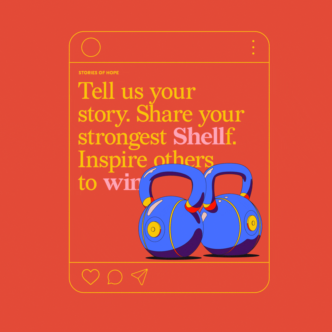
All of this was supported by our digital communication which acted as a first point of contact for potential members. Content was carefully crafted to be accurate, engaging, inspiring and an invitation to join in our community of open honest conversations. On a platform of their choice and comfort, from intimate groups on WhatsApp, Telegram, Facebook or through personal connections with whoever they feel comfortable with in the community. Creating a safe access spectrum to deal with everything from diagnosis to moving beyond the treatment.
A growing community of care
Meaningful communication, insightful activities and a genuine purpose have led to Shell win becoming a unique support group for those affected by breast cancer in India. Individuals and families reach out to the group, privately, as anticipated, glad to find an intimate space. Where they can share their thoughts, fears, dreams and hopes, and find the support they need. The support community has grown to include over 300 experts, warriors and survivors, each of whom voluntarily act in service across a range of needs. Rural outreach in the State of UP is currently centred around the city of Agra. A first step has been to educate and create awareness camps. Over 500 women have benefited from the free mammography service.
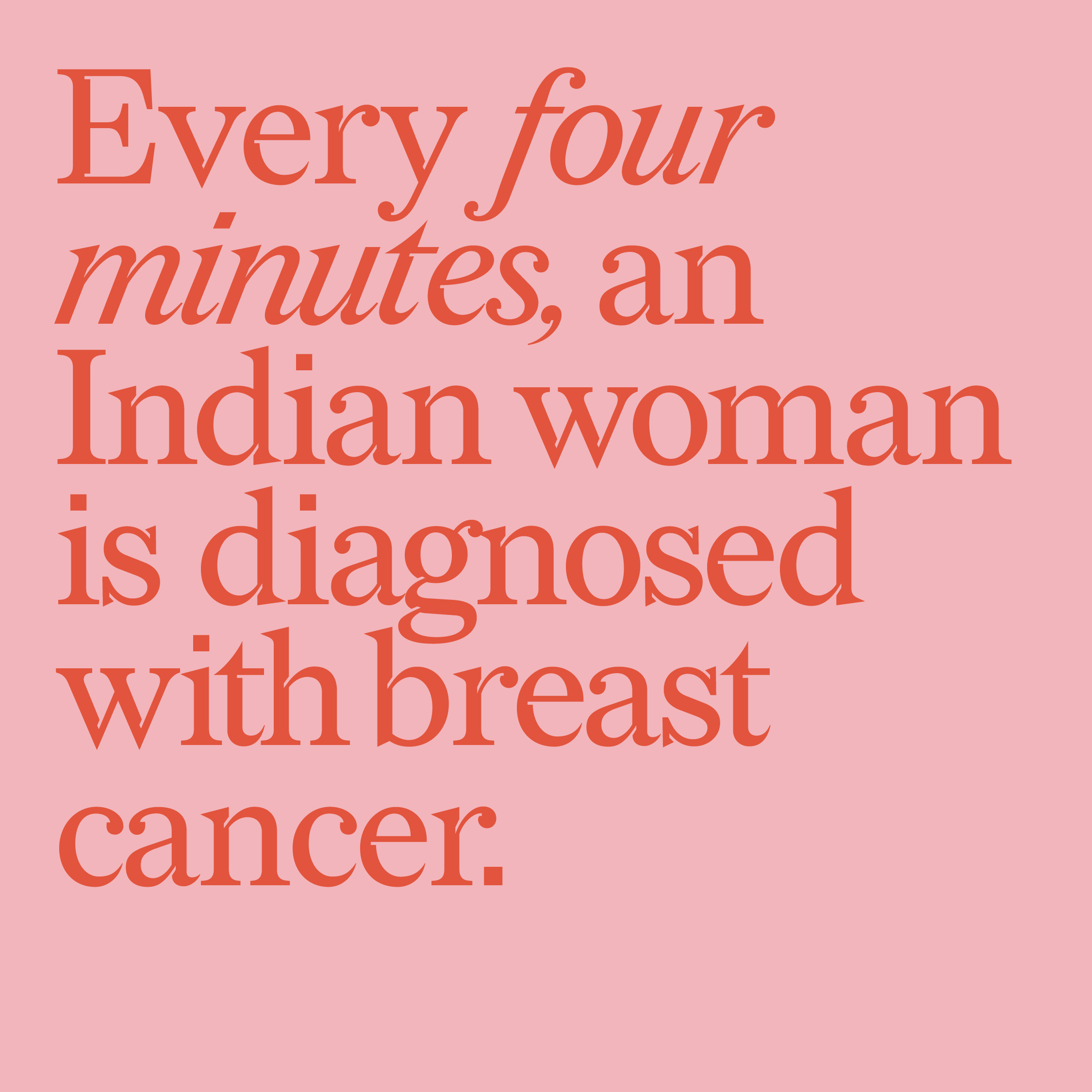
As the group expands its outreach both online and offline, its ambitious aim is to alleviate detection in the late stages by educating and empowering women and men. And support in reducing India’s alarming statistics of a woman being diagnosed every 4 minutes with the disease and a woman losing her life to the disease every 8 minutes
Meaningful communication, insightful activities and a genuine purpose have led to Shell win becoming a unique support group for those affected by breast cancer in India. Individuals and families reach out to the group, privately, as anticipated, glad to find an intimate space. Where they can share their thoughts, fears, dreams and hopes, and find the support they need. The support community has grown to include over 300 experts, warriors and survivors, each of whom voluntarily act in service across a range of needs. Rural outreach in the State of UP is currently centred around the city of Agra. A first step has been to educate and create awareness camps. Over 500 women have benefited from the free mammography service.
As the group expands its outreach both online and offline, its ambitious aim is to alleviate detection in the late stages by educating and empowering women and men. And support in reducing India’s alarming statistics of a woman being diagnosed every 4 minutes with the disease and a woman losing her life to the disease every 8 minutes
Let’s start a conversation.
For business enquiries:
eamonn@twodesign.co.in+91 98676 54952