
Brand
Paddy Fields
Paddy Fields
Industry
Events
Events
Region
India
India
Key Services
Brand Strategy
Brand Identity
Communication
Environment
Brand Strategy
Brand Identity
Communication
Environment
Harvesting melodies from the fields for an urban audience.
NESCO began as one of India’s renowned engineering companies and evolved to become a diversified conglomerate. As part of this expansion, the newly formed Events division’s goal was to develop new IP’s that the company could leverage into ownable brands.
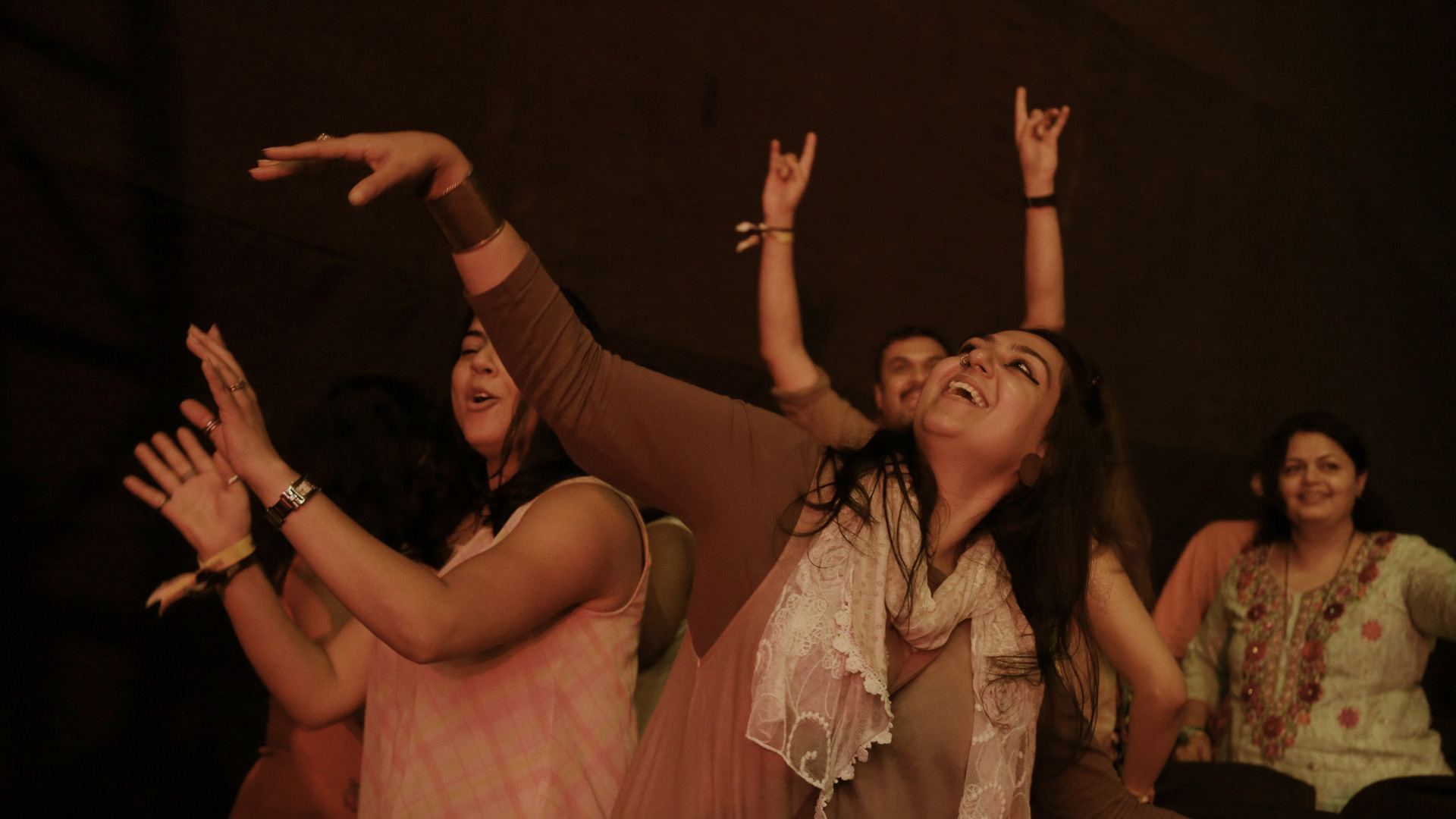
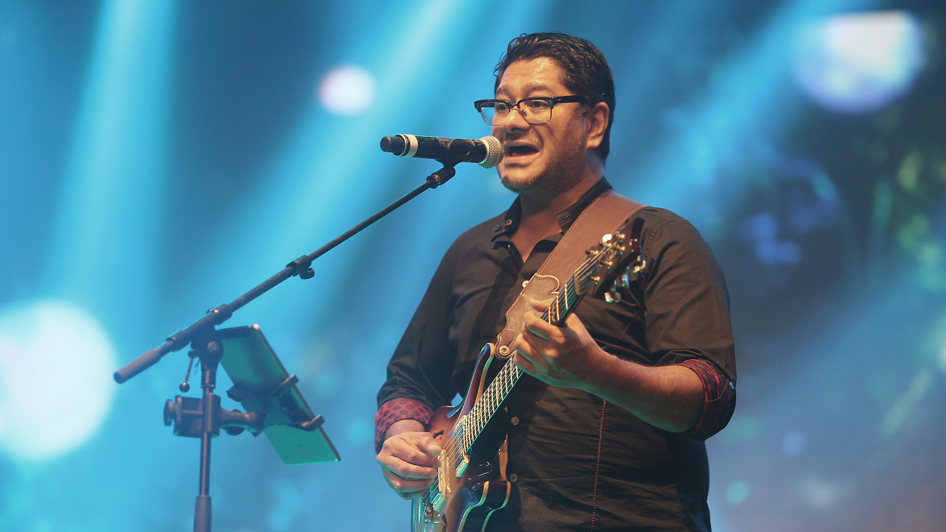
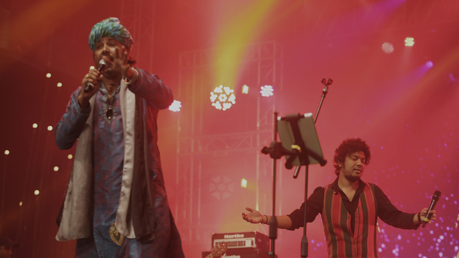
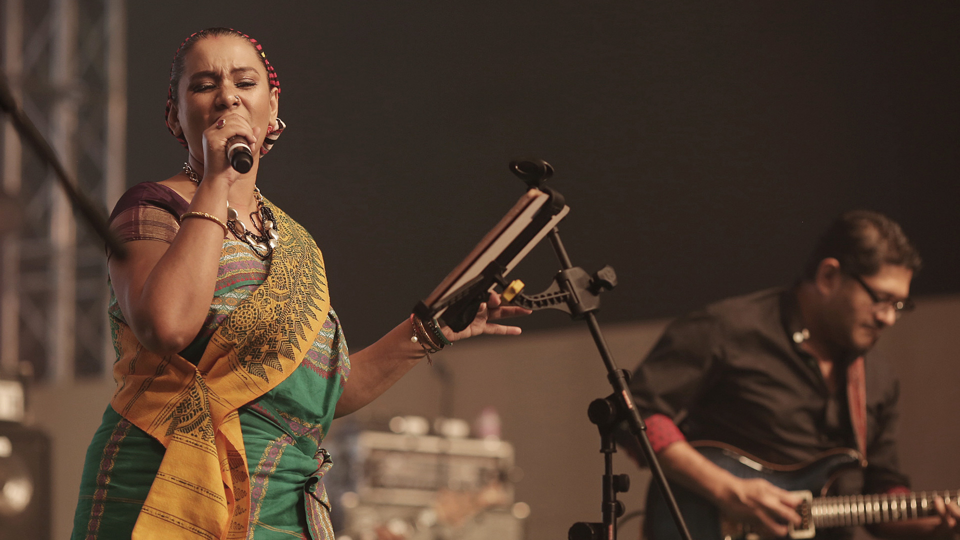
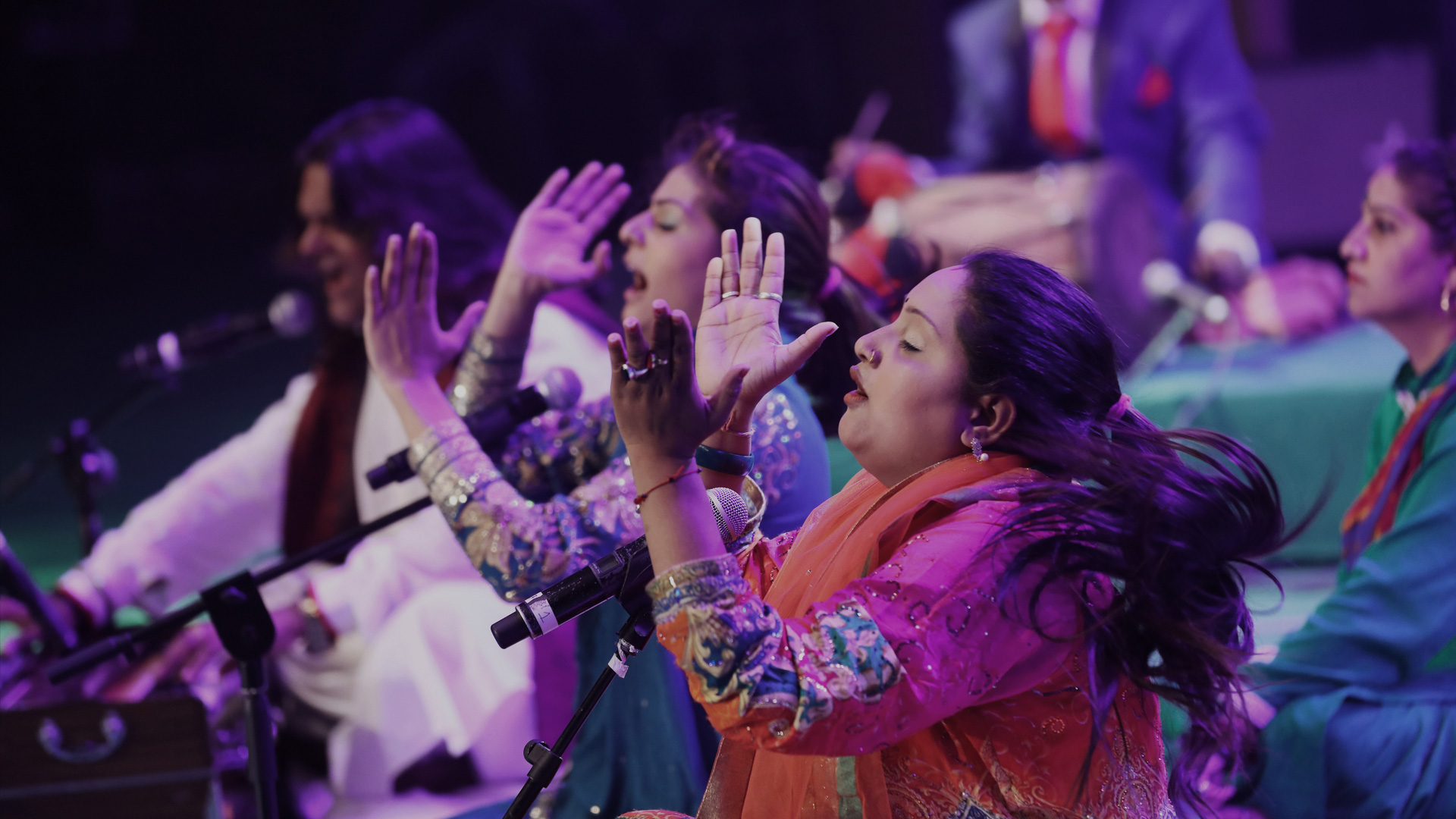
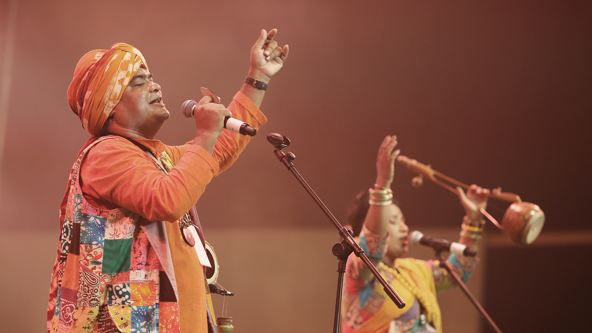
We were commissioned in 2016 to conceptualise their first IP, a music property. Our handcrafted identity system created a brand that has become the nation’s premiere folk and fusion music festival, with an annual concert and weekly radio show. A soulful revival of music's origin, that is slowly becoming mainstream. Attracting talent from across the country and a dedicated audience.
We were commissioned in 2016 to conceptualise their first IP, a music property. Our handcrafted identity system created a brand that has become the nation’s premiere folk and fusion music festival, with an annual concert and weekly radio show. A soulful revival of music's origin, that is slowly becoming mainstream. Attracting talent from across the country and a dedicated audience.
Appreciating every facet
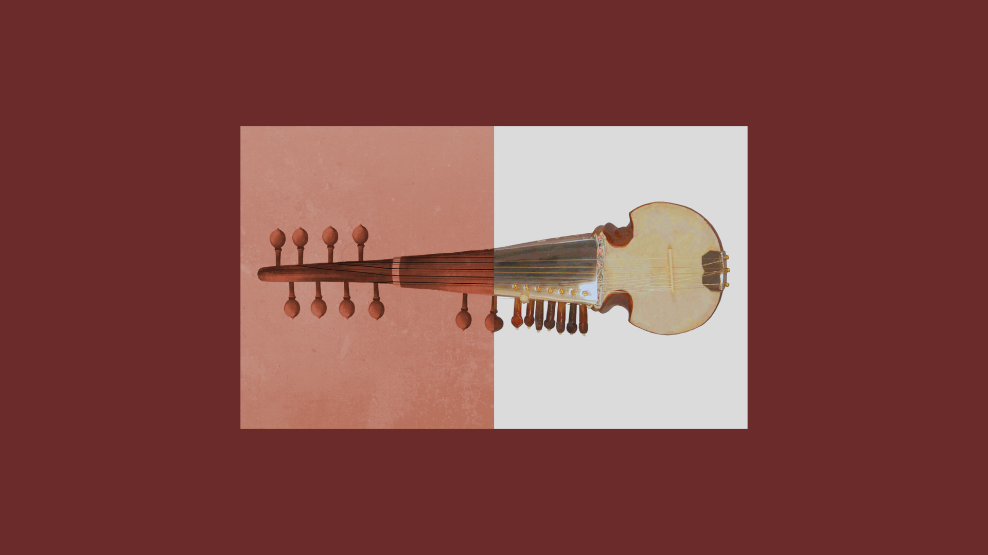
The urban Indian audience has been weaned on international music or the songs from the film industry. Folk music seemed to be the realm of the music connoisseurs or listened to by those who still had strong ties with their rural roots.
NESCO events realised the opportunity to bring folk music to the fore, in a meaningful way. Their new property would have to recontextualise the art form for the urban. We delved into the history of folk music to understand the underlying ethos that ties different musical styles and musicians together, leading us to uncover an identity rooted in the genre’s heritage.

Refining the sketch
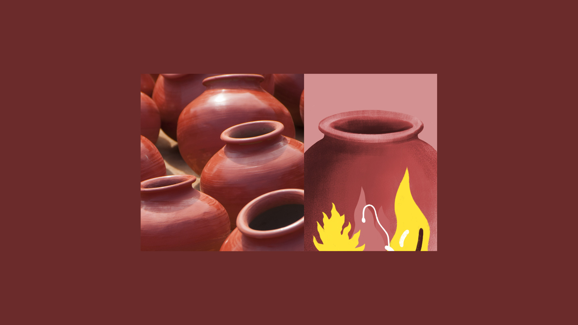
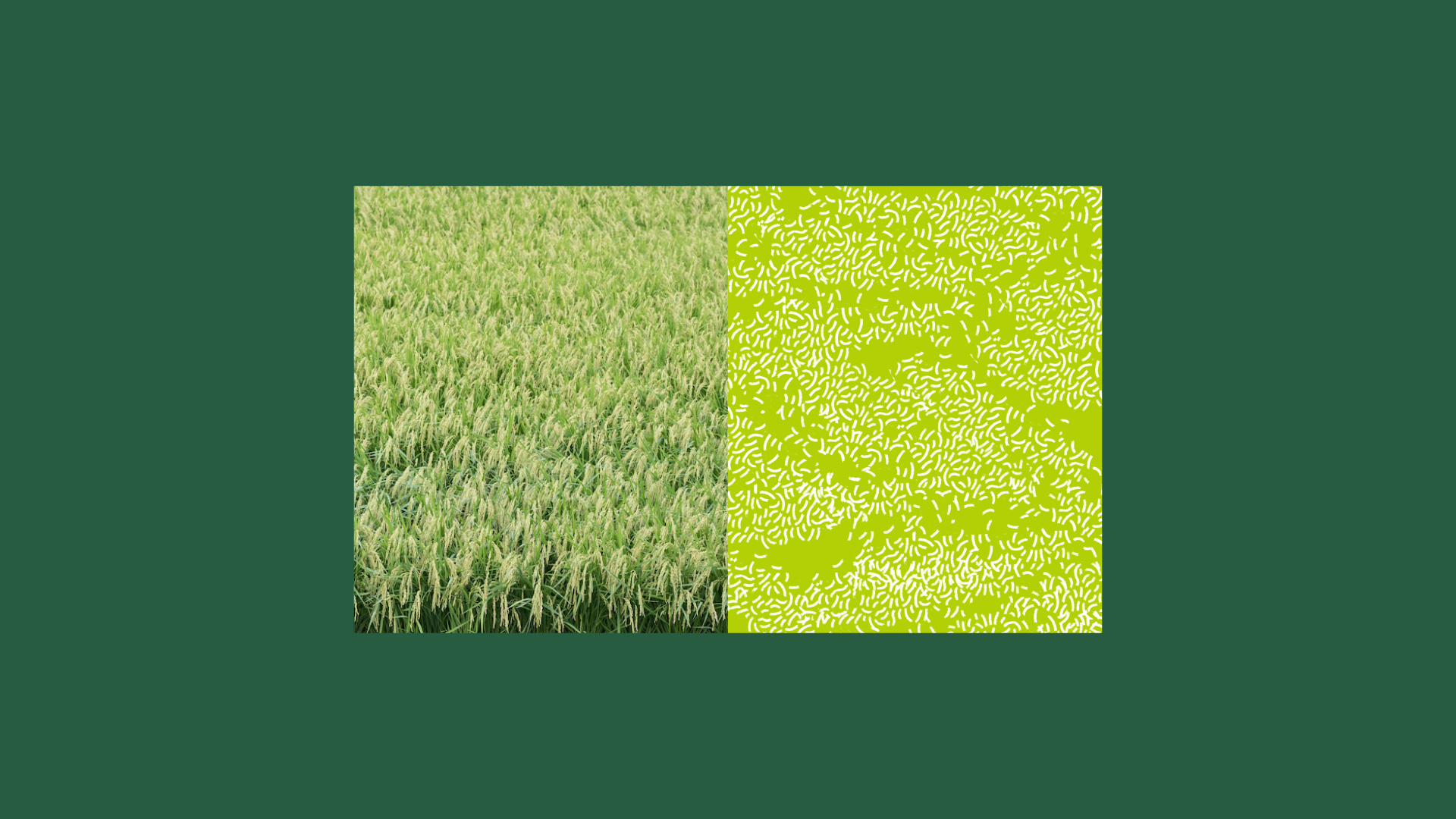
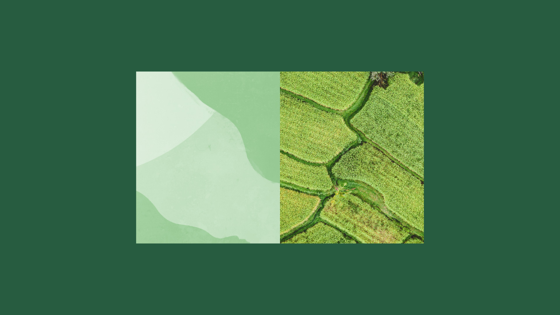
The rhythm and beat of folk music is indelibly linked to the rural farmlands of India. Songs born as harmonies that move through the fields from one generation to the next; to inspire, teach and reconnect us to our roots. We coined a name evocative of this connection lost to most urban indians.
‘Paddy Fields’ embodies this heritage. It revives the swaying, soothing, forgotten rhythms of folk music, to capture the imagination.
The Final Piece
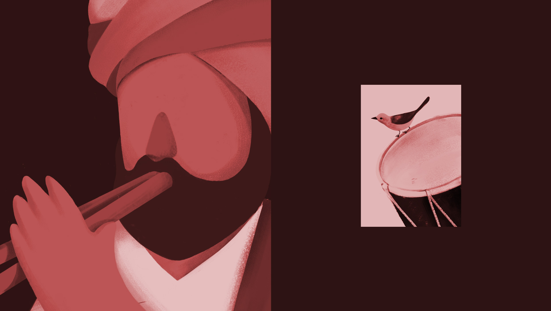
As a truly unique musical property, we wanted the identity to represent the ethos behind the music. Our identity had to be organic, playful and rustic - calling to mind the sublime sounds of nature that inspired the art form. The dynamic logotype became a soulful rendition of paddy stalks swaying to the winds of music.
Through 180-degree animation, we crafted 20 logo expressions that shift and undulate, inspiring the urban to move in time with the rugged and the rustic.
A whisper in the wind
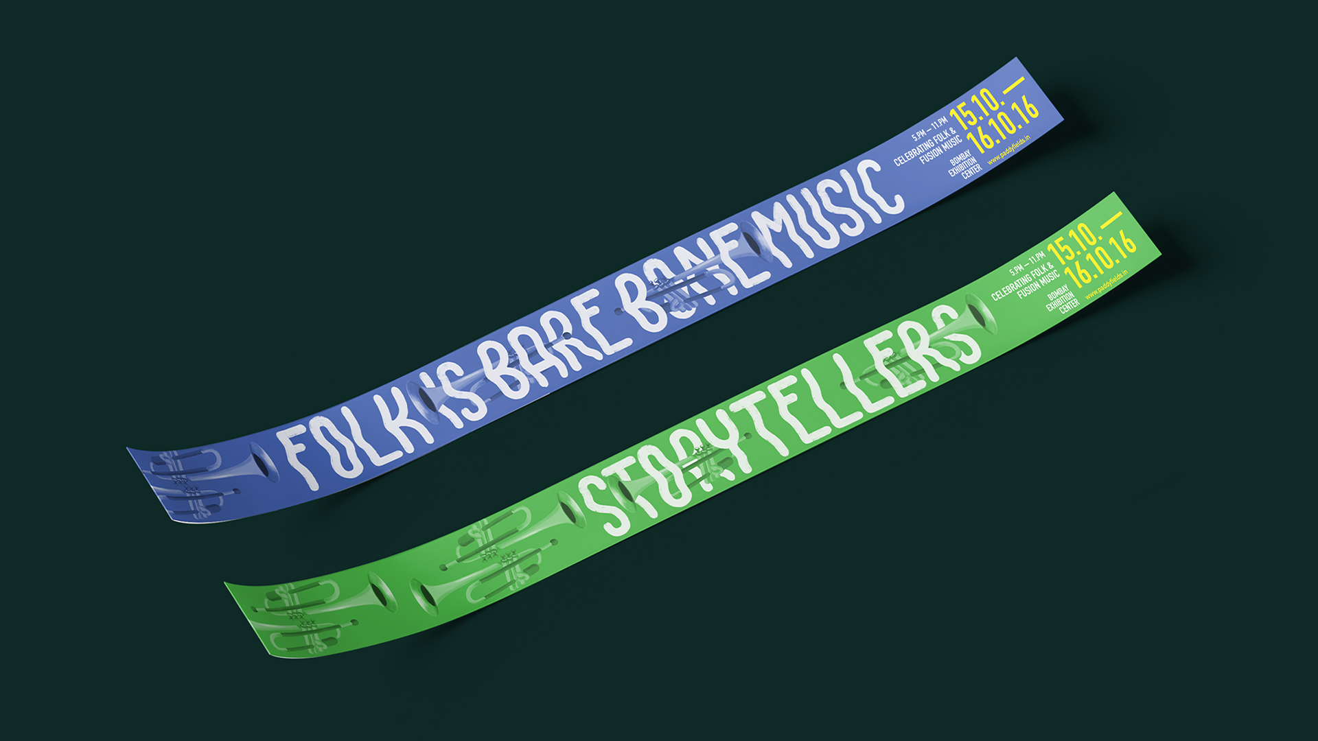
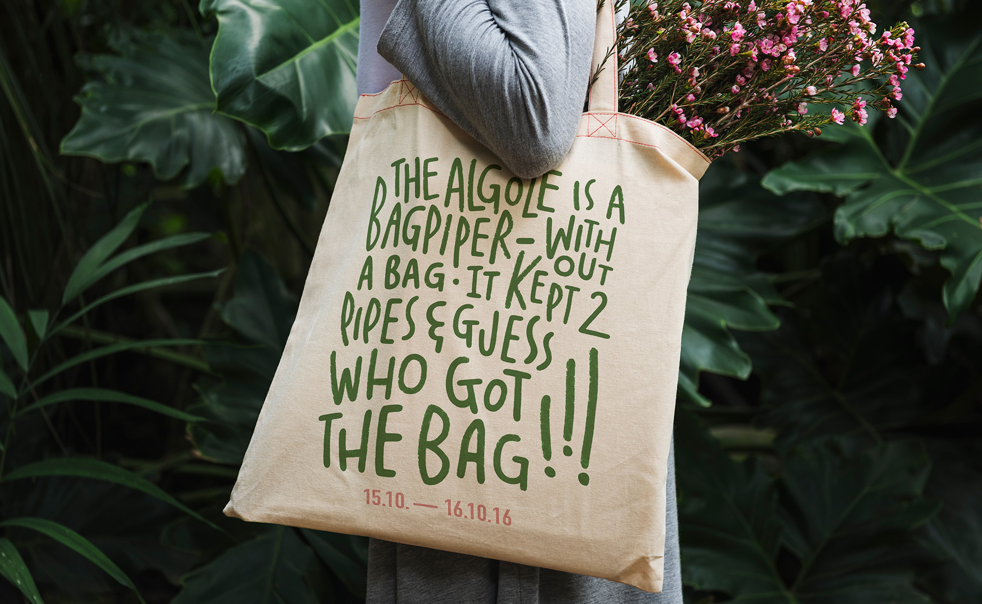
Using the dynamic motion of the logo, we crafted two custom typefaces that could be used boldly throughout our messaging, while still being delicate in form.
Using the dynamic motion of the logo, we crafted two custom typefaces that could be used boldly throughout our messaging, while still being delicate in form.


The landscape of our lore
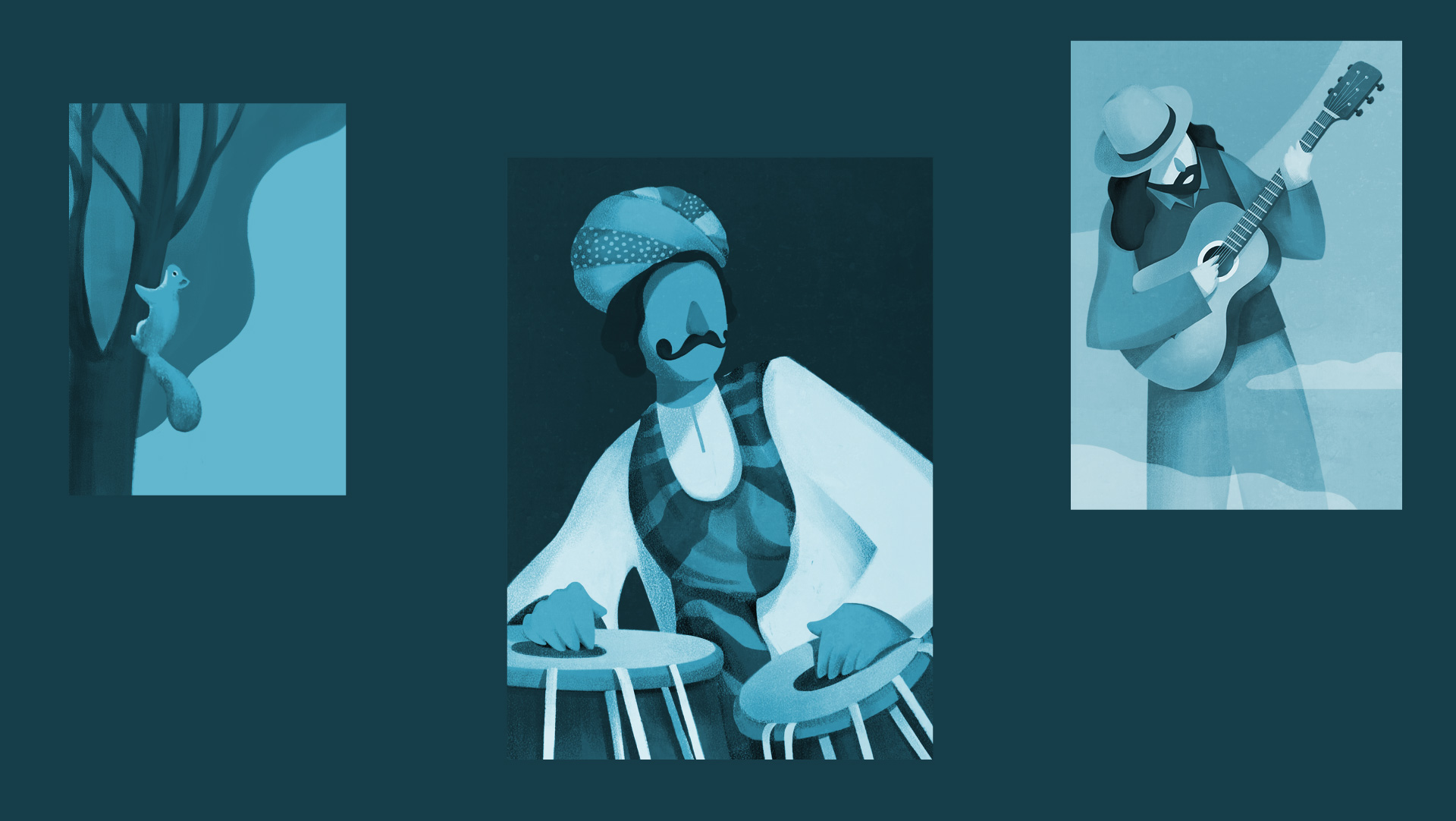
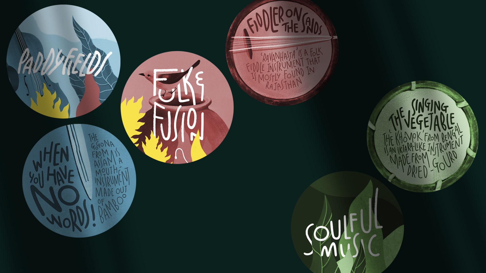
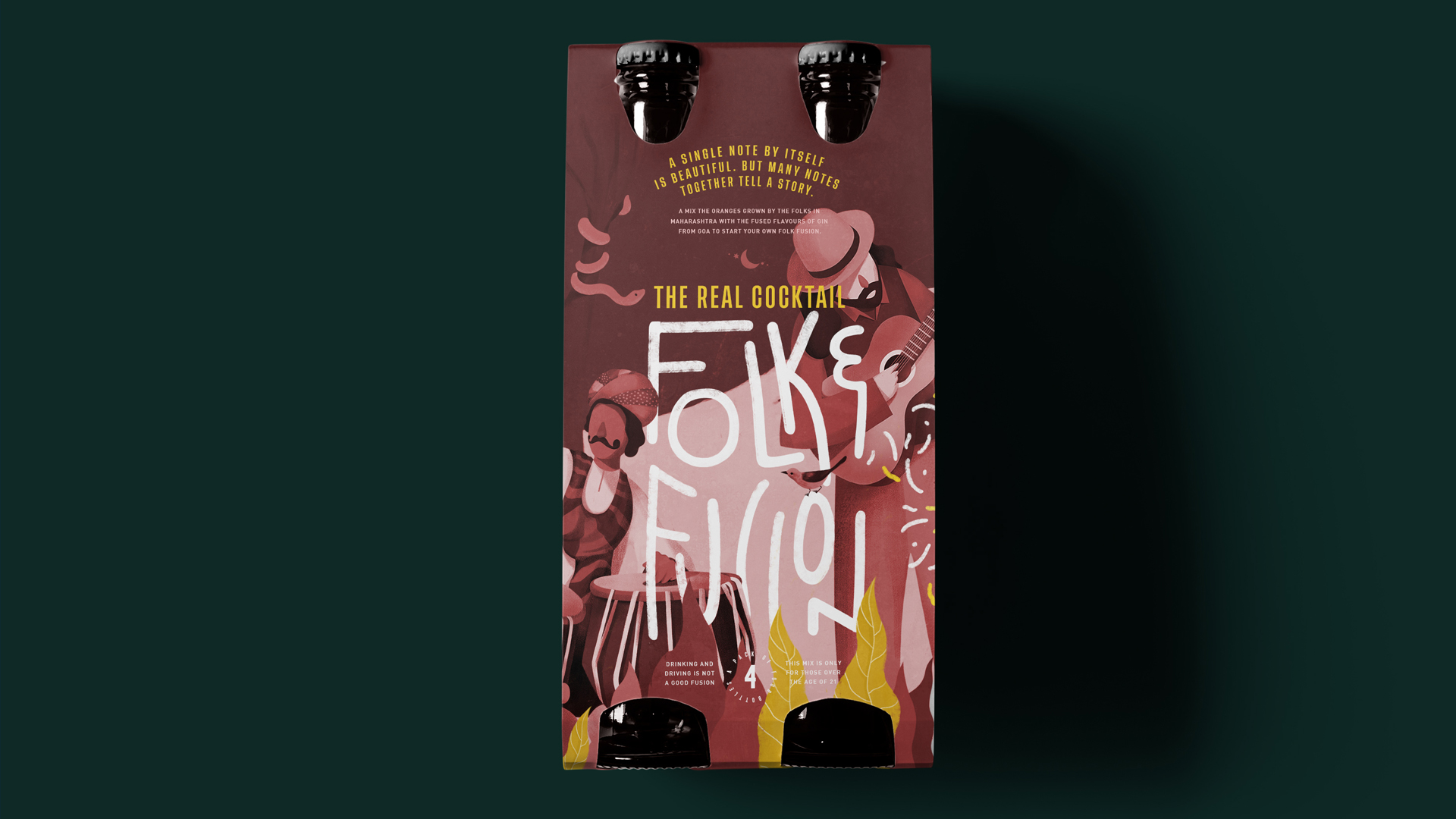
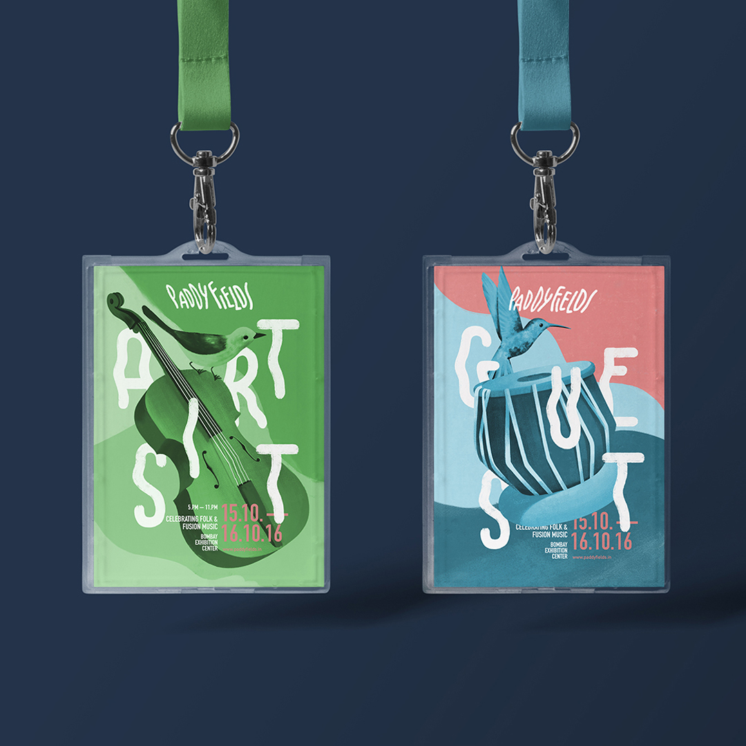
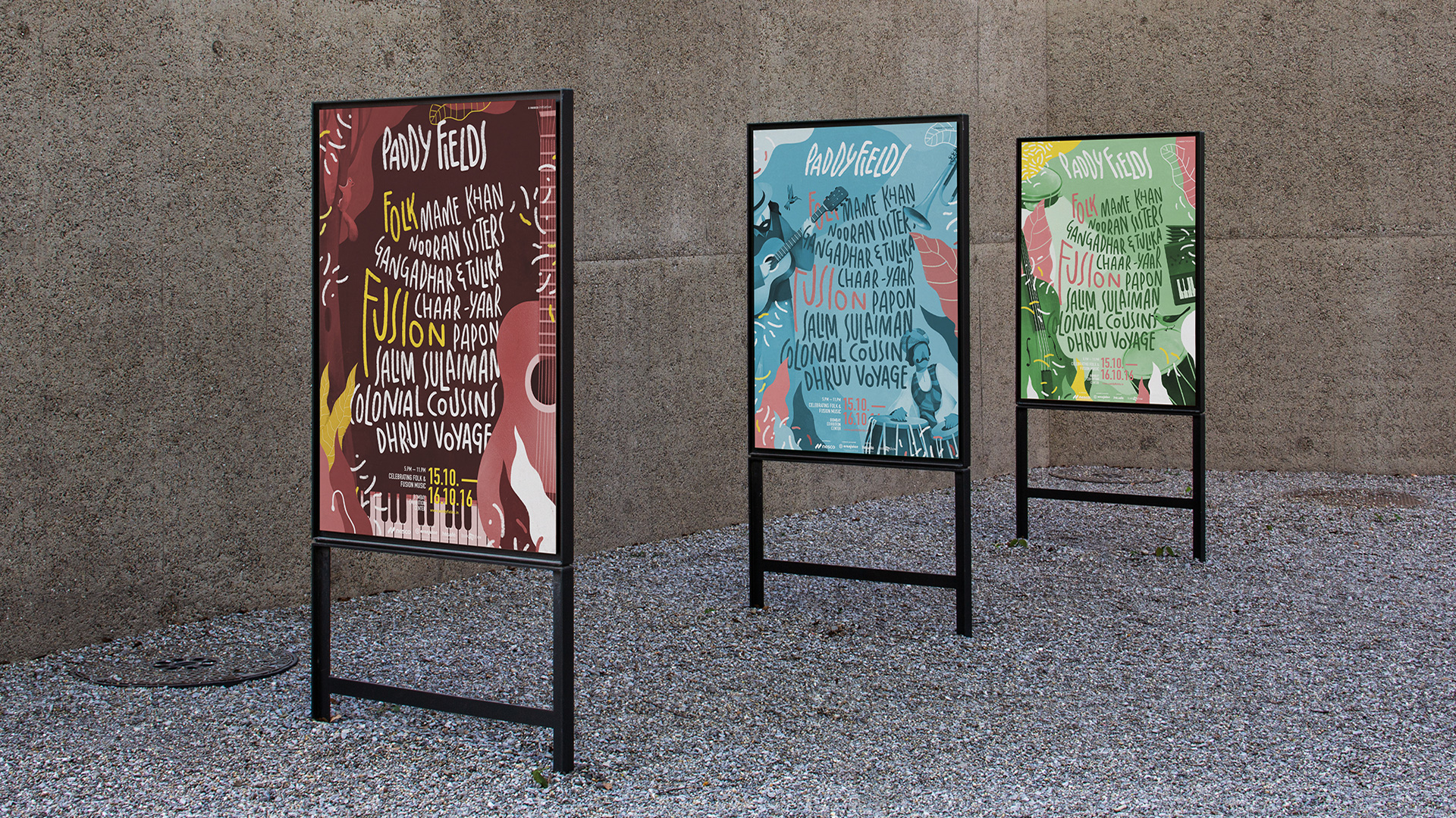
The design language was handcrafted and stylized, taking inspiration from mountain peaks to field mice and incorporated with the instruments, styles and moods of the musicians. The colour palette was created to mesmerise, with predominantly rustic tones and shades of brightness that add an air of mystic wonder. Bold type and messaging brought to life the magical feeling of listening to the soulful sounds of folk music.
The design language was handcrafted and stylized, taking inspiration from mountain peaks to field mice and incorporated with the instruments, styles and moods of the musicians. The colour palette was created to mesmerise, with predominantly rustic tones and shades of brightness that add an air of mystic wonder. Bold type and messaging brought to life the magical feeling of listening to the soulful sounds of folk music.
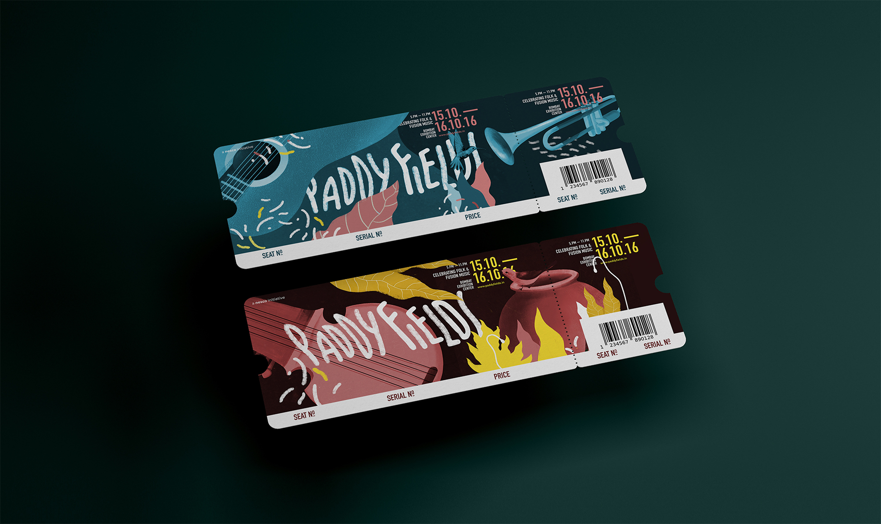


Bringing heritage home
Each collateral is designed soulfully to mesmerise, passing on the powerful stories of folk tradition in a contemporary avatar. Harmoniously weaving together diverse artists, their instruments and styles into a singular aura to create an immersive experience bound by the magic of their music.
Each collateral is designed soulfully to mesmerise, passing on the powerful stories of folk tradition in a contemporary avatar. Harmoniously weaving together diverse artists, their instruments and styles into a singular aura to create an immersive experience bound by the magic of their music.


A harmony for tomorrow
An agile identity, rooted in truth, has allowed Paddy Fields to encompass an ever-expanding narrative for the future. Making it an award-winning brand ahead of its time.
An agile identity, rooted in truth, has allowed Paddy Fields to encompass an ever-expanding narrative for the future. Making it an award-winning brand ahead of its time.


Let’s start a conversation.
For business enquiries:
eamonn@twodesign.co.in+91 98676 54952