
Brand
NESCO Group
NESCO Group
Industry
Growth Enterprise/ Events
F&B/ Realty
Growth Enterprise/ Events
F&B/ Realty
Region
Global
Global
Key services
Brand Strategy/ Brand Identity
Brand Architecture/ Brand Systems
Brand Story / Environment Design/ Naming/ Packaging/ Communication Framework/ Website
Brand Strategy/ Brand Identity
Brand Architecture/ Brand Systems
Brand Story / Environment Design/ Naming/ Packaging/ Communication Framework/ Website
Igniting a spark for a 90 year old company, rooted in Indian industry, to become a multi-vertical powerhouse.
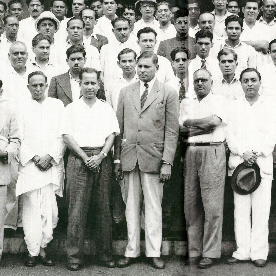
The Standard Engineering Company was founded in 1939 and became a core pillar of India’s industrialisation. Towards the end of the 20th Century they began to diversify their holdings to enter Real Estate with an IT park in Goregaon, and exhibitions with the establishment of Bombay Exhibition Centre, the nation’s largest private exhibition space. To reflect this shift from an engineering giant into a multi-vertical conglomerate, the company was renamed NESCO.
In 2016 we were brought on board as strategic design partners to rebrand this established entity and define the start of a new era for growth, by reimagining its legacy business (primarily B2B) and defining new verticals (primarily B2C). Over 3 years we crafted 6 B2B and 10 B2C brands, creating brand harmony and an aligned roadmap that truly captured the expansionary vision of this growing conglomerate.
In 2016 we were brought on board as strategic design partners to rebrand this established entity and define the start of a new era for growth, by reimagining its legacy business (primarily B2B) and defining new verticals (primarily B2C). Over 3 years we crafted 6 B2B and 10 B2C brands, creating brand harmony and an aligned roadmap that truly captured the expansionary vision of this growing conglomerate.
Appreciating every facet
Over the course of 90 years Nesco had organically grown and evolved, striding from engineering into new verticals as opportunities arose. They were pioneers in the exhibition space, and capitalised on the potential of the Western Suburbs as home to the city’s businesses with their state-of-the-art IT parks. However, this foresight had led to verticals growing quickly into their own entities without a cohesive brand identity or architecture tying them together.
Over the course of 90 years Nesco had organically grown and evolved, striding from engineering into new verticals as opportunities arose. They were pioneers in the exhibition space, and capitalised on the potential of the Western Suburbs as home to the city’s businesses with their state-of-the-art IT parks. However, this foresight had led to verticals growing quickly into their own entities without a cohesive brand identity or architecture tying them together.
Together with the leadership team we dove into the company’s rich heritage to discover and articulate Nesco’s binding philosophy. Clarifying and synthesizing their founding characteristics, personality and competitive strengths we distilled a core essence. One that has bound the various verticals, properties and brands together effectively with a singular belief system.
Refining the Sketch
Companies with the heritage of Nesco are built on a visionary foundation. By looking at the life and philosophy of Mr. JV Patel, the founder of Nesco, we uncovered the company’s driving philosophy, one that has always been followed but never truly articulated - ‘Believe’. It began with Mr. Patel’s belief in developing industries that could advance the nation and evolved into a belief in enriching and uplifting people’s lives through their various offerings across verticals.
Companies with the heritage of Nesco are built on a visionary foundation. By looking at the life and philosophy of Mr. JV Patel, the founder of Nesco, we uncovered the company’s driving philosophy, one that has always been followed but never truly articulated - ‘Believe’. It began with Mr. Patel’s belief in developing industries that could advance the nation and evolved into a belief in enriching and uplifting people’s lives through their various offerings across verticals.
With the foundational belief system in place for the core brand, we moved on to identifying the right architecture to provide a clear framework for future growth. We recommended a mixed monolithic and endorsed brand approach. The monolithic architecture for the business verticals would allow the core brand to showcase its strengths across industries and build brand equity through effective recall by carrying forward the personality and brand attributes of the parent company.
The endorsed brand approach would be used for new independent properties, offerings, products and established end-to-end brands. This would allow each of the new brands to grow and develop their own personalities and visual styles, providing endless possibilities for creativity and innovation.
The endorsed brand approach would be used for new independent properties, offerings, products and established end-to-end brands. This would allow each of the new brands to grow and develop their own personalities and visual styles, providing endless possibilities for creativity and innovation.
The Final Piece
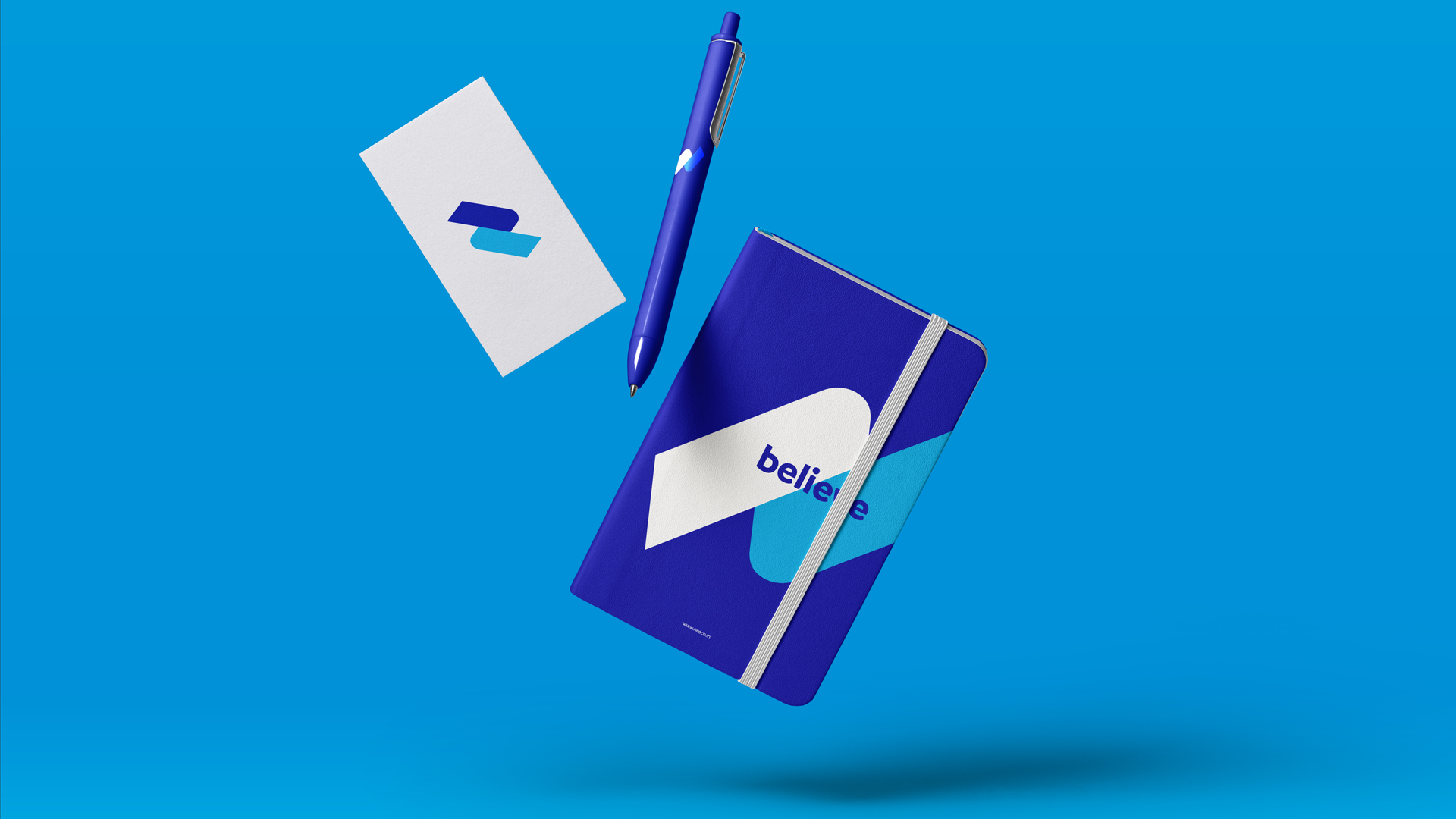
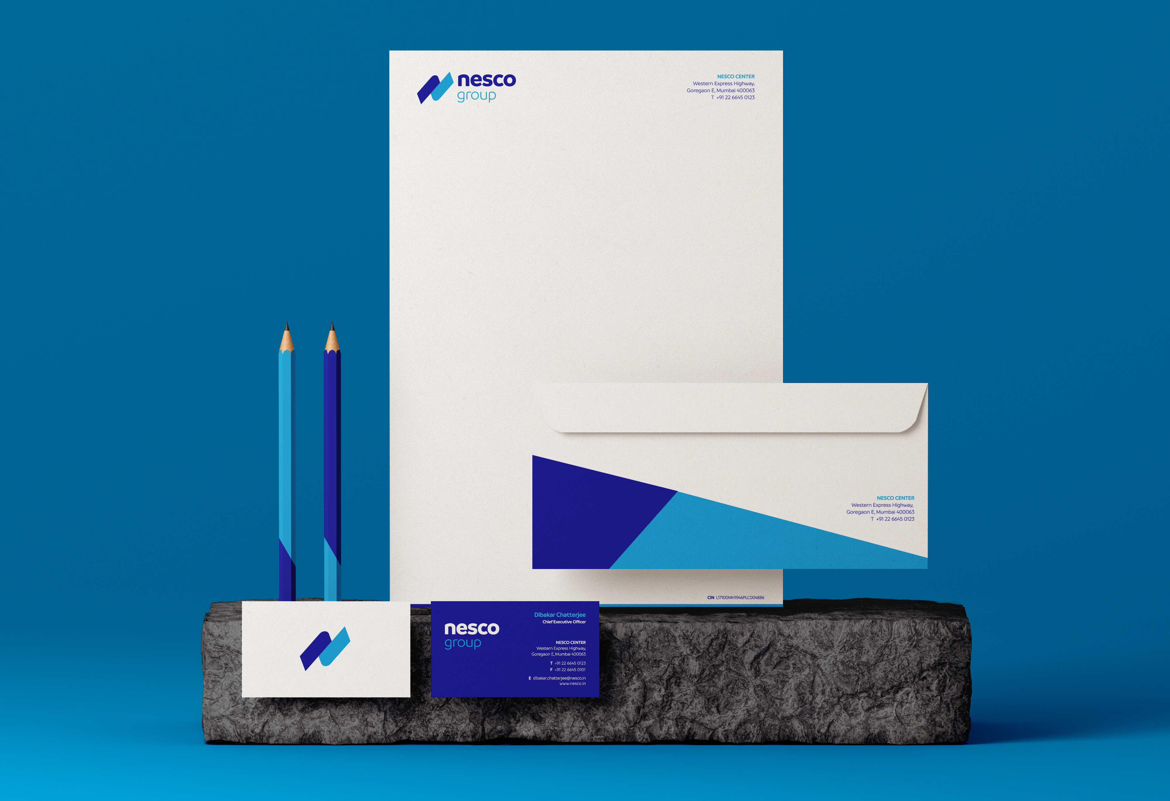
The logo mnemonic embodies the philosophy Nesco, a reimagining of the ‘n’ as two ideas that rub together to create a ‘spark’ that ignites new ideas and innovations. One line of the ‘n’ is rooted in the past - taking strength from the company’s rich heritage. The other is looking towards the future.
The type itself has smooth edges to show the friendly, warm and inviting nature of the brand. The bold makeover, highlights Nesco’s shift and redefines each of the businesses and brands that it encompasses.
The Colours
The core brand colours are an evolution of the original blue of the brand. The colours of the sky and the sea, they represents depth and stability. Symbolising the vastness, trust, loyalty, wisdom, confidence, intelligence and faith of the brand.
The core brand colours are an evolution of the original blue of the brand. The colours of the sky and the sea, they represents depth and stability. Symbolising the vastness, trust, loyalty, wisdom, confidence, intelligence and faith of the brand.
Graphic Language
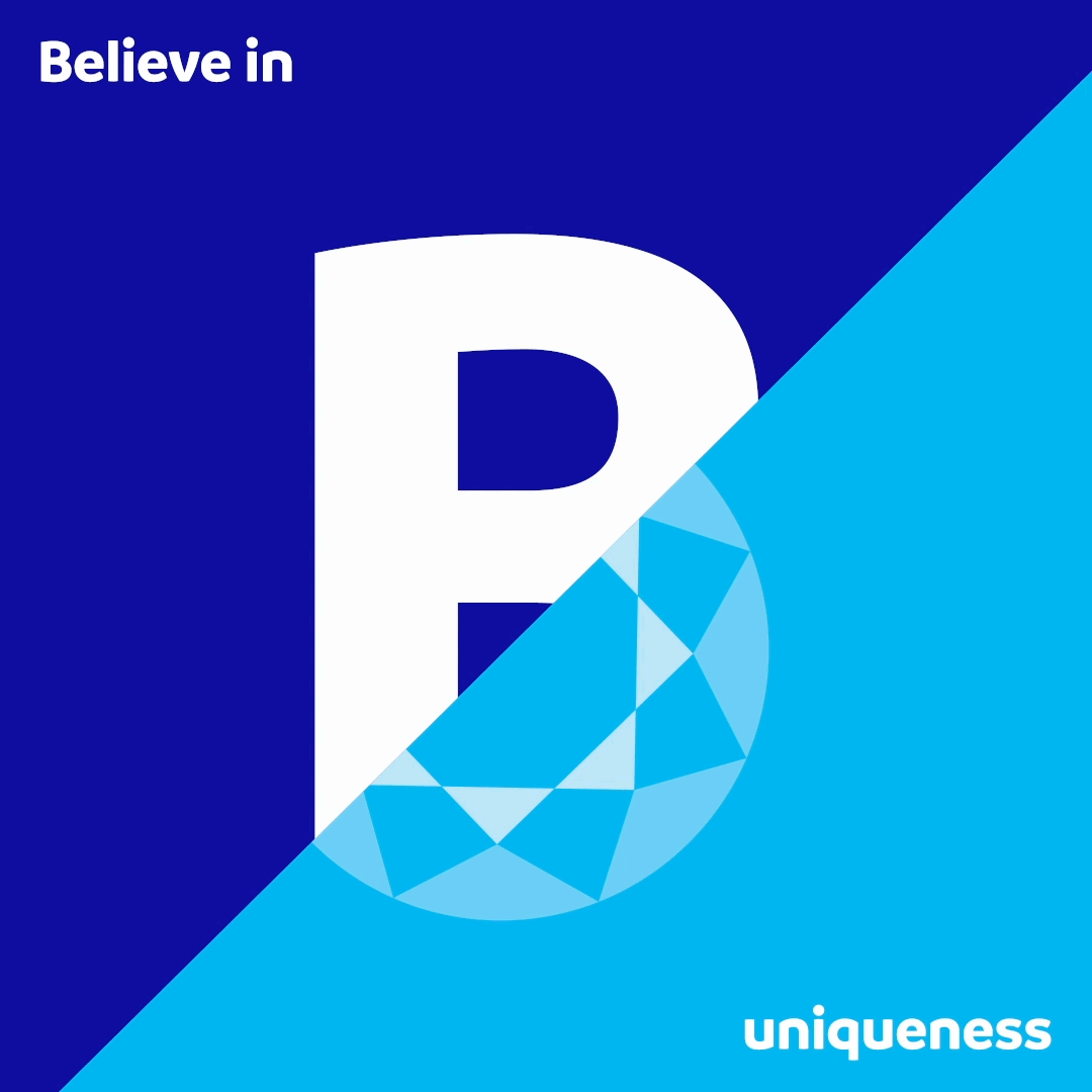
It was imperative to build a connection between the conglomerate and its new identity. Used intelligently to provide greater flexibility across medium and messaging, the two bold, tilted lines of the Spark carry the brand’s new identity across every touchpoint.
It was imperative to build a connection between the conglomerate and its new identity. Used intelligently to provide greater flexibility across medium and messaging, the two bold, tilted lines of the Spark carry the brand’s new identity across every touchpoint.

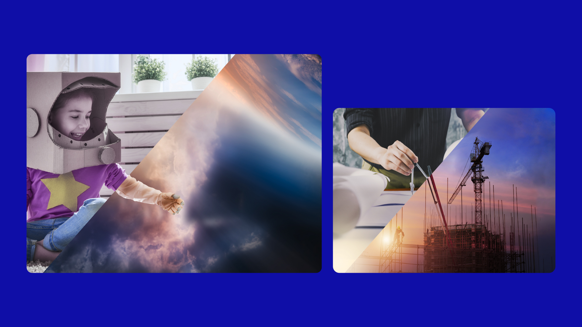
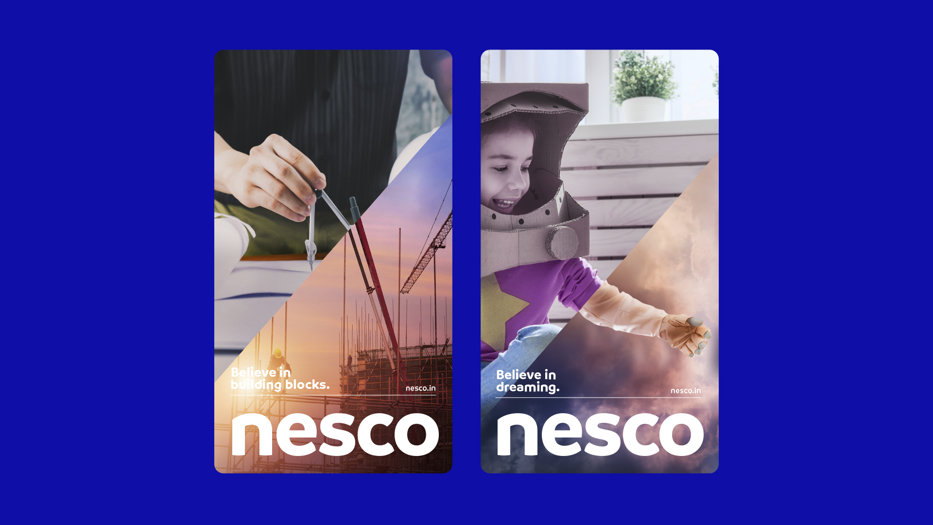
The diagonal between the two lines of our spark is where imagination and innovation come together. From thought to realisation, ideas to implementation. It is used creatively to break messaging (images, iconography and type) into two parts - what is and what Nesco believes tomorrow can be.
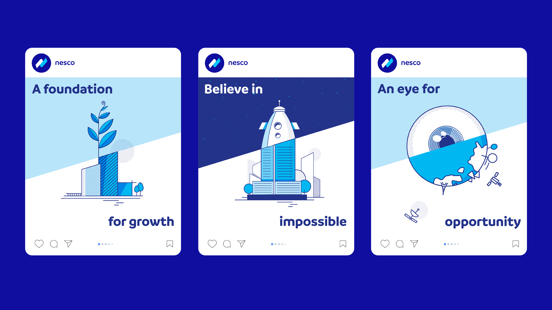


New forms for an iconic brand
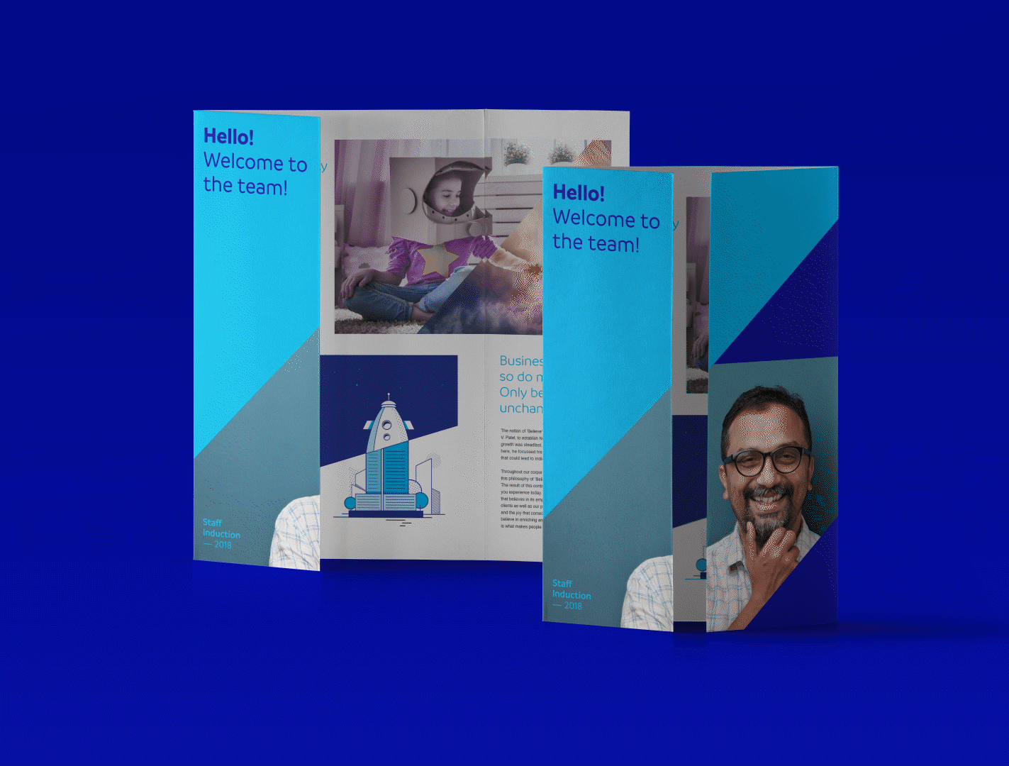
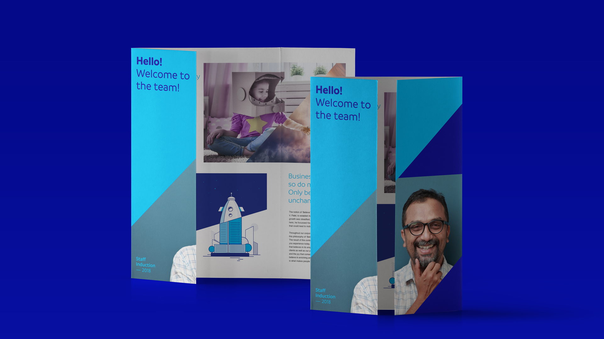
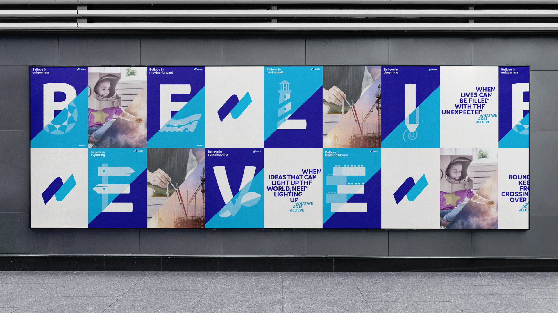
The friendly system of icons we created builds on this idea of duality. They can been used functionally across brochures, the website and potential future digital products, and creatively as part of their digital communication.
The friendly system of icons we created builds on this idea of duality. They can been used functionally across brochures, the website and potential future digital products, and creatively as part of their digital communication.

Coding multi-vertical growth
The verticals under the new monolithic architecture would carry the core brand identity forward with a shift in the secondary colour of the spark. These colours were carefully selected to represent the verticals offerings and examples were provided for how various future verticals could be incorporated easily within the system
The verticals under the new monolithic architecture would carry the core brand identity forward with a shift in the secondary colour of the spark. These colours were carefully selected to represent the verticals offerings and examples were provided for how various future verticals could be incorporated easily within the system

Believing in every creation
During our time with NESCO we crafted numerous brands within the various verticals. Each unique, with an identity, colour system and tonality that perfectly matches their offering, but still manages to fit within the overarching architecture we created.
During our time with NESCO we crafted numerous brands within the various verticals. Each unique, with an identity, colour system and tonality that perfectly matches their offering, but still manages to fit within the overarching architecture we created.
Let’s start a conversation.
For business enquiries:
eamonn@twodesign.co.in+91 98676 54952