Client
London Dairy
London Dairy
Brand
Connoisseur Club
Connoisseur Club
Industry
Luxury & Lifestyle
Food & Beverage
FMCG
Luxury & Lifestyle
Food & Beverage
FMCG
Region
U.A.E.
U.A.E.
Key Services
Naming
Visual Identity
Packaging
Environment Communication
Naming
Visual Identity
Packaging
Environment Communication
A scoop of surreal luxury for a renowned creamery.
With a presence in over 30 countries, London Dairy is a renowned entity in the world of ice cream. They have always prided themselves on using fresh and premium ingredients for their flavours. Looking to make a mark in the competitive haute-cafe culture of Dubai, they wanted to create a property that- while catering to an extremely rich clientele - still fit within the overall brand architecture.
The brand envisioned a place where customers would be treated to customisable ice cream creations that would blur the lines between reality and fantasy. Unique flavor combinations enhanced with premium ingredients such as gold dust. This merging of the unexpected and the exceptional formed the basis for our approach.
The brand envisioned a place where customers would be treated to customisable ice cream creations that would blur the lines between reality and fantasy. Unique flavor combinations enhanced with premium ingredients such as gold dust. This merging of the unexpected and the exceptional formed the basis for our approach.

The cafe itself was called the Connoisseur Club, creating an air of exclusivity for the space and targeting only customers with a true appreciation for the unique flavours that would be available. We decided to embellish the existing brand logo with a letter mark that would clearly distinguish the new luxurious and exclusive offering from the premium ice cream range. The font for Connoisseur Club is a thin sans serif that weaves together modernity and elegance.

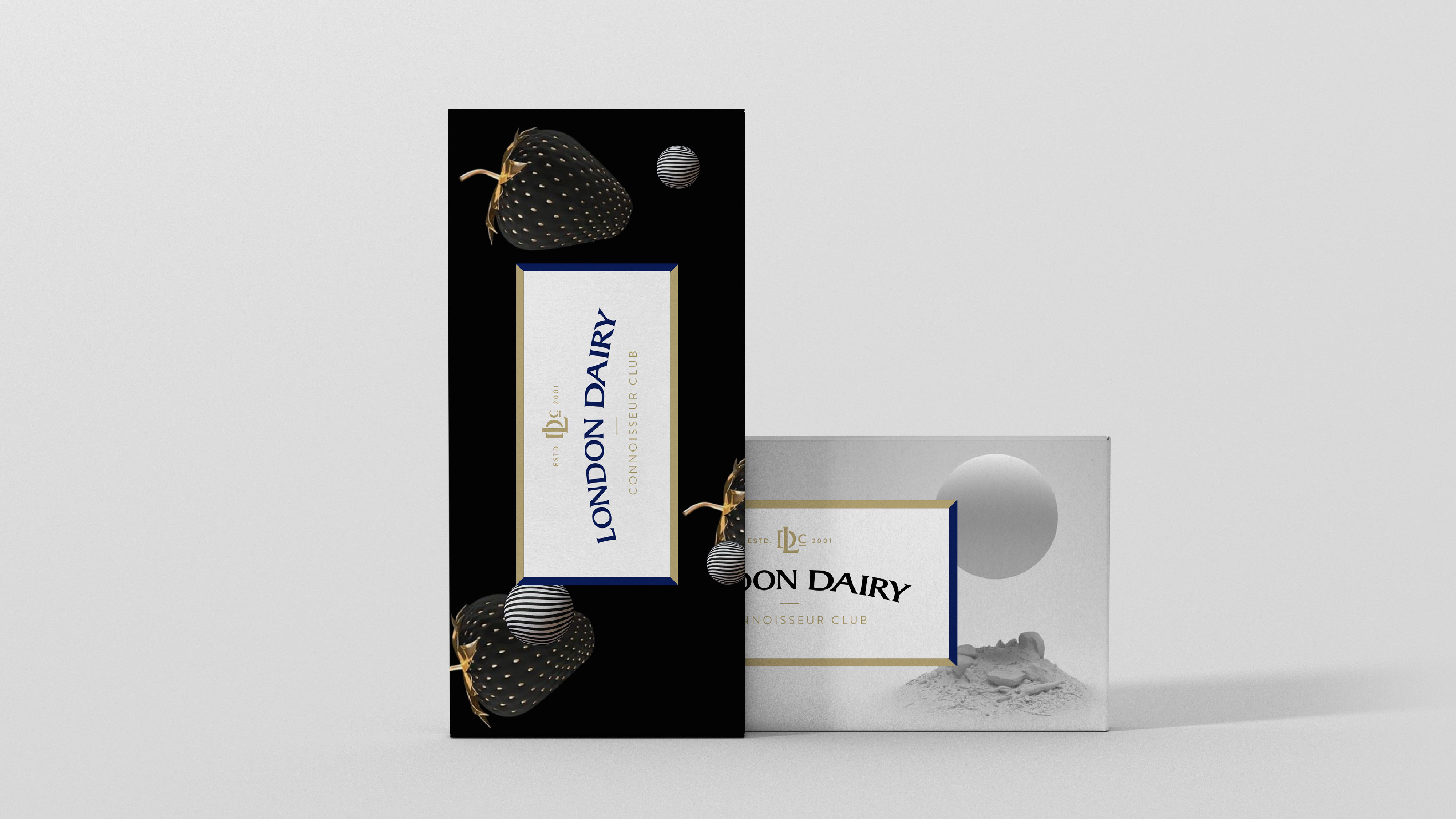
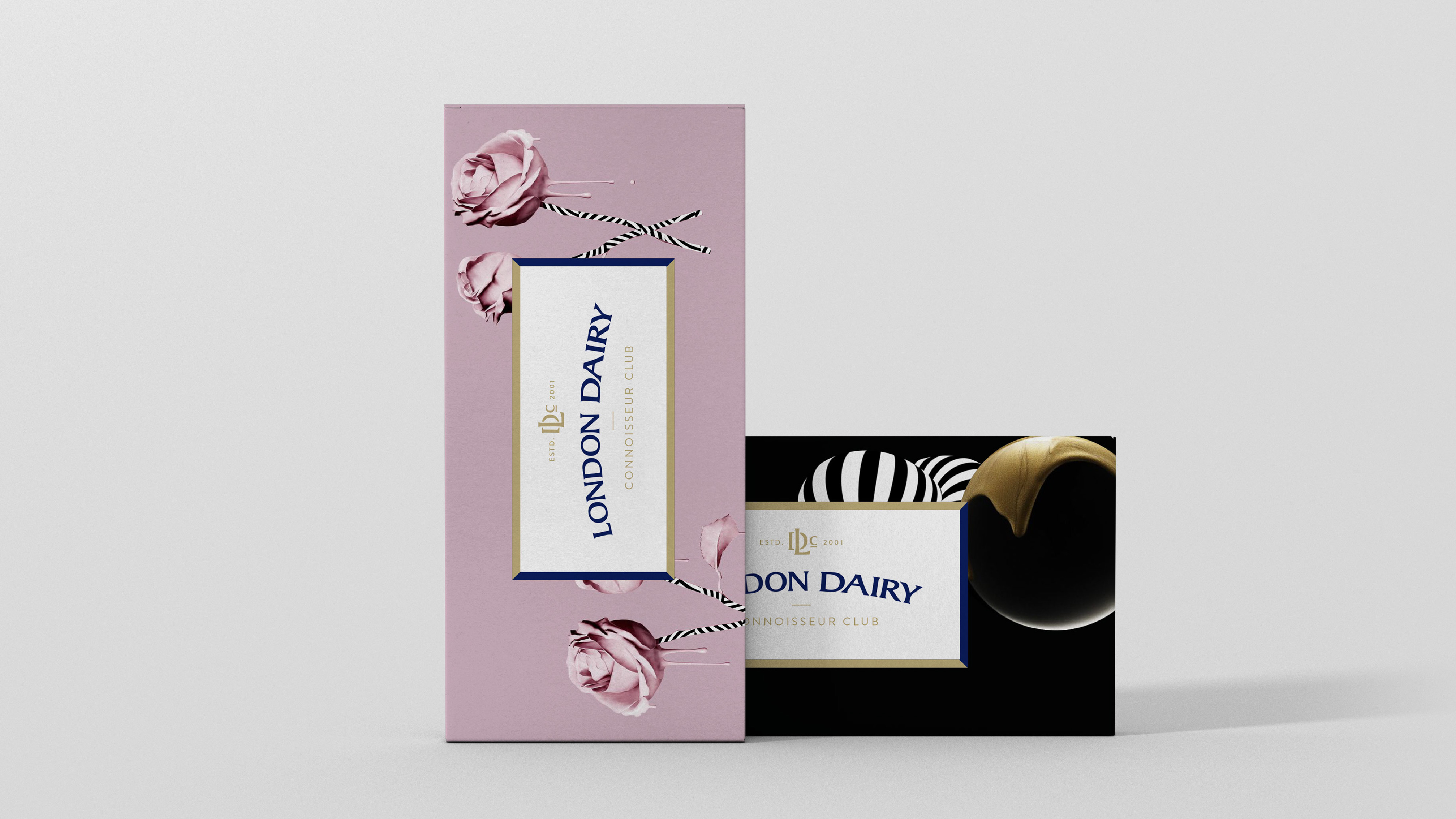
Taking inspiration from the imagination displayed in creating the ice creams, our design language is rooted in surrealism and underlined with luxury. Black, gold and royal blue form the primary colour palette and are used to enhance the imagery of natural ingredients. Bold circular patterns, inspired from the perfect scoop of ice cream, and clean gold lines build an air of exclusivity throughout the space and the packaging. Each flavour was elevated with surreal imagery. The visuals were created to be works of art that could be appreciated by visitors.


Let’s start a conversation.
For business enquiries:
eamonn@twodesign.co.in+91 98676 54952
