
Brand
Ekyaam
Ekyaam
Industry
Agritech
Foodtech
Agritech
Foodtech
Region
Global
Global
Key services
Brand Strategy
Naming
Brand Story
Brand Identity
Packaging
Communication Framework
Phygital Templates
Brand Strategy
Naming
Brand Story
Brand Identity
Packaging
Communication Framework
Phygital Templates
Mangoes and memories united glocally.
Innoterra, a Swiss-Indian agri-tech company is on a mission to build a more sustainable food ecosystem. It empowers farming partners by enabling growth, transitioning towards regenerative practices and the sale of traceable farm produce through an established global network.
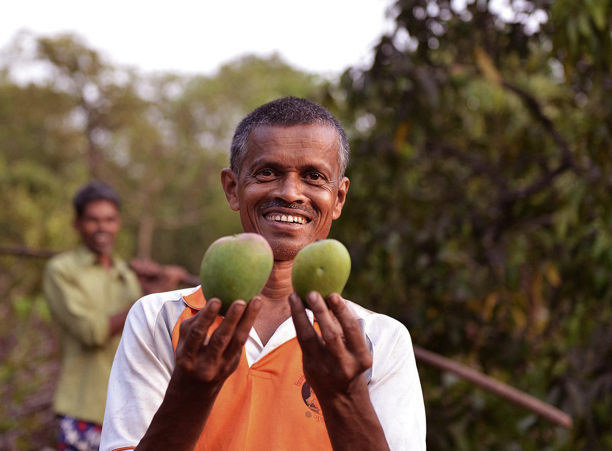
As an extension of this mission, we were commissioned to build their first collaborative endeavour. A Konkan-based farmer led Alphonso brand that would herald the king’s genuine authenticity - from soil to soul. Our strategic exercise has readied the business to effectively transition from its current pilot stage, this summer, into a fully realised brand.
As an extension of this mission, we were commissioned to build their first collaborative endeavour. A Konkan-based farmer led Alphonso brand that would herald the king’s genuine authenticity - from soil to soul. Our strategic exercise has readied the business to effectively transition from its current pilot stage, this summer, into a fully realised brand.
Appreciating every facet
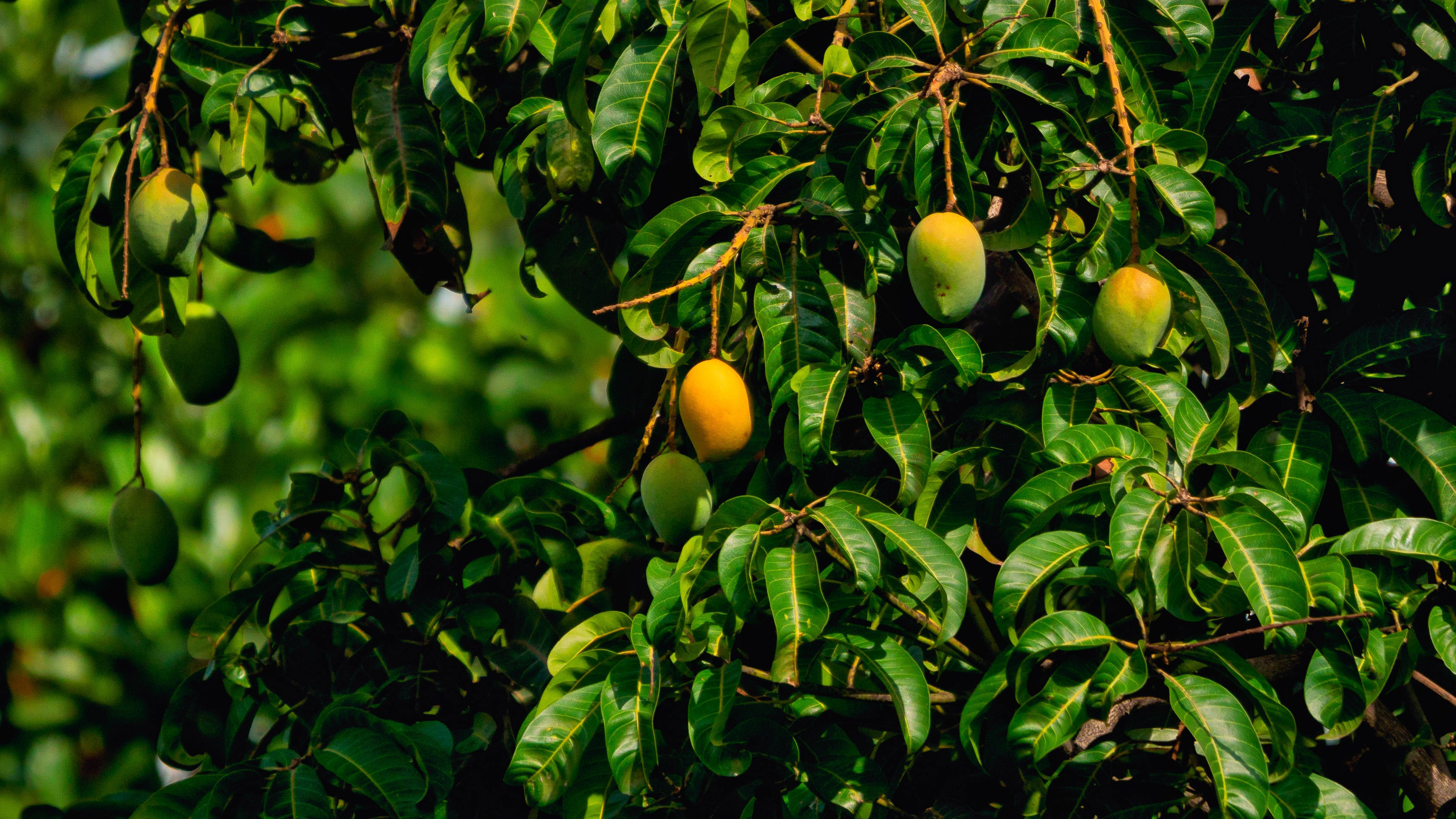
Despite growing one of the most prized fruits in the world, the Alphonso farmer remains unsung. Helpless against trade practices, climate change and a growing mis-appropriation of its Geographic source. The category is unorganised with ‘brands’ being either very small, local or supermarket-led.
Innoterra hopes to resolve this dynamic by addressing this power imbalance by connecting the farmers directly with consumers. Fulfilling a clear market gap by establishing a singular brand to become synonymous with alphonso in the national and global markets.
Audience Tastes
Early consumer scans showed that Alphonso's appeal remains localised to Maharashtra, adjoining states, and select global markets. To understand mindsets, from selection to purchase, meaning and relationship, we conducted extensive interviews, both domestic and international.
By focusing on those who consume annually, as well as those who had never experienced it, we identified a clear brand opportunity - To awaken the world and the rest of India, by pitching Alphonso as a life-changing fruit, to elicit a response: “If its mango, it better be Alphonso’ and a guiding insight.
Refining the Sketch
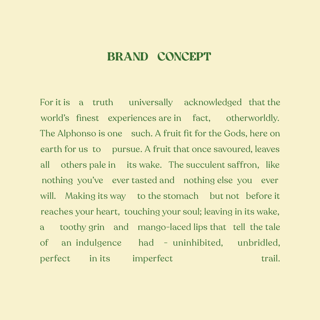
We conceived the Brand’s concept based on our all-embracing research. We fathomed that culturally, the Mango has an ethereal and mystical quality in India. A rare fruit that evokes a powerful sense of nostalgia. Adding magic to everyday life. Making you want to pursue these superlatives, to the farthest corners of the world and beyond.
Combined with a shifting consumer desire to experience genuine, healthy and sustainable food experiences, led us to create a narrative that leverages this sense of nostalgia to unite consumers and producers through the Alphonso. Making them ‘One with Aam’, or together with mangoes.

The Final piece
Our identity construct stemmed from the Mango’s mystical and nostalgic essence. To unfold a Brand story that is rooted in establishing a consumer connect with the fruit’s source - ‘From the finest orchards of Konkan’s hardiest farmers, we present the heartiest ‘original’ Alphonso mangoes; cared for and hand-picked, for your otherworldly union with God’s own fruit.’ Arriving at the Brand’s Positioning - a ‘Divine union with God’s own fruit’.
Our identity construct stemmed from the Mango’s mystical and nostalgic essence. To unfold a Brand story that is rooted in establishing a consumer connect with the fruit’s source - ‘From the finest orchards of Konkan’s hardiest farmers, we present the heartiest ‘original’ Alphonso mangoes; cared for and hand-picked, for your otherworldly union with God’s own fruit.’ Arriving at the Brand’s Positioning - a ‘Divine union with God’s own fruit’.
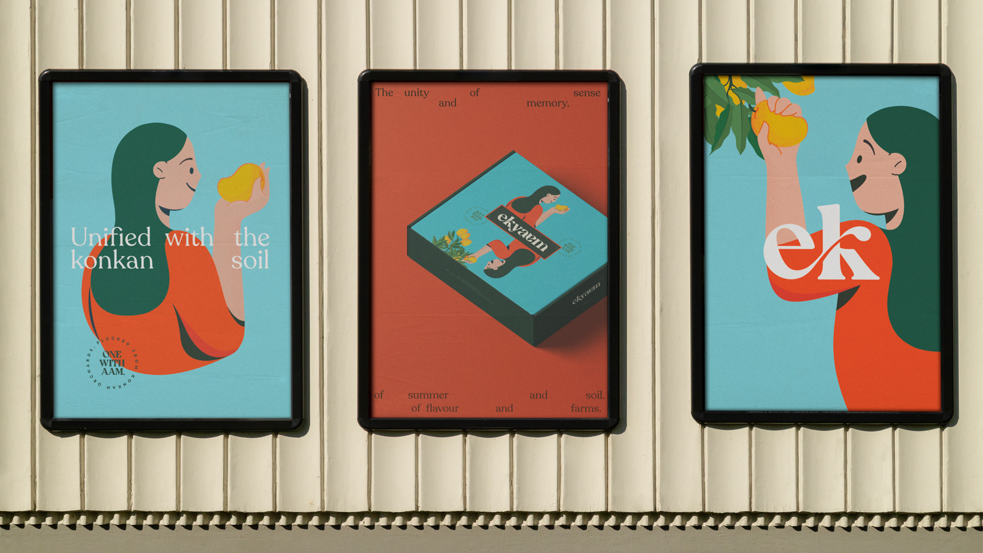
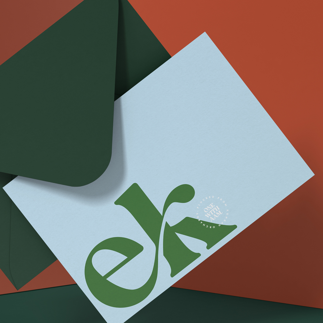
We crafted the logo as a combination of a logotype and a logomark, based on a modern serif that is bold and organic. E and k are conjoined to form ‘Ek’, birthing a mark, united in form and meaning, within and without the logotype. Moreover ‘Ek’ also extends itself as a simple signifier of the brand across mediums.
In an always-on omni-channel world, brands are omnipresent and need an identity approach with a unique digital heartbeat. Where each design element has a clear purpose, the ability to be a bite sized-messenger, ubiquitous in part or as holistic communication across the omni-channel gateway.
In an always-on omni-channel world, brands are omnipresent and need an identity approach with a unique digital heartbeat. Where each design element has a clear purpose, the ability to be a bite sized-messenger, ubiquitous in part or as holistic communication across the omni-channel gateway.
Drawing on nostalgic nature
Childhood summers in India were defined by the sweet flavour of the Alphonso, joyfully scarfed down during two short months. This joy is represented through a vibrant colour palette, soulfully complemented with pastel shades, to infuse nostalgia. The fruit’s lost authenticity is reaffirmed through serif fonts that provide a genuine touch to the story.
Childhood summers in India were defined by the sweet flavour of the Alphonso, joyfully scarfed down during two short months. This joy is represented through a vibrant colour palette, soulfully complemented with pastel shades, to infuse nostalgia. The fruit’s lost authenticity is reaffirmed through serif fonts that provide a genuine touch to the story.
The illustration style is reminiscent of joyful childhood drawings, dualistic in nature to connote the Brand’s transformative nature. To other worlds. To your childhood and its memories of perfect aams. To the orchard and its region. From farm to fork. Always one with aam. In unity it represents mangoes so fresh, it feels as though they’ve been plucked directly from the tree.


Packaging
Alphonso has for generations been home to rustic packaging. Yet opening these cardboard boxes were filled with little rituals. Snappin the twine ties that hold the flaps down. Eagerly rifling through the straw within which these golden treasures were hidden.
Ekyaam’s packaging takes inspiration from these rustic rituals to create an experience that is revolutionary for the category. Our earthy organic colour palette draws the eye away from the riot of usual reds and yellows. The illustration highlighting the connection between the customer and the farmer is united around the organic logotype.

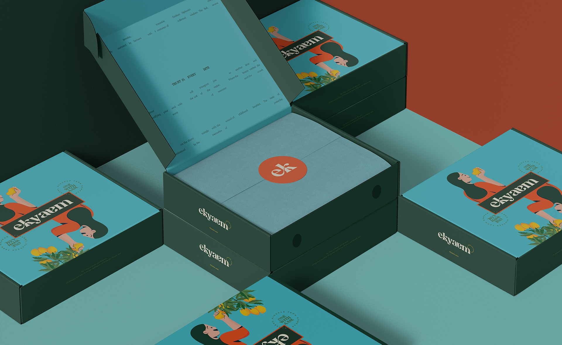
The enveloped card within each box builds on the story of authenticity. The wrapper within, surrounding the mangoes and carefully sealed with a sticker, is an elegant reinterpretation of pulling away bundles of hay to uncover the coveted fruit within. Every element of the packaging weaves memory and mystery to create a pure Alphonso experience.


Authentically Glocal
Crafting a brand of global aesthetics that is deeply rooted in homegrown sensibilities, we have empowered Innoterra and the Farmer’s Collective to shift from pilot to sales and distribution within 3 short months of being commissioned.
Crafting a brand of global aesthetics that is deeply rooted in homegrown sensibilities, we have empowered Innoterra and the Farmer’s Collective to shift from pilot to sales and distribution within 3 short months of being commissioned.
Let’s start a conversation.
For business enquiries:
eamonn@twodesign.co.in+91 98676 54952